Picture this—your manager has asked you for this year’s key figures. You have lots of tabs in your Excel workbook, but there’s so much data for you to trawl through to get what you need. The best way to get around this is to have a dashboard containing all the important information in chart form.
Step 1: Plan Ahead
You might think that a dashboard showing every bit of data is the way forward, but the whole point of a dashboard is to summarize key information (such as key performance indicators, or KPIs) so you can analyze it at a glance. Once you have copied or inputted the data that will form the dashboard into your Excel worksheet, look through your data and decide what you’re going to display.
At the same time, think about how you want to display each data set. Will you use pie charts or line graphs? Would a scatter graph or a pie chart work better for some of your data? Is your data going to be dynamic or static, and will this affect the type of chart you select?
It’s always good to visualize how your dashboard will look and what it will contain, so you have a better idea of what you need to do for the next steps.
Step 2: Prepare Your Workbook
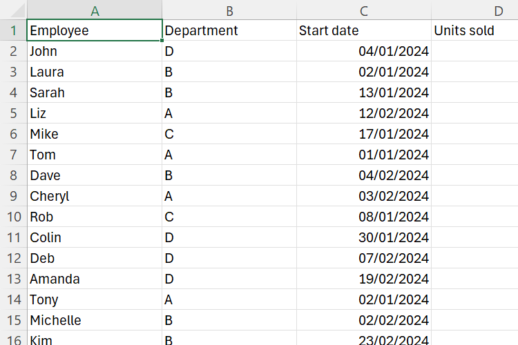
Before you create your dashboard, you should ensure your data is properly prepared. This will make setting up your dashboard a lot easier, guarantee that your dashboard works smoothly, and save you time down the line. In our example, we have one large table that we’ll use to extract specific information into three separate charts.
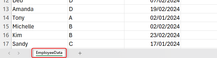
Make sure you have given each sheet an appropriate name. Do this by double-clicking a tab and typing a short sheet title that makes it easier to remember what it contains.
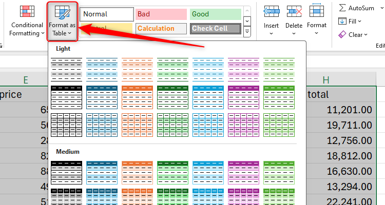
Then, select the data in your table, including the headers, and click “Format As Table” in the Home tab on the ribbon, choosing suitable colors and designs. Make sure you also remove any blank rows in your tables.
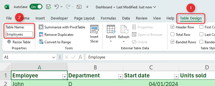
The next step in preparing your data is to name the table. Click anywhere within your newly formatted table, and give the table a short name in the Table Name box within the Table Design tab on the ribbon. Try to keep this to one word, if possible, for easier use later on.
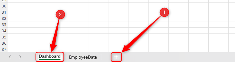
The final prep step is to create a dashboard tab. Click the “+” symbol next to your tabs and rename it Dashboard. You want this to be the first sheet in your workbook, so click and drag the tab to the left of all tabs.
Step 3: Create Your PivotTables
Now that your data is prepared, you need to create tables that will feed the data to your charts. You might think that this is an unnecessary step, because you’ve already got your data nicely formatted into a table, but PivotTables let you manipulate your data more easily and summarize your data more quickly.
Create Your First Pivot Table Template
Click any cell in your original data table, and in the Insert tab, click PivotTable.
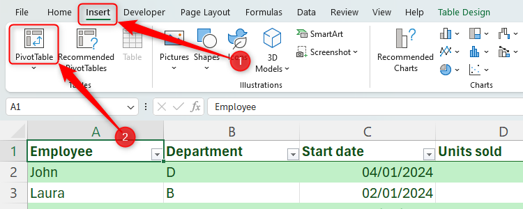
Fill in the dialog box with your table’s name (if it’s not already filled in), and make sure you select “New Worksheet” before clicking “OK.”

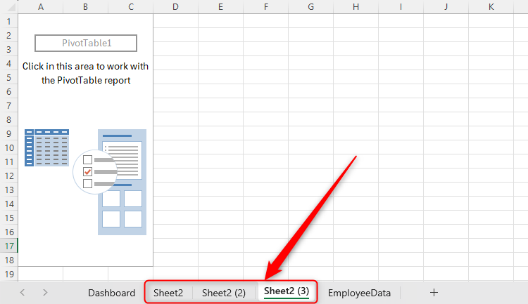
A new tab will open with a PivotTable area, which you will update shortly.
Duplicate and Rename Your Pivot Table Tab
As you planned ahead in step 1, you’ll know how many charts you will have on your dashboard. So, you want a separate PivotTable tab for each chart you will create. Rather than creating brand new PivotTables each time, hold Ctrl and drag your first PivotTable to the right to create a copy. We want three charts on our dashboard, so we’ll do this twice.
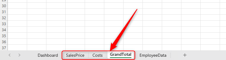
Once you have the correct number of PivotTables, rename the tabs according to the data they will contain.
Amend Your First Pivot Table
Click anywhere on the first PivotTable you created, and the PivotTable Fields sidebar will open on the right.
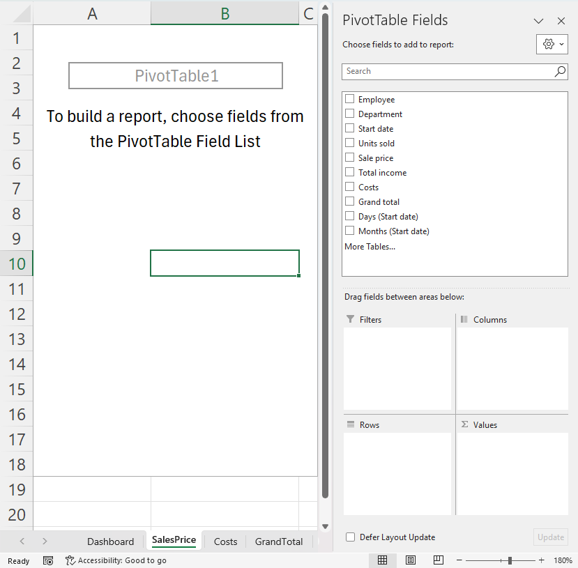
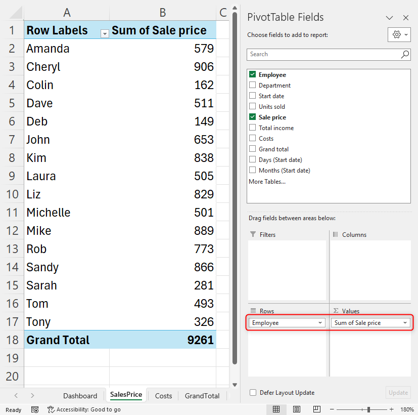
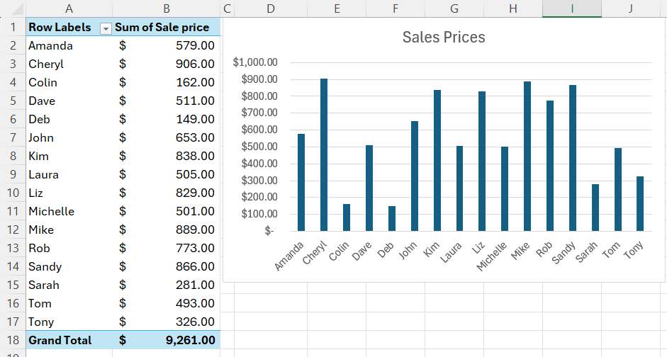
This is where you’ll choose the data to add to your table (and this will inform your charts later on). Click one of the series and drag it to the correct area below, and repeat this process for each series you want to include. In our case, as we’re on the Sales Price tab, we will click and drag Employee into the Rows section and Sale Price into the Values section. You will see your PivotTable update on the left as you do this.
Format Your Pivot Table
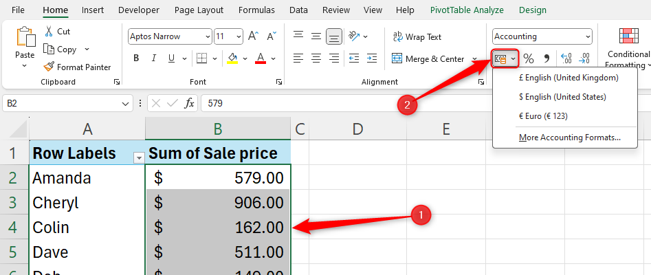
The final step before you create your charts is to format the PivotTable, so the data will display how you want it to when you create your chart. In our example, we want to change the numbers to a currency by selecting the data and clicking the currency icon in the Home tab.
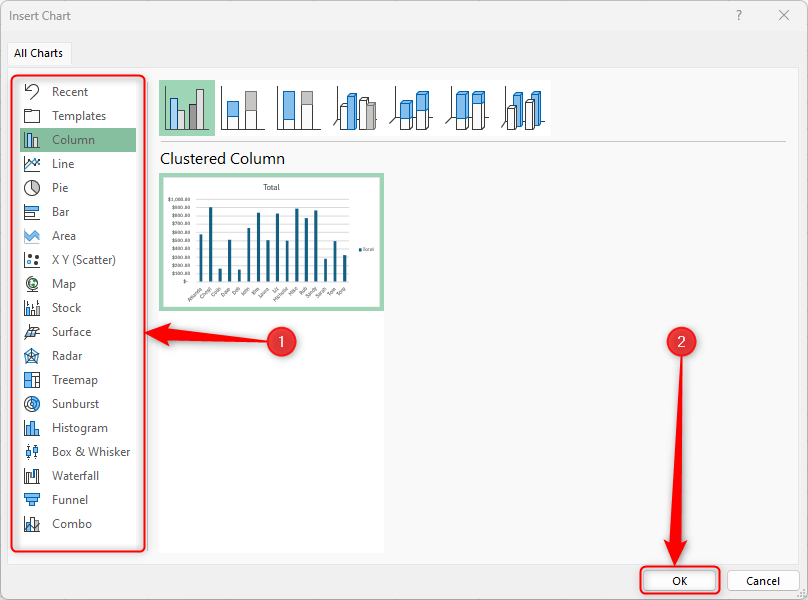
Step 4: Create Your First Chart
You’re now ready to create your first chart.
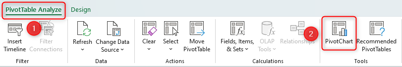
Click anywhere in your PivotTable and head to the ribbon. In the PivotTable Analyze tab, click “PivotChart.”
Then, choose a chart that presents your data in the best way, and click “OK.”
You can then format your chart and change the title and field items to suit what you’re looking to display.
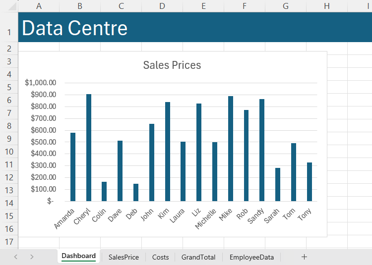
When you’re ready, select the edge of the chart and press Ctrl+C, and then go to your dashboard sheet and press Ctrl+V. Before you add the other charts, reposition and resize this first one so that your dashboard will look great. You could even add a stylish header to your dashboard tab.
Step 5: Repeat the Process!
Now that you have your first PivotTable and PivotChart, follow the same steps to complete your dashboard. Head to the second PivotTable tab, adjust the fields, settings, and formatting, create your table, and paste it onto your dashboard. Continue this process until you have all the charts you wanted on your dashboard, and move them around until you’re happy with how it looks.
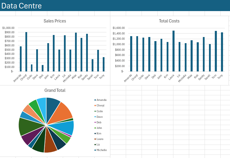
When repositioning your charts, hold down the Alt key to make them snap into a given position. This is great for lining items up when you have more than one on a worksheet.
Step 6: Add Slicers
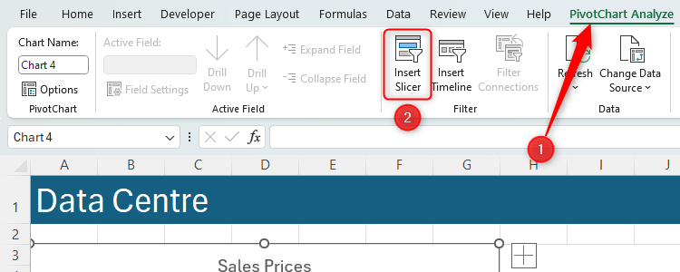
To make your charts more interactive, add slicers. Click any of your charts, and in the PivotChart Analyze tab, click “Insert Slicer.”
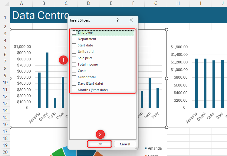
Select the data that you want to be changeable in your chart, and click “OK.”
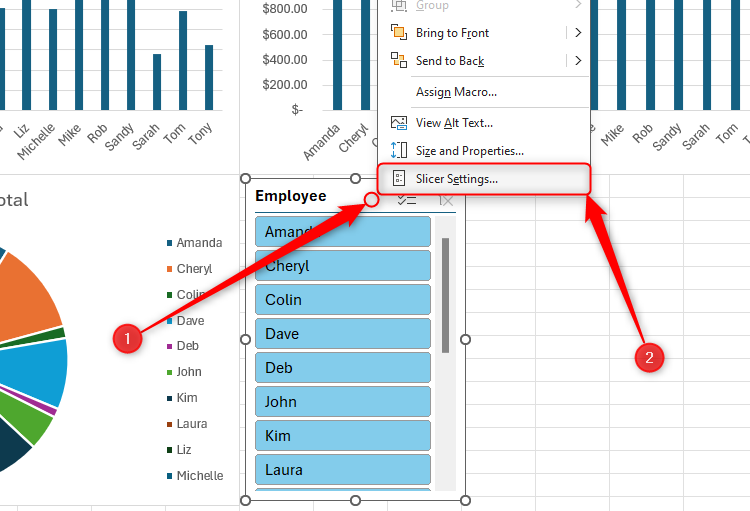
Reposition the resultant slicer. Then, to make your slicer tidier, right-click anywhere on the slicer, and click “Slicer Settings.”
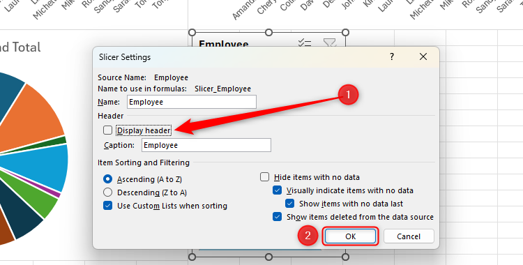
Change the settings according to what you want the slicer to show. In our case, we don’t need it to show the slicer header, so we’ve unchecked that box. When you’re done, click “OK.”
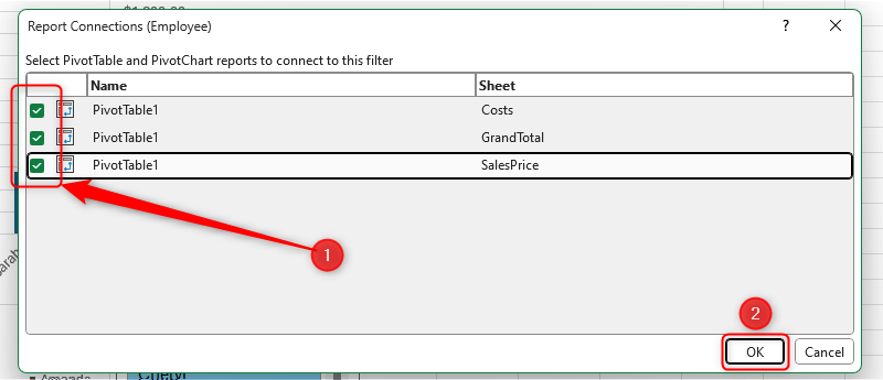
You’ll notice that only the chart we selected adjusts to what you choose in the slicer. So, to apply the slicer to all charts on your dashboard, right-click the slicer and click “Report Connections.” Then, choose which PivotTables your slicer controls by checking the relevant boxes, and click “OK.”
If you’re confused by the PivotTable names, and aren’t sure which one refers to which, go back to the PivotTables and rename them.
Repeat this process for each slicer, so that your whole dashboard represents all the different options you choose from all slicers.
To select more than one item in a slicer to display in your charts, hold Ctrl as you choose your options.
Step 7: Add More Data
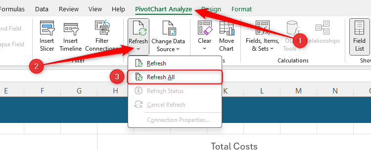
Because you formatted your tables properly in step 1, when you add new data to your original data table, the PivotTables will automatically pick this up. To make sure your dashboard reflects any new data you added, go back to your dashboard and click on one of your charts. Then, in the PivotChart Analyse tab, head to the Data group and click “Refresh All” under the Refresh button.
Step 8: Tidy Your Workbook
Before you share your professional workbook, take a minute to tie up the loose ends.
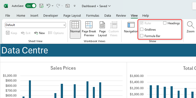
First, in the View tab on the ribbon, head to the Show group, and uncheck “Formula Bar,” “Gridlines,” and “Headings” to make your dashboard look less like an Excel sheet and more like a professional data dashboard.
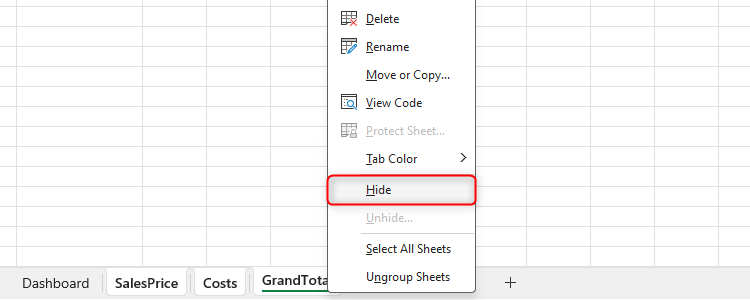
Then, hide your PivotTable tabs, as they could confuse other people when they open your workbook. To do this, click one of the tabs, hold Ctrl, and then click the other tabs. Then, right-click one of the selected tabs and click “Hide.”
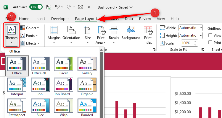
Finally, go back to your dashboard, and in the Page Layout tab, click the drop-down arrow under Themes. Then, choose a color scheme to make all your charts and layouts match each other.
Now that you’ve created a fully functional and interactive dashboard, you may want to share it with others who need to see the KPIs you’ve identified and analyzed.