The Apple Vision Pro has garnered lots of initial attention. The company’s brief in-store demos and its selection of immersive clips of content on Apple TV+ are arresting and spectacular. But can this new device launch a really useful new platform for augmented reality apps, and does the world even need Apple’s new “spatial computing?”
Apple has a pretty solid track record of hitting it out of the park with its bold new product introductions. Both iPhone and Apple Watch appeared with price tags significantly higher than many comparable products that already existed.
Despite much hand-wringing by pundits who thought Apple had priced things far too high for mainstream users to consider, both dramatically outsold their peers. Premium priced editions have expanded peak prices upwards since their introductions.
Other new introductions, like iPad and AirPods, were not only much more usable but were significantly cheaper than other existing alternatives. Consumers didn’t always realize this. Writing about the new $159 AirPods in 2016, The Verge had to explain that “the price has already put a lot of people off, but […] it’s actually really competitive.”
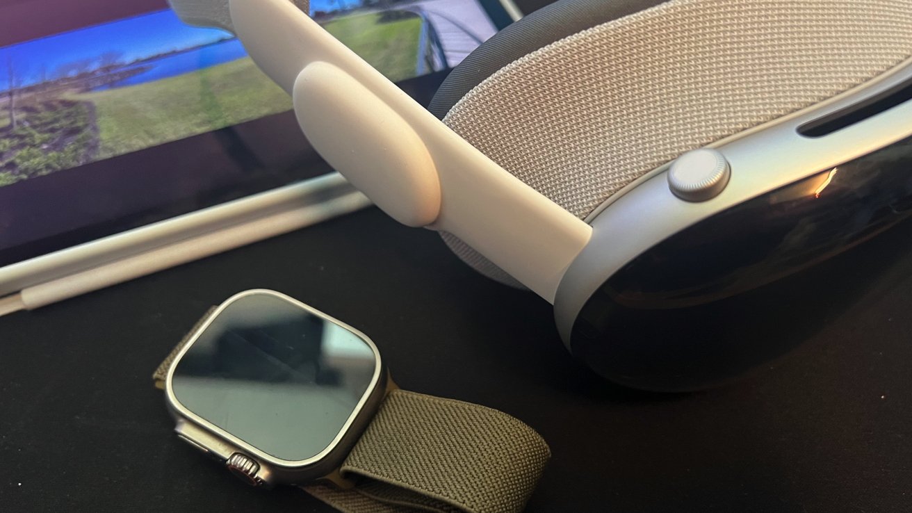
Apple Vision Pro is somewhere in the middle. It’s priced far more than typical video game VR visors, higher than Meta’s premium niche Quest Pro, and about the same as Microsoft’s HoloLens aimed at enterprise.
Given that VR devices have largely languished as a novelty or toy, and have seen some high end use but certainly nothing blockbuster, is there any real value for consumers or even prosumers for Apple’s high quality, amazingly engineered, but quite pricey Vision Pro and its novel concept of an immersive desktop for spatial computing?
Well, isn’t that spatial?
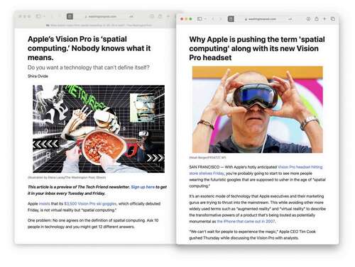
What even is “spatial computing?” That question was posed by the Washington Post last Friday under a headline that insisted, “Apple’s Vision Pro is spatial computing, Nobody knows what it means.”
And, to sell the question further it was frantically paired with a subtitle that asked “do you want a technology that can’t define itself?”
In an era where serious and storied investigative journalists are being laid off, Shira Ovide leisurely explored the idea that nobody knows what spatial computing is across several paragraphs that didn’t really say anything.
Two hours later, another piece was published by the same paper, written by Michael Liedtke, which offered a detailed explanation of spatial computing as provided by “a long time industry consultant.”
According to this source, the answer to this confounding riddle “incorporates elements of augmented reality, or AR, and artificial intelligence, or AI,” and “will enable devices to understand the world in ways they never have been able to do before.”
The Post piece even predicted, “eventually every interface — whether it’s a car or a watch — will become spatial computing devices,” before Liedtke cited his research on motion sensors that flush toilets as being “a primitive form of spatial computing.”
I was left wondering how these word salad chefs still have jobs.
But more importantly, did anyone get confused when they saw Apple’s presentation of spatial computing, and wonder for even a moment for what this phrase could possibly mean? “Spatial” quite simply refers to things in the space around you, right?
The Spatial Audio harbinger
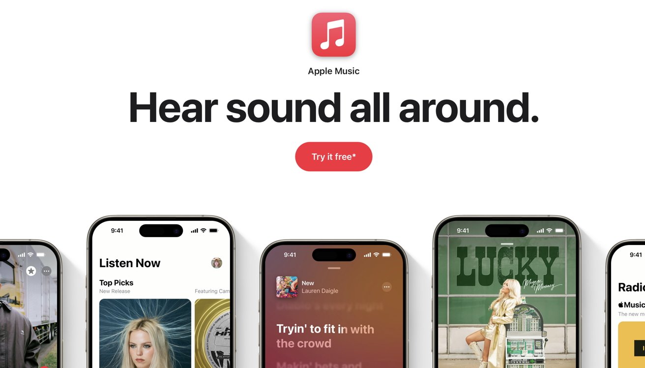
The concept of “spatial” is something consumers have already contemplated. Almost three years ago, Apple unveiled Spatial Audio as a new feature in Apple Music. Released during the summer of 2021, Apple quite simply marketed it as “the music comes from all around you and sounds incredible.”
Behind the scenes, Apple’s new Spatial Audio used Dolby Atmos to deliver atmospheric audio experiences that required music labels to remix their catalogs to deliver a new, higher quality of music, remastered to convey a precisely accurate stereo sound stage beyond the simple status quo of two channel, stereophonic sound.
Apple Music distributed musicians’ remastered content and played it back spatially for users using fancy new decoding provided by its custom chips already in recent iPhones, iPads and Macs, as well as its AirPods and Beats headphones with Apple’s H1 or W1 chips.
Teasing valuable new features from its recent hardware offerings, with the help of content providers creating new applications of its technologies, is the most Apple thing ever. Subscribers of Apple Music got a content upgrade for “free” as they bought new Apple gear to enjoy it.
Vision Pro takes the concept of Spatial Audio and brings it into the visual user interface. It’s not just your audio soundscape that’s all around you and directional, but also all of your windows of content, your games, your videos, photos, and Panoramas.
Spatial inflation
Spatial Audio was a solution nobody was really asking for. Other music services imagined that what consumers really wanted was Tidal’s high fidelity music encoding or Spotify’s content curation or perhaps exclusive podcasts. Yet both companies are struggling to survive and doing little for musicians and the industry, with Tidal paying them a bit more for the paltry plays they gather, or Spotify paying them a lot less for a lot more plays.
While Apple has devoted a lot of marketing attention to Spatial Audio over the last three years, it’s not something you explicitly have to pay extra to get. Not so with this new world of spatial computing, where the player costs upwards of $3,500 and you have to search out new 3D movies and get new spatial apps specially created for Vision Pro.
What’s the value of explicitly buying into this new concept?
If you listen to a lot of critics, the answer is that Vision Pro is a lot like the iPad. It doesn’t do what they imagined Apple should, and they’re upset that it might not ever be able to deliver exactly what they had expected.
They really feel like it should cost half as much, be half as big, and do a lot of things Apple never said it would. This is evergreen Apple criticism.
As I noted in Monday’s column, the most readily apparent valuable feature of Vision Pro is its captivating immersive video and the spellbinding entertainment of having a vast virtual television that wraps around you and puts you right into an environment: from your own Panoramas and 3D captures to commercial immersive 3D movies.
Wearing the device can be tiring. Will people actually put it on to do real-world productivity work? Even before ever trying it on, I had confidently predicted that “Vision Pro isn’t going to replace the Mac to do the same tasks.”
But what about using Vision Pro with your Mac?
Windows for your Mac
Often, even a really nice TV makes a poor display for your Mac. Televisions are designed and installed on the wall to be watched at a distance for leisure.
The features that make a great display for productivity and serious computing are quite different. Even a 4K television across the room up on the wall delivers an effective resolution and overall clarity that isn’t very impressive once you’re used to a Retina Display Mac.
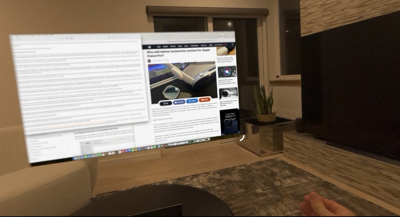
That left me surprised to find that using Vision Pro as a Mac display, with Screen Mirroring, is pretty phenomenal. In typical Apple fashion, it just works. If you look at your MacBook wearing your Vision Pro on the same WiFi network, it pops up a virtual Connect button that lets you establish a session. It’s not that hard to connect a desktop Mac either.
My 13-inch MacBook Pro from 2020 creates by default a virtual display positioned just above machine at a higher apparent resolution of 2560×1440. That provides a larger working desktop. It looks at least as sharp and as bright as my built-in screen, but never has any reflections or glare issues.
For comparison, my M1 MacBook’s “default resolution” is 1440×900, but I use it set to 1680×1050 to have a larger desktop. It can technically paint its UI to the built-in display at its native resolution of 2560×1600, but this results in tiny text that isn’t really readable.
Apple seemed to be the first PC maker to realize that higher resolution isn’t always better, and that delivering a beautiful, razor sharp Retina Display was easier to sell than just higher pixel count stats.
While my MacBook Pro scales back its UI to look Retina perfect, Vision Pro’s optics have such a high resolution that it can draw my Mac’s Screen Sharing window so that it appears sharp, vibrant, bright, and delivers a larger desktop area without text getting too small for me to read.
Additionally, instead of being 13 inches it appears to virtually be around 46 inches in its default window position, and can be effortlessly expanded beyond 140 inches (3.5 meters) while still looking Retina sharp.
For even more desktop real estate, you can also drive one virtual Mac display at 3940×2160 (aka 4K), which Apple’s Screen Mirroring labels as “low resolution.” That begins to feel a little soft around the edges for text to my eyes.
Vision Pro presents you with a vast, astoundingly clear, flat display hovering right behind your darkened MacBook screen. With its screen turned off, the MacBook’s processor is driving this virtual display. So just as when watching Apple TV+ films and playing Apple Music videos, you’re using the Vision Pro as effectively a giant virtual television panel.
Unlike a real screen, it doesn’t reflect ambient light in the room. There’s nothing heavy and large to carry around, no power cables to run, and you don’t plug anything in.
Mac Screen Mirroring on Vision Pro takes the idea of a physical dock and wirelessly and virtually gives you a single comfortable, enormous screen with more real estate than you might natively have on your MacBook.
Because it works without regard for lights and glare in your environment, you can even use it outside in bright lighting, where productively working a notebook could be tricky.
With Vision Pro, you can carry a light, thin MacBook around but open it in your office, your hotel, your car, seated in the airport terminal or on airplane — or pretty much anywhere other than driving a car obviously — and virtually roll out a big screen you can comfortably position anywhere you like. Nobody else can see what you’re working on, and if you pop in AirPod Pros, they won’t really hear things either.
I expected the Mac Screen Mirroring to be marginally useful. But after getting started with it, I absolutely loved it.
Perhaps in the future, Apple will add the ability to transform the Mac’s desktop to appear as a curved screen that wraps around you, or give you more than one screen. Right now it’s just a flat plane you can position anywhere, even on the ceiling.
This big screen for your Mac is a standard Vision Pro window that you can expand, move around, and close in the normal ways with your eyes and fingers. But with your MacBook sitting in front of you, you can type on its keyboard and move the Mac cursor around with your trackpad. There’s nothing to learn.
This feels both very useful and valuable for lots of travelers who want to get work done, particularly for business people who want to stay productive in a hotel or between meetings where it would be nice to have a larger display that you can look at comfortably without being hunched over your laptop looking down. With Vision Pro, you can sit up straight and look forward ergonomically.
The future of TV meets the Mac and iOS
The hosted view of your Mac on Vision Pro remains a single window that acts like an external monitor would, except that it can be super enormous if you like. That means all your Mac apps are overlapping windows within this conventional desktop metaphor that’s defined the Mac since 1984.
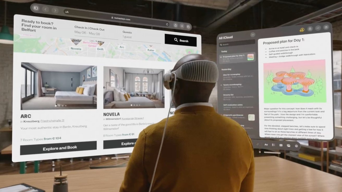
But Vision Pro’s spatial computing isn’t just a big virtual screen for your Mac. It can also create lots of additional virtual screens on its own, each effectively a giant iPad window. This, collectively, is spatial computing: screens wherever you want, without the physical limitations inherent in physical display hardware.
As I noted in the previous segment, Apple’s “future of television” on display here finally breaks out TV from behind the confining glass screen that has inherently defined the experience. Rather than looking at a screen, your vision is surrounded by screen.
Beyond Apple’s built in support for Mac Screen Sharing, you can also access games and apps using Windows PC mirroring with a pair of third party apps: Moonlight (formerly Limelight), an open source implementation of NVIDIA’s GameStream protocol, and LizardByte Sunshine running on your PC.
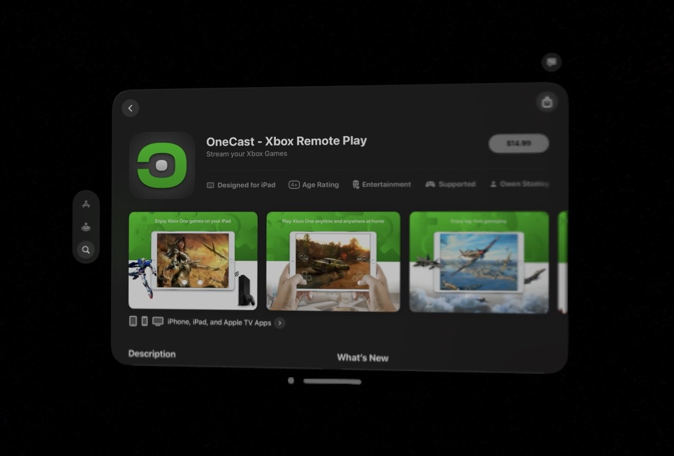
You can also stream console games from and Xbox or PlayStation using apps designed for iPad, including OneCast and MirrorPlay, respectively..
Look for a more in-depth piece from the rest of the AppleInsider gang on streaming games from your PC very soon.
Apple and the bitmapped display
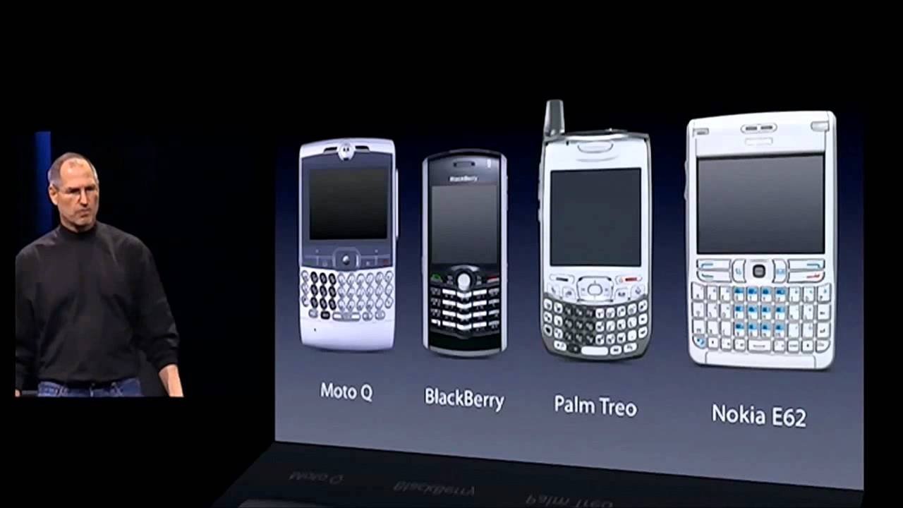
When Steve Jobs introduced the original iPhone, he took existing smartphone designs to task for devoting so much of their face to a bunch of buttons, either numbers and directional keys of the most basic models or the rows of full physical alphabetical keyboards popularized by Blackberry, Nokia, Treo, and Windows Mobile.
These physical keys were seen at the time as essential, but Jobs said the solution Apple had arrived at was to remove them all and replace them with a bitmapped display that could function as a keyboard, then be redrawn to show a full document, or display a movie, or play a game. Virtual keys could even be reconfigured to show other languages, or special keys, or emoji, or anything else the user wanted.
Jobs emphasized that this bitmapped display was historically the key thing driving Apple’s innovative leaps. If you can imagine something, you can portray it in pixels on a bitmapped display.
As touchscreen technology advanced, iPhone X finally allowed Apple to even get rid of the last physical Home button that had defined previous iPhone faces, and replace its entire functionality with gestures on its even larger edge-to-edge display of bitmapped pixels.
Bigger isn’t always better
iPhones and iPads keep getting incrementally larger but at some point become too large to easily carry around and use. In my personal experience, I found Apple’s Plus-sized iPhones too large for my taste. After using one anyway, I started suffering from pain in my shoulder and down my arm.
After some treatment, I decided that its large display wasn’t just too big for my pants pockets, but was also changing how I used the phone.
For many years, I had been consciously sitting upright at a quite ergonomic desk to do most browsing, writing, and other Mac tasks, and using my iPhone to take calls, play games, access email, and do other minor tasks on its tiny mobile display. But with the advent of iPhone 6 Plus, I found myself lounging at strange angles hunched over its larger screen for much longer to do more browsing, shopping, videos, and other things that had once been “laptop at a desk” tasks.
I decided it was this unergonomic shift that was causing my problems. Sure enough, shortly after switching to a standard sized iPhone and making an effort to do most of my computing work at a desk, the pain went away.
The same sort of pains also come from trying to lug around a notebook that’s too big and heavy. Anyone past their early 30s should realize that while a giant screen on your laptop looks really beautiful and feels productive, it will bust your back to carry that big thing around.
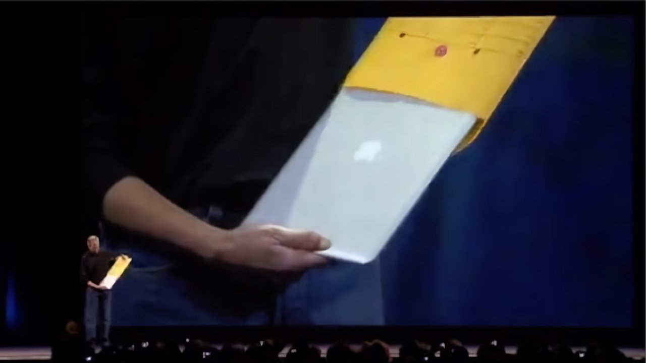
That’s clearly why Apple has always pushed the envelope — literally with the MacBook Air — to deliver light and thin machines, even as the tech media demanded Apple instead make big thick desktop replacements with lots of various ports, “no dongles,” and until quite recently, disc drives.
The market spoke, and what it wanted was clearly Apple’s vision for light, thin MacBooks. Virtually all PC laptops now look as much as they can like MacBooks.
The engineering challenge remains: how do you pack in the power of more bitmapped pixels without getting heavy and physically large?
Vast without the mass
Vision Pro is, effectively, the greatest bitmapped display Apple has shipped. And it’s not just a display that wraps around you; it’s a bitmapped screen that can literally be anything, just like the first graphical Mac desktop and its key-free iPhone, iPad, and Apple Watch screens.
What’s new of course, is that Vision Pro puts all its pixels in your line of sight so they are all you can see. That’s basic VR. What’s novel is that Apple is also capturing your surroundings and displaying them on these pixels, compositing its graphics on top, and overlaying your hands above them. That means you have a reality that can be fully virtual, or simply partially augmented, and anywhere in between.
Beyond acting as an impossibly large television, and also a vastly large display for your Mac, you can also create new virtual iPad window displays and mount them anywhere you can look. And additionally, along with full document-style windows, you can also have virtual platters with 3D models on them, to examine a structure or object as if its floating in your world populated with whatever huge virtual displays you want.
One cool implementation of Apple’s support for USDZ 3D models is explorable in the Red Bull TV app. Besides various sports related clips, you can examine models of a couple racetrack locations as a 3D model you can freely manipulate in the air.
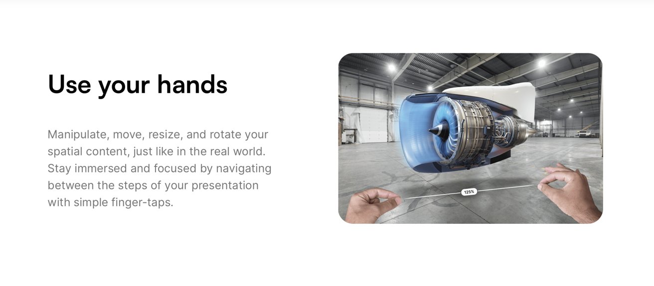
Another Vision Pro title, JigSpace, lets you view and interact with 3D spatial content models and create presentations to communicate complex ideas, visually in space.
Standing on the frameworks of giants
Over the past several years, Apple has been showing off new things at WWDC from ARKit to Reality Composer for working with 3D objects fixed to a space in our world. Many people weren’t convinced that there was tremendous value in AR, particularly on an iPhone. Apple was ultimately doing all of that work for Vision Pro.
In typical Apple fashion, the company was just making its pre-requisite work available in advance on iPhones and iPads, and enabling its developers to become familiar with AR and the world of spatial computing before Vision Pro was delivered.
Other incremental OS advances, from Accessibly features to Continuity to Keychain to iCloud to Apple Pay, all serve to also add value to Vision Pro. It’s a “1.0 release” but it got started years ago and benefited from a huge body of existing work that’s already been delivered.
Vision Pro is the next big leap.
Mixed Mac with giant iPads
For users who want to do the kind of tasks you can perform on an iPad, Vision Pro can act like a virtual world where you can have as many full screen iPad apps arranged however you like, moving around between them rather than flipping between apps on one iPad, all constrained behind its limited glass physics.
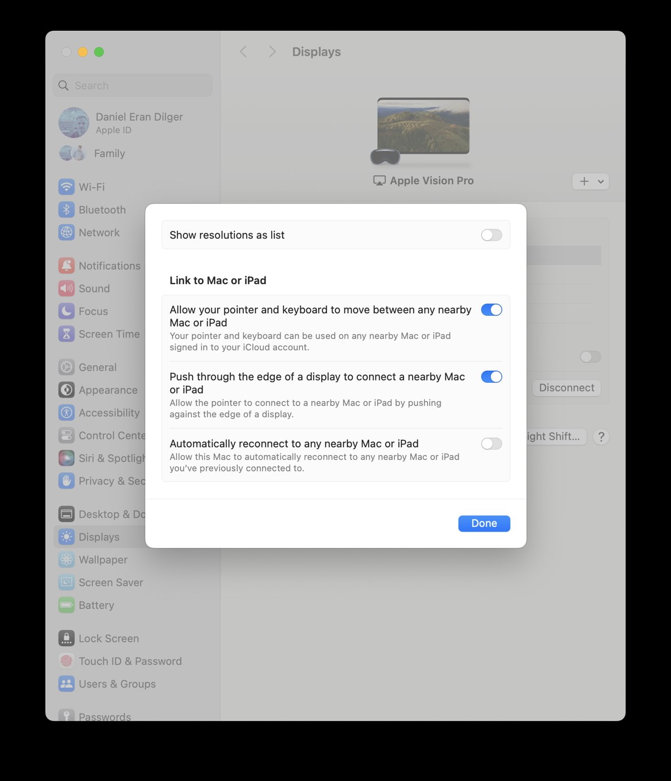
If you carry a MacBook, you can also add its experience to your world of virtual iPads. What’s especially cool is that these work together seamlessly thanks to Continuity. Type into a Mac app, then drag the cursor beyond the limits of your Mac window, and you can use your MacBook’s trackpad to control and select elements in the Vision Pro world.
Apple had already delivered and perfected this Continuity integration in the real world, so in Vision Pro it just works flawlessly.
Move the Mac cursor to a Vision Pro app next to it, and the arrow turns into a touch sized dot, so you don’t have to consciously think about shifting from “point and click” to “look and gesture.”
The Mac window remains a Mac, so you can’t look to select and your hand gestures do nothing to your Mac windows. To move the Mac around, you do focus on its window bar and move it with your hands, just like any other Vision Pro controls.
By leaving the Mac and its apps confined to a Screen Sharing view, your Mac world remains consistently and comfortably where it is. Close the shared window on Vision Pro and that environment is right back on your Mac without any real changes. There’s no relearning curve at all.
Typing and selecting with a look
The native windows of Vision Pro apps continue to act a bit like individual iPads, except that they can get virtually as large as you’d want, or at least up to a reasonable degree.
While it is impractical to type lengthy text using “look and gestures” on the virtual keyboard, I found it pretty easy to edit documents and enter short notes. Also, Siri and Dictation both work really well on Vision Pro, and are seemingly more powerful and refined than I expected.
You can also connect a recent Bluetooth keyboard or trackpad. If you have a Mac session going, its physical keyboard works really effortlessly as well, both in Mac apps or anywhere
My initial skepticism of how much time you’d want to spend doing “Mac stuff” on Vision Pro may be wrong. There certainly is a limit to how long you can comfortably wear Vision Pro against your face.
After a marathon session, I’m happy to have fresh air hitting my eyes and relief from the pad in contact with my forehead. I didn’t imagine I’d write an article on it when I have my MacBook right here. But I did, and enjoyed it.
Used with a Mac, Vision Pro is a virtual giant monitor with as many big Continuity iPads around it as you’d like. All alone, it’s just as productive with an external keyboard. But even by itself, it’s quite easy to do Mac-like editing tasks — perhaps more so than a typical iOS device, even, because you have a vast canvas that allows you to arrange your app windows around you.
On a physical iOS device, your apps generally take up the full screen and have to be paged between. In this new spatial computing world, it’s like iOS is upgraded into a futuristic 2024 version of the Macintosh.
On Vision Pro, I experienced few of the frustrating text selection issues I often run into working with documents on my phone. With a large virtual display, it’s quite easy to click with your finger tap, double-tap to select the document text you’re looking at, and then expand the selection by looking at its end point and moving it with your hand. Vision feels much more precise than trying to select text with your relatively fat fingertips on a small glass screen.
Having said that, if you’re working in a text document, your eyes are constantly selecting elements and you may inadvertently gesture something with significant and destructive results. Unless your hands are resting on a keyboard, you have to give extra thought to how you might change a document if you’re not careful.
You also have to give thought to other people’s hands. A nearby person’s gestures could be interpreted as your own, particularly if Vision Pro doesn’t have a clear view of both of your hands. Even sitting by yourself reading a long block of text, you can inadvertently move your arm in a way that results in rapid scrolling and losing your place.
It seems like it would be useful to have a way to pause gesture input controls to prevent any accidental — or malicious — interruptions.
I got so comfortable with typing, pointing, and dictating into my huge virtual screen that it initially felt surprising that my giant window disappeared when I took the Vision Pro off. There’s a neurological reason for this, though.
Objects in the Vision Pro spatial computing world feel very real. It is your reality when you have it on.
Productive anywhere
Apple largely depicts Vision Pro as being used in a living room, kitchen, or in a conventional office. But the portability of the unit, and its ability to act as a huge accessory display or an array of large apps you can all access at once as if independent screens — Apple’s definition of spatial computing — actually seems to deliver a very useful and compelling virtual studio or office you can unfold essentially anywhere.
While the home theater and entertainment aspect makes it fun to have, using Vision Pro as a portable office seems like a clear business use case. Buying a big $3,500 television isn’t out of the reach for many comfortably affluent people, but perhaps a larger group of Vision Pro buyers will be road warriors, commuters, desk workers, and people working from home who want a personal office space they can customize as they see fit.
Priced more like a high end notebook, this makes a strong enterprise case, as well as tapping into the prosumer field of creatives and entrepreneurs who’d like a private workspace they can take with them anywhere and roll out effortlessly on location to work.
Early adopters among the influencer crowd are all contriving absurdist skits using Vision Pro, to be comical or provoke engagement. In reality, it generally makes sense to use Vision Pro anywhere you’d be comfortable and safe opening up a laptop.
On a plane, yes. On an urban metro where any sort of insanity might occur randomly? Perhaps no.
There are also places where you’d might want to use your laptop but wouldn’t be able to see the screen well, or wouldn’t be comfortable with other people viewing what you’re working on. From brightly lit rooms to a public lobby or your seat on an airplane, Vision Pro feels like it would enable you to be productive or entertained without glares of any sort.
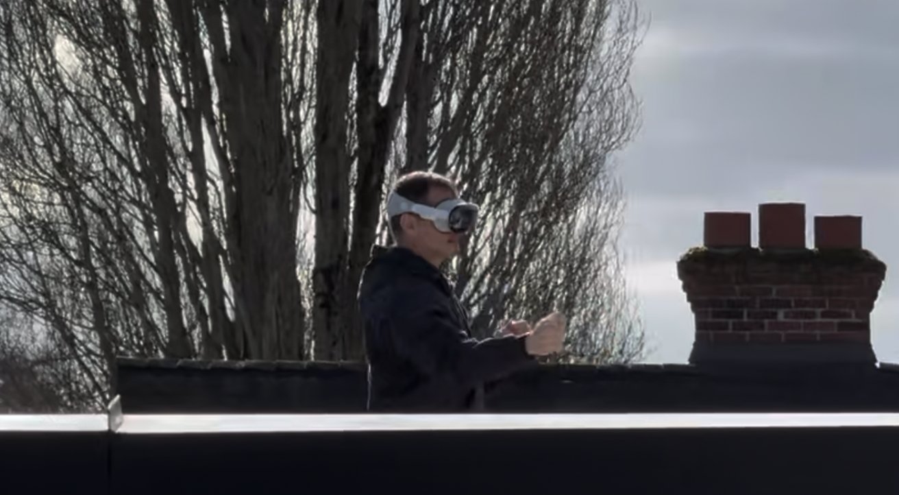
I went up on my roof deck and enjoyed the sun a bit while writing and working on documents. Ambient lighting is not really an issue. Even in the sun, the light seal works well. I could at times see a light artifact that was, surprisingly, coming in from the back of the band area.
Conversely, in near darkness there is also sometimes a light artifact from the lens that is perhaps a reflection of your eye. Sometimes it helps to lighten the room or the background Environment (effectively a desktop wallpaper you can select behind your floating windows).
I wouldn’t recommend working in direct sun as I did for very long. Even iPhones are more sensitive to sun than we are, and Vision Pro is delicate and expensive.
It also needs to stay dry of course. Even if it could be made water resistant — and it very much is not — the band and light seal and other components are not going to like getting wet, and would obviously not be comfortable to have on your face damp or soggy.
The biggest restriction to productivity in Apple’s emerging world of spatial computing is that wearing Vision Pro might mess up your hair or redden your face after extensive use. But the more I actually use it, the more practically useful I find it to be.
Creative Productivity
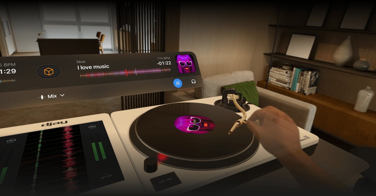
Beyond typical office productivity work, the spatial computing of Vision Pro is also well suited to creative work. It’s not just a huge cavas for existing iPad apps, but a new way to experience real world devices and controls. One great example comes from Algoriddim, with its new edition of djay for Vision Pro.
The Apple Design Award winning DJ software has been quick to adopt new Apple technologies. It just announced new integration with Apple Music, and its new Vision Pro app takes its virtual DJ decks and places them in a realistic space.
Instead of playing on the flat glass of an iPad, you can experience the feel of real world equipment. I’m looking forward to get more experience with this new spatial interface.
Algoriddim’s Karim Morsy described his experience with the new Vision Pro, writing in an email that, “for an app like djay it opened up possibilities that were unimaginable before.
“What has fascinated me the most as a developer was that for the very first time a device allowed us to go from functional to experiential aspects of an art form, i.e. not only give users the tools to let the become DJs but also let them experience first hand what it feels like to be DJing. It’s a major paradigm shift for product design and development.”
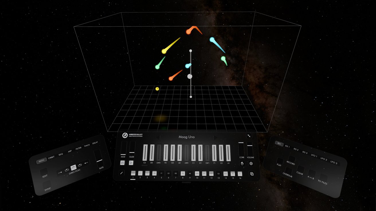
Another creative spatial experience available for Vision Pro is Moog’s Animoog Galaxy. It allows you to physically interact with a virtual synthesizer with your hand gestures and build performances you can share.
These experiences show a tremendous potential for Vision Pro to serve as another frontier for Apple’s computing platforms, offering a real glimpse into the virtual world of spatial computing. Of course, beyond these entirely new productivity uses and creative experiences, Vision Pro also lets you run most existing iPad software, positioned around you as you like.
Spatial Value
Is that enough value for you to buy your own Vision Pro? Well, first consider that this device is tightly connected to you. It’s not quite as tightly bound to you as your Apple Watch or iPhone, but trying to share it is currently limited to offering a friend essentially a quick sneak peek session.
It’s not multiuser the way a Mac is. It also involves some custom fitting because everyone’s head and eyesight is different.
If you’re comfortable buying one for yourself as the primary user, it’s smart to be reasonable about whether you can really afford a $4,000 device with AppleCare. It’s tempting to finance it, but keep in mind this is the first version. Look back at what strides Apple has made with successive versions of its new products.
I’d love to see Apple deliver some additional headset fitting options designed for more comfortable longer term use. I don’t think the limited battery pack is really an issue because if you do want to use it for a long session, you can plug it in with USB-C through the battery pack.
My initial experiences have been mesmerizing and wonderful. I’m also a bit surprised to see how useful it really is in delivering not just a virtual workspace, but also a personal creative zone that can be curated to your individual preferences.
Apple’s Vision Pro spatial computing isn’t a half finished idea lingering in beta. It’s already here and ready for work.
If you can afford it, this taste of the future delivers not just compelling entertainment, but a productive environment that seems perfectly curated for Apple’s creative, entrepreneurial, mobile, and business productivity customers.
