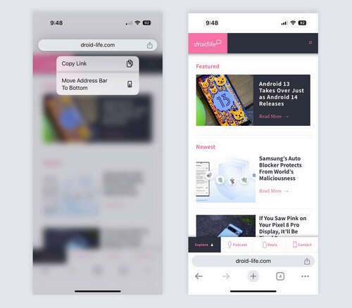
There was a brief moment in 2017 when we thought Google had decided to move the address bar in Chrome on Android to the bottom of the app, making it easier to reach on all of the massive phones we had adopted into our lives. The change was referred to as “Chrome Home” at the time, and it even went as far as Chrome Beta, seemingly on the verge of going stable. But then Google changed directions in 2018, scrapped the idea, and we’re now 5 years removed from that period with only a top-positioned bar.
I bring that history up because Google pushed out an update to iOS and the iPhone today that lets users choose where they want their address bar – top or bottom. It makes sense why they would allow iPhone users to choose, since their native Safari browser has the address bar at the bottom. If they were to switch or give Chrome a tryout, this new option would at least let the experience be somewhat familiar.
So yeah, on an iPhone, you can now choose to have the address bar at the top or bottom. Neat, right?
Google, please let us do the same. Chrome Home was so lovely to use. The address bar, which I tap on regularly when using Chrome on my big ass Pixel 8 Pro, would be so much easier to reach and interact with if at the bottom. Just let me choose! If everyone else in the world hates that idea, that’s cool – you clearly believe people on iOS want the choice, Google. In fact, in today’s blog post announcing the feature, Google says they “know people prefer different address bar positions depending on the size of their hands and devices” and that this is was a “highly requested feature.”
Is it not highly requested on Android? Maybe we should tell them it is.


