Astek Diagnostics closed a $2 million round for its urine diagnostics system, despite the fact that raising money for medtech isn’t for the faint of heart. The company’s deck has some good stuff in it and could be a deep source for things we can learn from, too.
We’re looking for more unique pitch decks to tear down, so if you want to submit your own, here’s how you can do that.
Slides in this deck
Astek Diagnostics has a pretty beefy 22-slide deck that splits a lot of the narrative over multiple slides. In some aspects, the deck is comprehensive and impressive, but it also comes across as pretty defensive and slightly dated, even though this fundraising round closed recently. Some of the slides have been lightly redacted.
- Cover slide
- Vision slide
- Platform slide
- Approach slide (Part 1)
- Approach slide (Part 2)
- Current focus slide (Part 1)
- Current focus slide (Part 2)
- Solution slide
- How it works slide (Part 1)
- How it works slide (Part 2)
- Technology slide
- Team slide
- Advisory board slide
- Technology validation testing
- IP overview slide
- Company validation slide
- Company timeline slide
- Investment terms slide
- Commercial and Exit strategy
- Comparable transactions slide
- Executive summary
- Closing slide
Three things to love about Astek Diagnostics’ pitch deck
Where the AD pitch deck is good, it’s great: comprehensive, well-researched and well-designed. Slide 6 — the problem statement — is a great example of all three coming into play.
A comprehensive problem statement
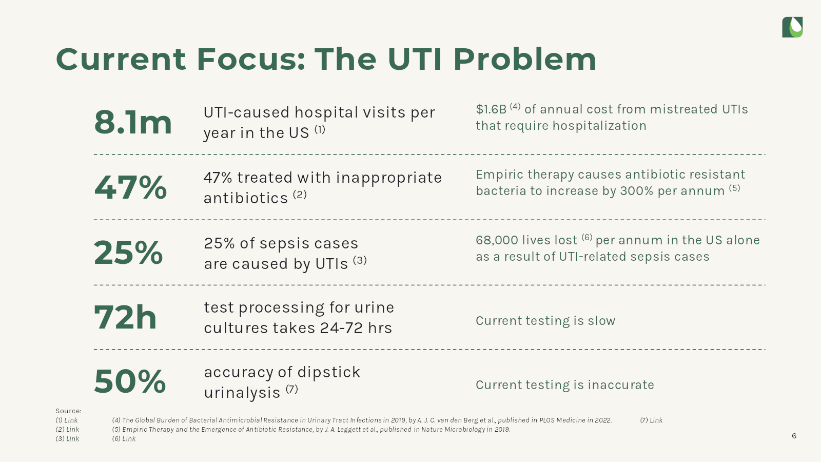
[Slide 6] A great, comprehensive problem statement. Image Credits: Astek Diagnostics
Explaining the problem in a pitch deck is crucial because it lays the foundation for people to understand the necessity and relevance of your startup. This section should captivate the audience by highlighting a gap or inefficiency in the market that the company aims to address. It sets the context for the entire presentation, allowing investors to grasp the magnitude and urgency of the issue at hand. Better still, explaining the problem effectively helps to validate the market demand for a product or service.
In this slide, Astek takes the opportunity to present data and insights that back up its claim, thereby reinforcing the potential for growth and success. This section is a startup’s first step in building a compelling narrative that aligns its mission with the interests and investment goals of would-be investors.
On this slide, Astek paints an impactful picture: huge amounts of hospitalizations, unnecessary treatments, problems with speed and accuracy. Solve these problems, this slide suggests, and almost 70,000 lives per year can be saved.
Another thing this slide does well. It describes the problem, but what’s really going to make investors lean forward is the immense proportion of the problem: 8.1 million hospitalizations indicates that there’s a truly formidable market size at play here.
Solid defendability
In biotech, a company is only as valuable as the ability to protect it, and having a great moat is a key part of building a startup for the ages. The fact that the company is thinking about IP protection is reassuring, although I did have some questions about what each of these actually mean.
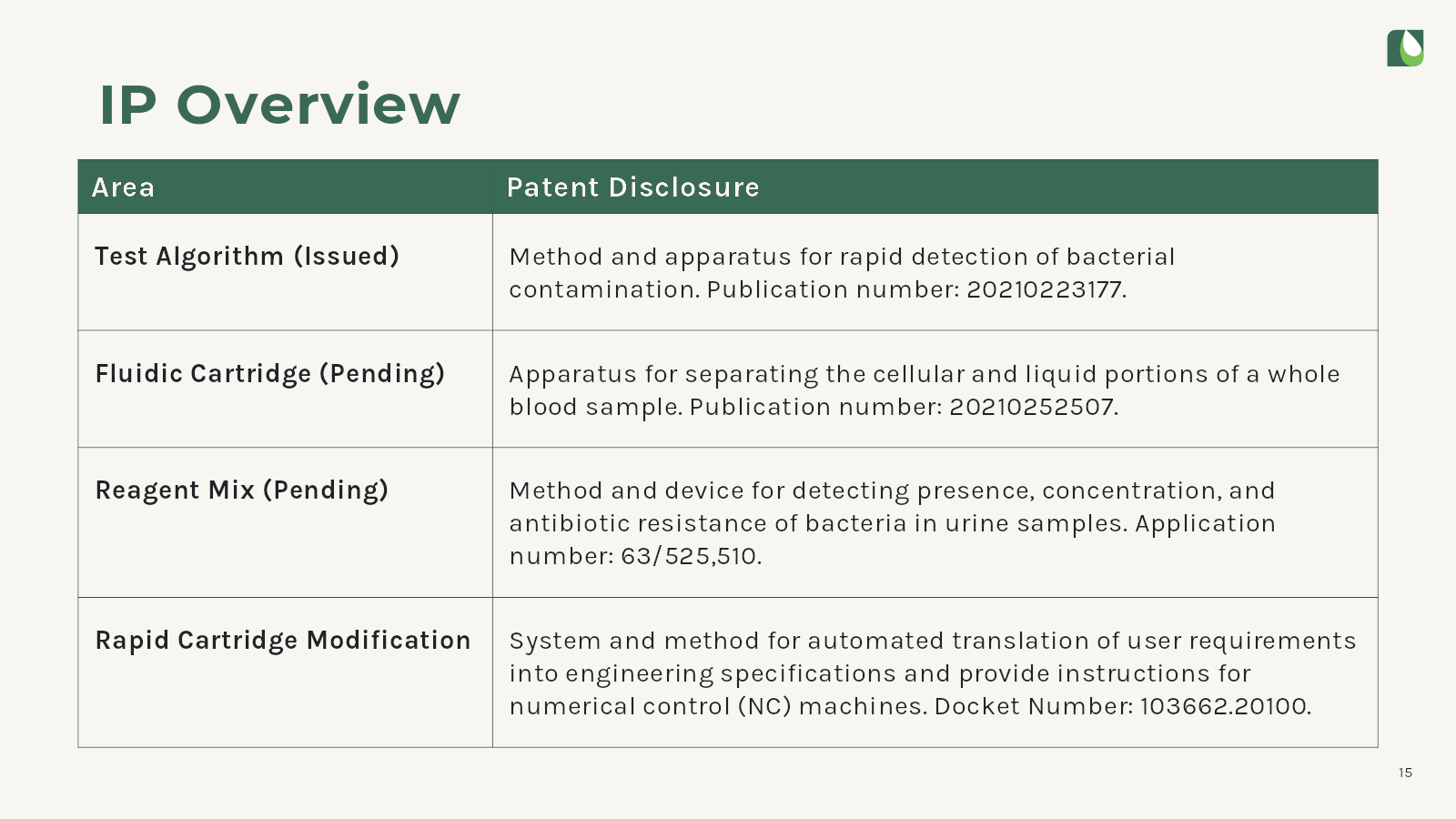
[Slide 15] The legal moat around Astek is off to a good start. Image Credits: Astek Diagnostics
One question I have here is why the Test Algorithm patent is shown with a publication number rather than the patent number; the patent (US11,788,962) was granted in October 2023. The second IP entry — the Fluidic Cartridge patent — is marked as pending, but it’s available to the public.
The third one had me flummoxed, so I checked with the team at Run8 Patent Group. They explained that that number is neither a patent nor a publication number: it’s a provisional patent number. We weren’t able to tell whether the patent was converted to a non-provisional patent, but at the very least, the terminology is confusing here.
The final entry on this list — for a Rapid Cartridge Modification — is also confusing. It appears that’s a law firm docket number, which isn’t much of an IP protection, and my friendly patent lawyer friends tell me that simply saying “filing in progress” may have been clearer and potentially a more honest description of what’s going on here.
Easy to understand (but …)
In slides 9 and 10, the company makes it very easy to understand how the system works:
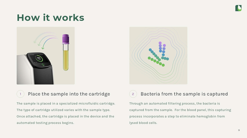
[Slide 9] – How it works, part 1. Image Credits: Astek Diagnostics.
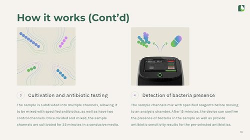
[Slide 10] – How it works, part 2. Image Credits: Astek Diagnostics.
These two slides do a good job explaining how a user would use the product. Insert sample, bacteria are captured, then tested, then you can read what the machine found. From a sales perspective — if I were a buyer of one of these machines — that’s a great top-level view over how a user would use the machine.
But, from the perspective of a consumer, this is how I would expect a machine like this to work. If I, a non-medically-trained person were to walk up to this machine, I think I could use it. the expectation of user experience is so high now, that this isn’t an innovation: This is how things should be. Of course, in medical devices, user experience is sometimes not a high priority, and perhaps the ease of use is a selling point for the machine, but the way these slides are projected, I kind of go “Yes, and so what?”
What I’d really love to have seen here is context. If all the other machines are much harder to use, tell that story. If the machine is way faster, show that comparison. If there is a major technology breakthrough, that is what I would be curious about as an investor.
The product slides shouldn’t show how to hit the minimum viable user experience. It’s better to explain what it is about the product that makes it special, defendable and worth investing in.
Three things that Astek Diagnostics could have improved
There were a lot of potential learning opportunities — many more than I have time or space to go into in this pitch deck teardown, but let’s pick out some takeaways:
Tell the full team story
The team slide has both too much and too little information on it.

[Slide 12] Teeming with team members. Image Credits: Astek Diagnostics
The purpose of a team slide is to tell the story of why a team is uniquely positioned to build this specific company. As an investor, I don’t particularly care about engineers or computer scientists. The team slide is for highlighting the founding team and senior leadership, the folks that are trusted to carry this company through the next few rounds of funding and product development. This slide needs more context to be useful.
Astek does get partial credit for including LinkedIn links to each of the team members, but a brief description under each name would be easier.
Since the company put links to the whole team’s LinkedIn profiles, I went looking to see what I could find — and I found some yellow flags. Kevin is listed as a co-founder, not as CTO on LinkedIn. His profile reads that he is “a versatile full stack developer with a background in Chemical Engineering. My expertise lies in developing web-based applications.” So that’s great and all, but hardware is hard, and medical devices are extremely specialized. Having a CTO that seems to have no startup or hardware experience could cause investors to ask some questions.
Rick is listed as the company’s CFO — it’s confusing why a company raising $2 million would even need a CFO — but he doesn’t list Astek Diagnostics on his LinkedIn at all.
On the slide, Scott is listed as the company’s chief commercial officer — again, a strange role for a company that doesn’t have a product in market yet — but he, too, doesn’t have Astek Diagnostic listed on his LinkedIn. On the bright side, he does appear to have relevant experience from Specific Diagnostics as the CCO and as a board member of LEX Diagnostics.
In a nutshell, make sure whatever information you include on your slides matches with public information that’s available. If not, get ready for some prickly questions from investors.
Let’s talk about the funding round …
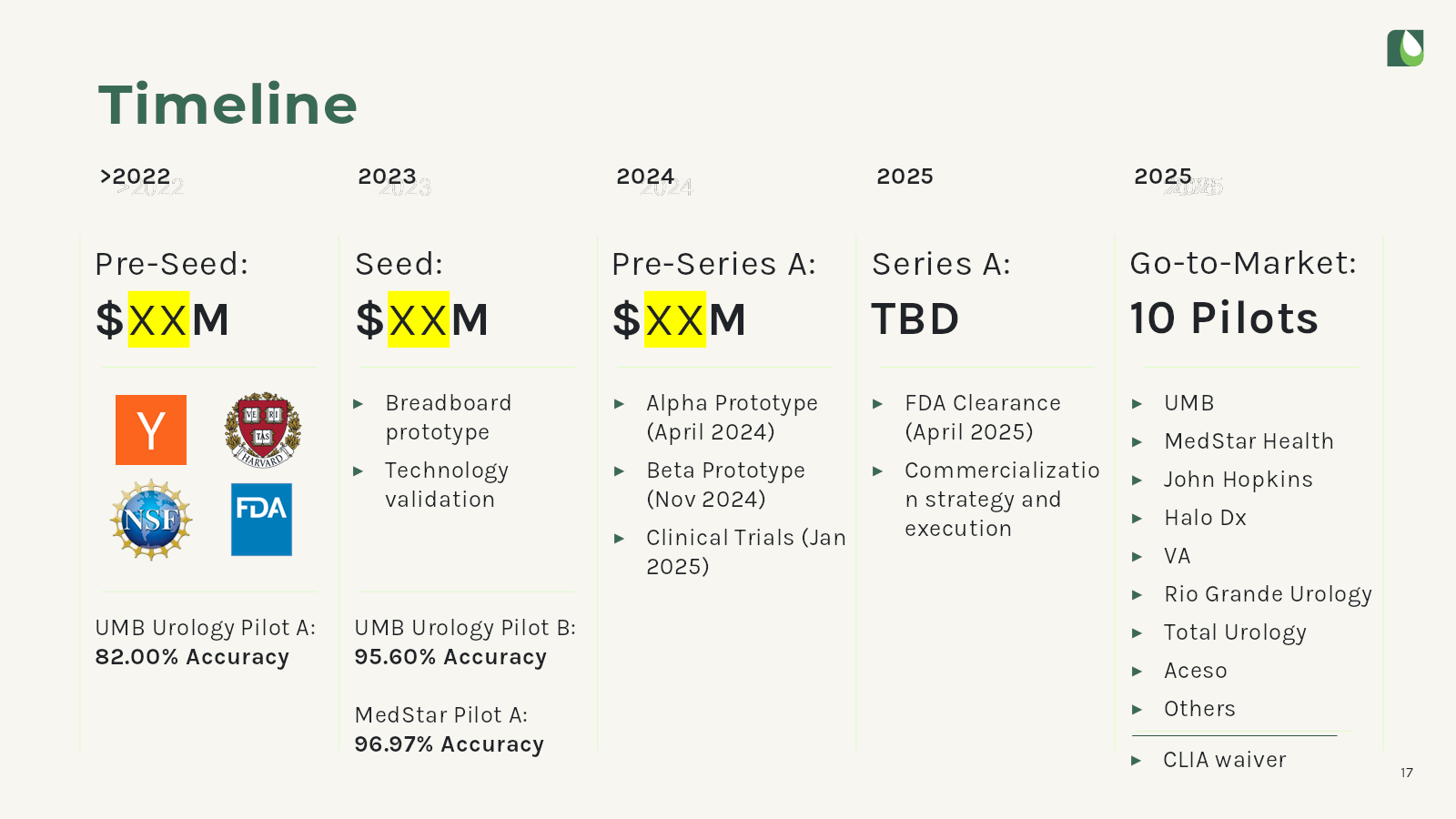
[Slide 17] That’s a lot of redacted data. Image Credits: Astek Diagnostics
The company has something going on on its timeline, showing three rounds of funding, all of them redacted. Putting aside for a moment that I’ve never heard of a “pre-Series A” round, this, too, raises some flags.
The irony, of course, is that a lot of this information is available through other data sources. When investors evaluate whether to talk to a startup, they use whatever information available to see the status of the company. In this case, I looked the company up on PitchBook and Crunchbase.

Crunchbase “knows” about three rounds of funding. Image Credits: Crunchbase
Crunchbase tracked a $125,000 pre-seed round, a $256,000 grant led by the NSF (which turns out to be $275k), and a $2 million seed round led by Wexford Scitech venture fund, which was reported in June 2023.
PitchBook has a bunch more information:

PitchBook shows a huge amount of information about company financials in its database. Image Credits: PitchBook
All of that is to say that I’m not entirely sure why the company decided to redact this part of the pitch deck, since the information is so easily gathered from public sources.
What worries me more, however, is the next slide:
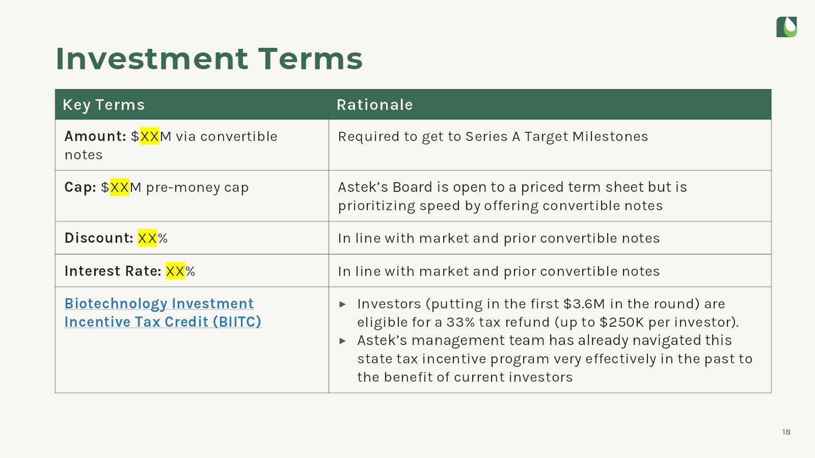
[Slide 18] This slide is not only superfluous, it’s potentially a red flag. Image Credits: Astek Diagnostics
There’s a lot of things to worry about on this slide: Raising an amount to “get to Series A target milestones” helps answer why the company wrote “pre-Series A” in the previous slides: It’s a bridge round. That could mean two things:
- The company wasn’t clear on what it needed to do to be able to raise a Series A.
- The company failed to hit the goals for its Series A.
In the case of the first option, that means that the founders didn’t have a good roadmap for what it needed to accomplish in order to raise its next round. That’s a red flag: It’s crucial to have a firm set of goals, ensuring that the company has a clear route to hitting its milestones and being able to raise its next round.
The other alternative is that the company did have a clear set of goals, but it failed to hit them. That happens all the time, and there’s no shame in that. However, this deck makes the problem worse: It doesn’t clearly outline what the company thinks the “Series A target milestones” are, and nowhere in the deck does it explain what the milestones are, or what thinks it needs to do in order to hit those milestones.
The final red flag here is that the company is trying to pre-negotiate the deal: I appreciate that the founders have an opinion on what they think the cap and discount are, but they don’t get to set those; the lead investor does. It’s possible, of course, that this deck was updated after the company already had a term-sheet in hand, but if that isn’t the case, this slide doesn’t come across as founders who are experienced in the fundraising process.
Most of the VC industry has stopped using convertible notes these days, using Y Combinator’s post-money SAFEs instead. The extra weird thing here is that Astek Diagnostics is, in fact, an Y Combinator alumnus from the accelerator’s S21 batch. It’s confusing why the company would go with something other than the standard investment terms.
The simple thing would be to just get rid of this slide altogether. When raising a specific amount, the terms are always up for negotiation and will be depending on which way the VC wind is blowing in that particular moment.
Get rid of the “exit” slide
Sophisticated investors are acutely aware of comparable exits in the space they’re investing in. A startup’s mission is to build an extremely valuable company. As soon as founders start talking about exits, they’re arguing against themselves.
Amazingly, Astek Diagnostics included not one, but two exit strategy slides:
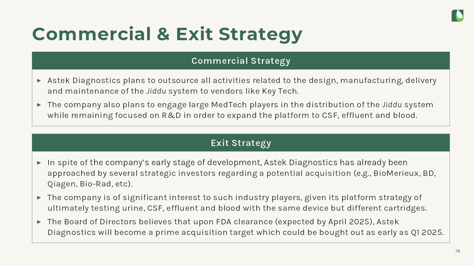
[Slide 19] Exit strategy, part 1. Image Credits: Astek Diagnostics
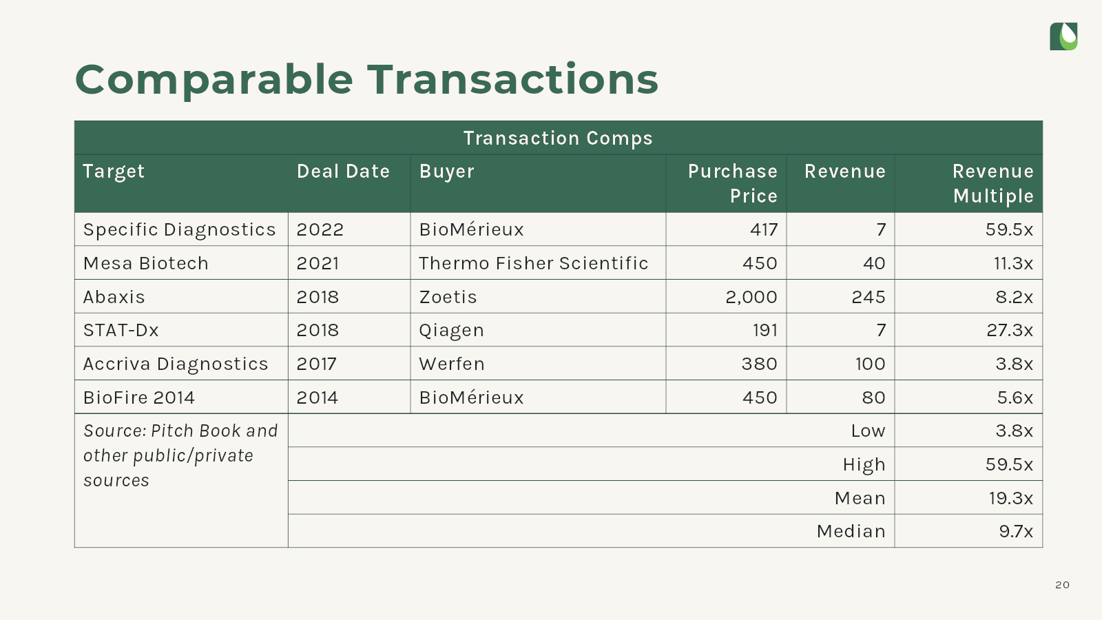
[Slide 20] Exit strategy, part 2. Image Credits: Astek Diagnostics
This exit strategy slide strikes me as spectacularly defensive, in addition to sending the wrong signal. Trust high-quality investors to know their markets. Founders should explain how they’re going to build a multi-billion-dollar company and worry about M&A or IPO another time.
The full pitch deck
If you want your own pitch deck teardown featured on TechCrunch, here’s more information. Also, check out all our Pitch Deck Teardowns all collected in one handy place for you!

