@zuck Instagram | Aurich Lawson
Since the launch of the Apple Vision Pro, it’s not been hard to find countless thoughts and impressions on the headset from professional reviewers and random purchasers. But among all those hot takes, the opinions of Meta CEO Mark Zuckerberg stand out for a few reasons—not least of which is that he and his company have spent years of development time and lost tens of billions of dollars creating the competing Quest headset line.
For that reason alone, Zuckerberg’s Instagram-posted thoughts on the Vision Pro can’t be considered an impartial take on the device’s pros and cons. Still, Zuckerberg’s short review included its fair share of fair points, alongside some careful turns of phrase that obscure the Quest’s relative deficiencies.
To figure out which is which, we thought we’d go through Zuckerberg’s review and give a quick review of the points he makes. In doing so, we get a good viewpoint on the very different angles with which Meta and Apple are approaching mixed-reality headset design.
There’s “high-quality” and then there’s “high-quality”
Near the start of his analysis, Zuckerberg says that the “Quest 3 does high-quality passthrough with big screens, just like Vision Pro.” This is only true in the most technical sense. Saying both headsets have “high-quality passthrough” is like saying an old 720p LCD TV and a new 4K OLED both have “high-quality screens.”
Compared side by side, Apple’s array of cameras and higher-resolution displays combine for a much sharper and more dynamic view of the “real world” than the Quest 3, which barely limps over the “good enough” passthrough threshold, in my experience. That display quality extends to the “big screens” Zuckerberg mentions, too, which are noticeably clearer and easier to read on the Vision Pro.

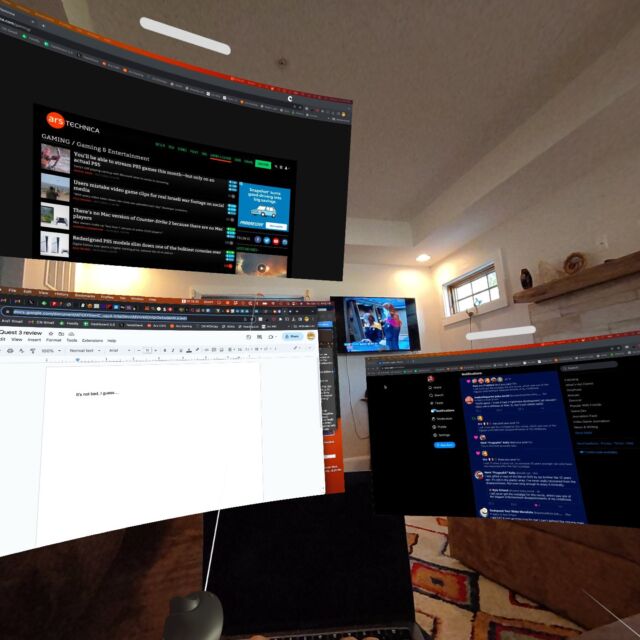
Speaking of those “big screens,” the experience with 2D virtual displays is quite different in both headsets. The Vision Pro seems built from the ground up with the ability to place and resize thousands of flat iOS apps anywhere around your virtual space. Those virtual windows react to the light in the room, cast gentle shadows in your virtual view, and get occluded by objects in the real world, adding to the sense that they are really “there” with you.
The Quest, on the other hand, was built more with immersive VR experiences in mind. Yes, recent Quest OS upgrades added the ability to snap selected flat apps and system tools (e.g., the store) into place in your Quest “home environment.” But the system-level “huge floating screens” experience is still much more limited than that on the Vision Pro, which offers easy free positioning and resizing of all sorts of apps. Quest users looking for something similar need to rely on a third-party tool like Virtual Desktop, which also has its own quirks and limitations.

