OnePlus has entered the foldable arena with the OnePlus Open, a $1,700 device that’s sold direct to you with a specs sheet and custom software experience you might not expect from a 1st-gen product. That’s actually a big part of the story of this first OnePlus foldable – in no way does it feel like a 1st-gen device and instead comes off like a device ready to compete with Samsung out of the gate.
I’ve spent the better part of two weeks with the a OnePlus Open review unit, received a couple of updates, and was able to dance between it and the Google Pixel 8 Pro at the same time. That double duty was an interesting way to take on these two important late-2023 devices, as they offer such different experiences that are aimed at two types of customers. Our Pixel 8 Pro review is out of the way, so let’s dive into the OnePlus Open, a foldable staring directly at Samsung’s Galaxy Z Fold 5. Can it truly compete in a world dominated by the Galaxy Fold series? Oh yes.
This is our OnePlus Open review.
What do I like about the OnePlus Open?
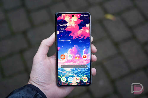
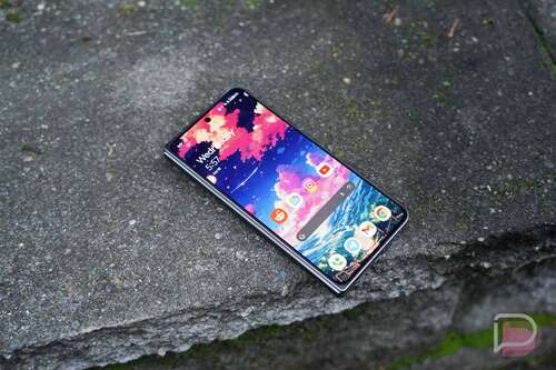
Displays. OnePlus put two high-end displays in the Open, a 6.3″ AMOLED cover screen with up to 120Hz refresh rate along with a big boy 7.8″ AMOLED on the inside that also hits 120Hz. These are LTPO panels with the inside screen able to dip as low as 1Hz. These panels are fast, incredibly bright (both hit 2,800 nits), and super responsive to the touch. They also get quite dim on the flip side of brightness, which I absolutely appreciate as a dark room, laying in bed user.
Each panel is tuned a bit warm and “natural” out of the box, but OnePlus lets you flip to cooler or more vibrant or a “Pro” mode depending on your preference. OnePlus’ OxygenOS is still filled with all sorts of custom options that extend into the displays. They have a great dark mode with various levels of darkness, a Natural Tone Display option, and all sorts of settings related to the always-on display, how images and videos look, etc.
The screens on the OnePlus Open are excellent, as they should be, since that’s sort of the pitch. You get two displays and you’ll use both throughout a day, so they better look good. Scrolling a web page or app is as smooth as ever, the transitions within an app or the UI never hiccup, and videos look sharp and vibrant. While full-screen video watching is a bit awkward with the shape of the display (you get black panels above and below videos), you can pop videos out and throw them all over the inside screen as you do other stuff. The flexibility of two displays really shines in situations like this.
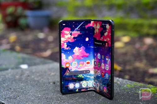
As for how the inside display feels to the touch, I’d say that it feels better than older foldables like this. They used to feel so plasticky and soft and almost sticky, yet this one isn’t as odd like that. It’s probably closer to a normal display feel, although it is a touch soft and there is a screen protector on it that you can’t remove. OnePlus also managed to really keep the middle crease to a minimum. In fact, it might be leading the foldable world in this area.
There are no issues so far with the OnePlus Open’s displays – they just look and perform so good.
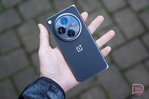
Hardware and most of the design. For a first foldable, OnePlus has put together an impressive package with hardware that really doesn’t come off like it’s from a company who has never done this before. OnePlus is using premium materials throughout, with a “proprietary cobalt molybdenum alloy and titanium alloy” that holds everything together. The phone feels metal and high-end and like it could possibly take a drop or two. This is a $1,700 device and it let’s you know when you hold it that it is expensive.
When folded, the Open is probably on the thinner side with a thickness of 11.7mm, but then gets absurdly thin at 5.8mm when open (not counting the camera). The bezels on the inner display are small enough and uniform (lookin’ at you, Google!), there’s a nice rounded corner on the bottom right when folded that’s comfortable in your right hand, and the device isn’t as heavy as other foldables in this category.
I think OnePlus chose the perfect shape for the outer display. It’s not awkwardly thin like Samsung’s Fold 5 or as wide as the Pixel Fold – it really feels like a normal phone when closed up. Then when opened, you essentially get a square display that never really requires you to rotate it, because content looks the same no matter the orientation. While some might like a more landscape appearance inside for viewing video, I actually prefer this square idea for general use.
As for the hinge, OnePlus says they are using fewer parts than others and that makes for a lighter device that (hopefully) has less parts that can break. The hinge itself feels somewhat less stiff than others I’ve used, so opening and shutting is an easier task. That said, you can’t really prop it open at any angle, as it’ll snap fully open or shut again pretty quickly. It has a good pop once it fully opens and the rear of the device comes together, but then it also shuts quite gently in a satisfying way. When shut, there is almost no gap between the two sides.
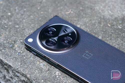
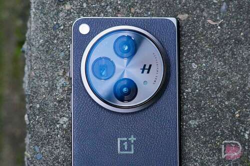
That’s not to say this device is perfectly designed. The camera hump is obnoxious and always in the way when I try to use it in closed mode. When open in tablet mode, that same hump leads to a wobble on a table, and the left corner is quite sharp in the palm of your left hand when closed. The fake vegan leather they used on this black model’s backside is also an odd choice. The texture of it feels cheap and I worry about how it’ll wear over time. While I don’t really like the emerald green color that OnePlus is obsessed with, that model at least has a glass finish on the back that looks (and should feel) better than this one.
Outside of the goofy camera setup, this is probably my favorite design of a foldable to date.
Battery life. The OnePlus Open sports a 4805mAh battery that should easily get you through a full day of use. Once I received a promised update from OnePlus that put the phone in a review-ready state, I’ve been testing light to heavy usage and rarely had to plug-in the phone before going to bed.
On most days, the OnePlus Open was sitting with 30-40% at night before I’d reach for a charger, and that’s with 3-4 hours of screen on time. In one screenshot of my battery usage, I was at 3 hours and 37 minutes of screen time with 40% battery at 10:40PM. That’s with a mix of daily Chrome, Instagram, Threads, and Google News usage, along with a couple of games of Pokemon Unite. On one day where I tried my best to kill the phone, I was able to drop the phone to 10% at 8PM with 5 hours of screen on time. That day’s usage consisted of heavy amounts of camera testing for this review, Pokemon Go in 75-degree temps, and the rest of my routine. Like, I’m talking about a lot of work thrown at the device from both screens and I still had 10% in the evening.
The Open doesn’t have wireless charging, which I’ll complain about later in this review, so you’ll charge it via direct USB wire at up to 67W. That’s quite fast and you’ll top up the phone in only a few minutes or you can get to 100% in well under an hour. OnePlus also gives you an 80W charger in the box with the Open, although charging will top out at that 67W speed.
For a phone with two screens that allows you to jump between multiple experiences that could suck all of the juice out of a battery, I found the OnePlus Open to impress in battery life.
Software. On the software side of things, since this is the first foldable from OnePlus, they are likely still in learning mode and could change or add-to this experience. However, they are off to a pretty solid start. They put in several big screen ideas that I like, although I’m still learning how exactly to use them all.
When you have the device closed, you get a typical OxygenOS experience on the cover display, because it operates like any normal OnePlus phone. This is OxygenOS 13.2, but the experience on the outside is familiar. The notification area, settings, app drawer, etc. is all where it should be. If you’ve used OxygenOS, you’ll be right at home. I don’t really need to dive in deeper there. Instead, let’s talk about what happens when you open the phone.
On the inside display (“Main screen”), OnePlus properly treats it like a tablet and uses Android’s task bar at the bottom for quick access to your favorite apps, recently opened apps, and a couple of other shortcuts that include a pop-up app drawer and file manager. You can customize how it works, with long-presses to hide or show it and you can remove several of the options I just mentioned to shrink things down.
Since this is a foldable, you can run split screen apps, with drag and drop from the task bar included that’ll get you up to 3 apps open at once. You can two finger swipe to start a 2-app session, full-screen an app that’s in split screen to panel over between the two to see more info, and you can flip the split from horizontal to vertical. This is all well-thought out in my opinion.
OnePlus also built in an easy way to make an app float and they gave you a couple of options to help you jump between inside screen to outside screen. For example, you can have your session continue, require a swipe to continue, or shutting the screen can simply turn the screen off.
Again, OnePlus is just getting started here and it already feels like they have a great foundation for foldable software. Some of these items take practice and some getting used to, but they work well once you figure them out. If you want a foldable like this because you like to multi-task on a big screen, this has the features you need to do that.
I should probably mention that OnePlus has committed to 4 Android version updates and 5 years of security patches on the Open. You should see software support for years if you buy one, as that commitment matches Samsung’s.
Performance. Whenever OnePlus releases a new phone, I sooooo look forward to just swiping around within the software. OnePlus really has figured out the whole “fast and smooth” thing on Android in a way that no one else has really matched, except for (maybe) Nothing. Google’s Pixel phones are super fast and smooth, but OnePlus has some special sauce in their software when combined with the hardware that feeeeels different. I don’t really know how to describe it, it just is a thing.
For the OnePlus Open, that smoothness is here again and it happens to be on both screens too. Part of the situation around smoothness and performance is helped by the Snapdragon 8 Gen 2 chip inside, as well as the 16GB RAM, UFS 4.0 storage, and the 120Hz displays I just got done raving about. But yeah, using the Open brings that joy of floating-without-hiccup animations, a never-stutter UI from app to app, and a general usability that never feels like it’s struggling.
For years to come, you are going to use the OnePlus Open and it’ll probably never slow.
Camera. The camera system on the OnePlus Open is a serious system that might be the best in any foldable. We all know that Samsung refuses to put its best cameras in its expensive foldables, but OnePlus appears to have at least tried to. They tossed in a new Sony main 48MP sensor, along with a 64MP telephoto and a 48MP Sony ultra-wide lens. They went high-end, teamed up with Hasselblad to do something with processing, and tossed in all the modes to try and get you a foldable camera that doesn’t cut a bunch of corners. I think they may have succeeded.
Here’s the camera recap to give you the full technical story:
- Camera (main): 48MP Sony LYT-T808 “Pixel Stacked” sensor (24mm), f/1.7, 85° field of view
- Camera (telephoto): 64MP OmniVision OV64B sensor (70mm), f/2.6, 33.4° field of view
- Camera (ultra-wide): 48MP Sony IMX581 sensor (14mm), f/2.2, 114° field of view
One of my favorite things about this OnePlus Open camera is the extended range of focal length shortcuts. Out of the box, you get buttons for 0.6, 1x, 2x, 3x, and 6x, while most other phone manufacturers only give you three options. I know this isn’t a huge deal, but it makes it easier to switch that zoom to get the right shot without having to pinch-and-zoom.
And that flexibility has led to some fun photos. The OnePlus Open can compete in long zooms, in close-up settings, in portrait mode, in landscapes, and in some cases, night shots. The night capabilities are certainly not up to the level of Google’s new Pixel 8 Pro because this camera either isn’t letting in as much light or because Google bakes in another level of processing magic, but you can still get usable images in the darkest of moments. When not in those dark situations, this camera is as good as any if you don’t mind an extra boost of color.
Like with my recent Pixel 8 Pro review, where I created a Google Photos shared gallery (here) to show you full resolution samples shots, I did the same for the OnePlus Open (here). I took several of the same shots with both phones, so you can compare. What you’ll notice, like with the images of the dinosaur on the wall, is that OnePlus is going a bit wild with color boosting, so the flowers, the grass, and the dinosaur really pop. It’s a style choice that you might love or hate, but the images are still crisp, dramatic, punchy, and should be fun to share. Are they the most photo-accurate? Ehhh, they at least look fun.
As for camera speed, it’s quite quick for the most part to load, focus, and shoot. I did come back to my gallery a couple of times and found missed shots that blurred as I pulled the camera down, but it wasn’t often enough that it worried me. I did make sure to take that extra half-second going forward once I noticed those missed shots, though. Overall, I found the shooting experience to be familiar, with buttons in the right places, modes a swipe to the left or right, and easy access to Pro controls or additional settings.
Wrapping up the camera, I’d call this an excellent camera system that’ll bring you flexibility at all times and one that produces punchy and lively images you’ll be happy to share. It’s good enough in low light, has extra controls and settings if you really want to dive in, and will only get better, as that’s what OnePlus does with its phones.
Below are several samples that have been resized, but again, checkout the full resolution gallery with more photos at this Google Photos album.
What’s bugging me?
It’s a big foldable. I haven’t used one of these big foldables that goes from smartphone-to-tablet since I reviewed the Galaxy Z Fold 3 back in 2021. Tim took on Fold 4 and Fold 5 duties, while I reviewed Samsung’s smaller Flip series the past couple of years. Google wouldn’t send us a Pixel Fold, so I didn’t touch that either. In this return to the full-sized foldable world, I can say that my thoughts from that Z Fold 3 review kind of still remain – these types of devices aren’t for me.
As fun as it is to sit on my couch with the OnePlus Open and flip between small and big screens to consume content, take in the news, watch YouTube, or play a game, this type of device is a bit much when you leave the house. As much as I praised the hardware design above, I can’t help but point out that it’s still big, has a massive and awkward camera hump, is plenty heavy, and basically requires a bag for transporting around. This thing is thick enough and weighs so much that tossing it in my gym shorts or pants that fit properly, doesn’t really work. Every time I’ve left the house with it, I’m either worried it’s going to slip out of my pocket or that it might be difficult to even get out of one.
This is, like I said in that Fold 3 review, my situation and it may be very different than yours. You may wear baggier jeans or have a bag on you at all times or you could have decided that having two screens in a single device is worth it, even with the weight and awkward size. For me, I need a device I can grab and go, that’s slim and allows me to be mobile. These big foldables aren’t that.
No wireless charging. Let’s be honest here – I don’t know how OnePlus would have fit wireless charging in the OnePlus Open or how that might work, because this massive camera hump is going to be in the way of that without OnePlus also making a special charger. But it does kind of suck that we don’t have wireless charging. I charge my phones at night while I sleep (I bet many of you do as well) and like to do so on a wireless charger that doubles as a stand, because then my phone becomes like a bedside clock. I’ve had to plug this phone into a USB cord at night, which isn’t a huge deal, but it does change my flow. And it also takes away my phone as an easily glanceable clock.
Availability. It’s starting to feel like OnePlus has lost its relationships with US carriers and that’s too bad, as they are such an important (and unfortunate) piece of the smartphone and wireless ecosystem in the US. You just can’t buy OnePlus’ best phones at any carrier anymore, from Verizon to AT&T and T-Mobile. T-Mobile was their last partner, but even they passed on the OnePlus 11 earlier this year. For the OnePlus Open, no carrier has decided to take it on.
What does that mean for you? You need to buy the phone from OnePlus, Best Buy, or Amazon, which is fine, except that this is a $1,700 device that can’t get carrier deals. We don’t love carriers forcing people into 2 or 3 year contracts, but those contracts also help people buy ridiculously expensive devices like this and spread the cost out over time. For the Open, you’ll have to pay full retail or try and trade something in to reduce the cost. Either way, it’s still going to run you hundreds and hundreds of dollars to get one.
Should you buy a OnePlus Open?
Deciding to buy a foldable is probably never going to be easy. These types of devices are expensive and there is always long-term durability to take into account. OnePlus says they’ve put in the work to ensure this device will last you for years to come, plus they are prepared to support it with software updates for a full 5 years, just like Samsung does with its foldables. So if you trust that OnePlus’ Open is built to last, does it standout enough to get you to buy one?
In my testing, I feel like the Open has it all for a foldable in this category. The displays are top-tier, the cameras are as well, performance is classic OnePlus awesome, software is off to such a good start, and battery life left me without worry. The hardware feels incredible and premium in hand and might be the best shape and size of this phone-to-tablet foldable design. Sure, the massive camera housing can be obnoxious, but maybe you’ll love its goofiness.
While large foldables are not for me, those who do love a big device that can act as phone and tablet should find a lot to like from OnePlus’ first offering. This is an impressive first effort from OnePlus that is a proper alternative to Samsung’s Fold series.
