“Avatar” first arrived in theaters in 2009. It was a technological marvel that gave audiences one of the most immersive filmgoing experiences in the medium’s history. If contemporary online forums are to be believed, it also gave some theatergoers something entirely unexpected: depression.
Not long after the film’s release, CNN reported on a strange new phenomenon that some deemed “Avatar Depression.” The film had been so immersive, a handful of audience members reported experiencing a kind of emptiness when they left the theater, and Pandora along with it.
As extended reality experiences have grown more prevalent on the success of headsets from companies like Meta, HTC and Sony, many have experienced similar phenomena. The more immersive the experience, the more jarring it can feel when you finally take the headset off.
After all, at their heart, these sorts of headsets are about effectively tricking one’s brain into what it’s seeing. That cognitive dissonance is also creating the motion sickness some experience in VR. Your body and brain are, for all intents and purposes, experiencing different realities.
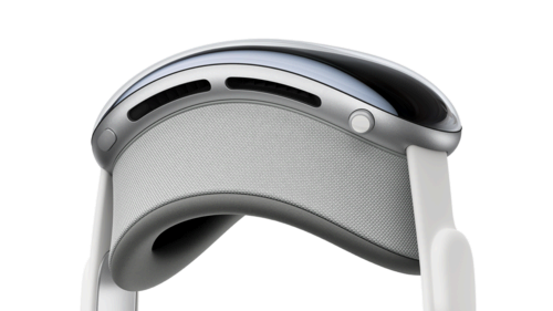
Image Credits: Apple
The Vision Pro isn’t a virtual reality headset — at least not as far as Apple is concerned. If you follow the company’s press materials, it’s a spatial computing device. In practical terms, it’s mixed reality. While many or most applications are thus far experienced as augmented reality, by way of on-board passthrough technology, the device is also capable of going fully immersive with a quick twist of the Apple Watch-style digital crown that sits atop the visor.
This week, Apple is giving select members of the media Vision Pro demos. I spent some time with the headset earlier today. It was my first hands-on experience with the hardware, as Matthew had the honor when it was unveiled at WWDC over the summer. The idea was to walk through as many elements as possible in roughly 60 minutes, from the initial app face scans, to the spatial desktop to movie watching (no gaming, this time out, sadly).
The company was careful to provide both ends of the Vision Pro immersion spectrum, ranging from full passthrough to Environments, an all-encompassing nature scene that’s a bit like walking into a live photo on infinite loop. An hour spent cycling through different apps probably isn’t enough to experience full-on Avatar depression (certainly not in my case), but it does afford a glimpse at a world where such phenomena are a distinct possibility, especially as display resolutions are capable of rendering increasingly life-like images.
In the case of the Vision Pro, the screen is everything. As handsets have arrived at a point where 4K and 120Hz refresh rates are no longer novelties, headsets have taken up the mantle. Much of the Vision’s ability to do what it does is dependent on the pair of micro-LEDs, which jam 23 million pixels in per eye. That has the effect of creating an extremely dense 4K display out in front.
Of course, this is Apple, so every aspect of the hardware is painstakingly considered. That begins with the fitting process. Starting February 2, Apple will have Geniuses on hand at all of its U.S. stores to guide buyers through the process. The exact nature of the in-store experience hasn’t been outlined, but a portion of the floor will be devoted to this, rather than performing it all within the confines of the Genius Bar.
Of course, not everyone lives near an Apple Store. As such, the company will also make the process available via the app. In fact, the at-home version relies on the same app employees will be using in-store. The first step is almost indistinguishable from the process of setting up Face ID on an iPhone. You hold the phone up near your face and then move your phone around in a circle as it takes a scan from different angles. You’ll do this twice.
From here, the system will determine which components will best fit with your face shape. All faces are different, of course. There’s a massive range, and getting the wrong component could dramatically impact the experience. We ran into some issues with my face (not the first time those words have been uttered). The Light Seal, which magnetically attaches to the headset, is designed to keep ambient light from leaking in.
I just couldn’t get it quite right. We ultimately ran out of time and I had to soldier on with light pouring in from the nose bridge and my cheekbones. If you’ve ever had a similar experience with a headset, you know it’s an annoyance at first, but your brain ultimately adjusts and you forget it’s there. There were, however, a few dark demos where it once again made itself known.
I’ve recently read some hands-on writeups that reported some discomfort after wearing the hardware for a full hour. I didn’t experience this, but your mileage, will, of course, vary. To more comfortably distribute the device’s pound of weight, Apple is including a pair of straps in the box. There’s the Solo Knit Band, which is the big, padded one you see in all the pictures. Apple is also tossing in the Dual Loop, which is narrower and has a secondary band that goes over the top of the head.
I wore the latter in the demo, assuming that it would do a better job with weight distribution. The straps snap on magnetically and feature Velcro for adjustments. And then, of course, there’s the battery pack. My guess is that Apple designers fought like hell to find a way around it. Ultimately, however, doing so would either mean a dramatic loss of battery life or a lot more weight added to the headset.
For better or worse, the hardware world is one of compromise. There are, after all, limits to physics. As it stands, the battery pack is a bit of a vestigial organ, and not a particularly elegant one at that. It feels like a very first-gen element to be addressed in subsequent versions.
It’s long enough that you can run it behind you while you sit, or stuff it in a pocket. I have zero doubt that the coming months will also see a number of solutions from third-party accessory manufacturers, like battery belts that promise an AR element.
Once you’re up and running, though, you’ll forget it’s there. This itself can ultimately be an issue, if you decided you want to stand, as I did, halfway through the demo. I got a slight jerk from the pack on doing so. Moral of the story, if you plan to do a lot of standing while wearing the headset, find a good spot for the battery.
The UX is largely gesture based. You’re going to do more pinching than an overzealous prankster on St. Patrick’s Day in this thing. The secret sauce is a combination of eye tracking and pinching. Look at an icon and it will pulse subtly. Now you can pinch to select. Pinch your fingers and swipe left or right to scroll. Pinch your fingers on both hands and pull them apart to zoom. There’s a bit of a learning curve, but you’ll get up and running quickly. I believe in you.
The hand tracking is very good here. You don’t have to lift your hands (though you probably will, instinctually), just as long as you ensure that they’re not occluded from the line of sight. I largely rested mine on my lap throughout.
Further refinement can be found through a button and digital crown located on the top of the visor. The crown is really not much more than a bigger version of what you get on the Apple Watch.
Once up and running, I immediately entered the world of passthrough. This isn’t a new idea. Magic Leap does this, as do new headsets from Meta and HTC. A fully immersive experience requires visor opacity. This means that you can’t simply look through the glass at the world around you. Passthrough utilizes on-board cameras to get an image of your surroundings and beam them to your eyes with as little latency as possible.
Of course, human beings are quiet adept at noticing latency. This is another one of those brain/body things. If the headset effectively tricks your brain into believing it’s looking directly at an image, the smallest perceptible bit of latency will be jarring. There is a small bit here. That’s to be expected. It’s not enough, however, to be truly off-putting. Again, you get used to it. (I’m going to be saying that a lot. Get used to it.)
You also get used to the passthrough itself. While it’s probably the best version of the technology I’ve experienced, it’s still immediately obvious that you’re not actually looking through a transparent surface. If the headset is a window, it’s a little foggy. The image isn’t as sharp as reality, nor is it as bright. Remember that bit before about getting used to it? That applies again.
Passthrough is a foundational technology here for a number of reasons. The first and most practical is so you don’t run into shit. Simple enough. The second is that spatial computing element we talked about 1,300 or so words back. The world, to paraphrase Billy Corgan, is a desktop.
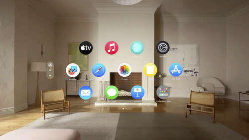
Image Credits: Apple
This is the bit you’ve seen in all the videos. Among those who imagined the Vision Pro as a gaming-first device, it was surprising just how much Apple leaned into this idea of spatial computing. In the grand scheme of things we imagine doing with mixed reality headsets, it’s not one of the sexiest. It’s work. It’s sitting at a desk typing or scrolling the internet. The rub is that there’s no desktop monitor — or rather, reality in your desktop monitor.
Again, Apple isn’t the first company to try this. It may well, however, be the most ambitious. It’s a great effect. As someone typing this to you while seated at a desk in front of two large monitors, the appeal is clear. Heck, if you read me with any regularity, you know that after decades of going TV free, I recently got a projector. As I was shopping for projector screens, I found the one that best suited my needs also happened to be 100 inches.
One hundred inches is — and I can’t express this enough — a lot of inches. I have a smallish one-bedroom apartment. The projector screen now monopolizes an entire wall of it. Using the Vision Pro, it strikes me that Apple has done a truly excellent job approximating distances and points in space.
Watching a movie on Vision Pro feels like watching a movie projected large on the wall in front of you. Utilizing the spatial computing element, meanwhile, really gives the effect of picking up app windows and moving them around in front of you. You can have (more or less) as many open at once as you please, like you would on your desktop or phone. It’s the first computing device I’ve used where real estate doesn’t feel like a premium. Want to open another app? Just toss it to the side.
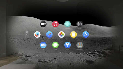
Image Credits: Apple
If reality is too boring, flip on the Environments feature we discussed before, and do your taxes atop a Hawaiian volcano at sunset. Apple is also opening up Environments to third-parties. Disney made a few, so I spent a bit of time at Avengers HQ and in a parked speeder on Tatooine. It’s a fun reminder of how much of my childhood IP that public-domained mouse currently owns.
For my money, aside from watching a movie, the most immersive experience today was Encounter Dinosaurs. Apple worked with Jon Favreau and other folks behind the Apple TV+ show Prehistoric Planet to create an impressive dinosaur experience. These projecst remind one a bit of some of the first-party app experiences Apple created to show the original iPad’s display.
Here, a portal opens on the walk, showcasing a craggy prehistoric landscape. A couple of large carnivores reminiscent of the T-Rex step through to give you a sniff. It’s very cool and makes you feel like a kid for a moment (never take the headset off and you’ll never have to confront any adult responsibilities). I loved it. The graphics are impressive, the AI makes the dinosaurs respond to the user’s movements and audio pod speakers on either side really bring to life the cacophonous snorts and grunts of a curious carnivore.
Encounter Dinosaurs isn’t a foundational selling point, but it’s a great sign post for where things are going. Today’s demo was, unfortunately, wholly devoid of gaming, but the dinosaur experience gave me a good bit of hope about future experiences. Honestly, I could have spent the full hour chilling with dinosaurs and been perfectly happy. That’s probably just me.
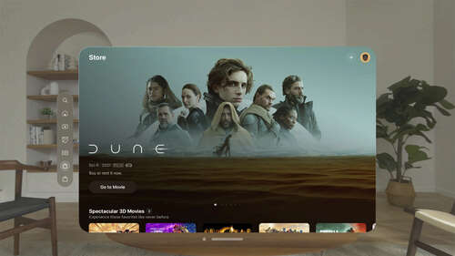
Image Credits: Apple
What may have been the most impressive thing about the demo, however, is that it felt wholly immersive even with passthrough on. It’s a strange sensation feeling transported while very much grounded in reality.
Another surprisingly immersive moment came while trying the Mindfulness app. It took decades of me banging my head against the wall (metaphorically) to really start to see the benefits of meditation. The Vision Pro, however, feels like a bit of a cheat code. The app centers around a flower petal ring that moves in and out to help you control your breathing (it’s similar to the app of the same name on Apple Watch). It’s very centering and something I absolutely plan to take advantage of if and when we get a test unit.
Spatial photos and videos also warrant a mention here. Shot on the iPhone 15 Pro, the images create a 3D scene with a real sense of depth. Remember ViewMaster? Imagine that, only with your photos and videos and you get a rough proximation of the experience. One video was seated at a family table, and felt downright intrusive, as though you’re watching strangers interact in their own kitchen.
If you turn your head toward a person while in one of these fully immersive experience, you’ll begin to see their figure come through. The system utilizes people recognition and will not do the same with objects. It’s just another way to help wearers avoid being fully cut off from reality.
For the people around you, there’s EyeSight (not to be confused with iSight). Remember the scanning process at the beginning? Another thing the app does is build a virtual version of your face. When you look at someone, an image of the top of your face (mostly your eyes) appears in a small virtual cutout on the visor. Cameras inside the headset see when you do something like blink or grimace, and the image responds in real time, with AI creating an approximation of what your face looks like when doing that.
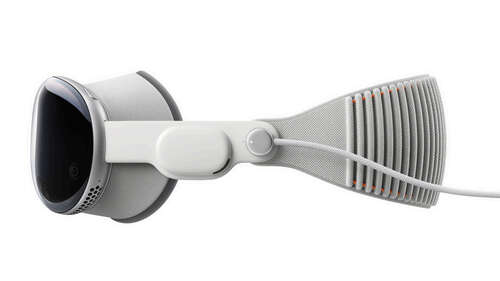
Image Credits: Apple
The feature exists to circumvent potential privacy concerns, proving a subtle way for people around you to know when you’re looking at them. The contents on the inside of the screen can also be broadcast to an iOS device via AirPlay, so people around you can follow along with what you see.
Preorders for the Vision Pro open this Friday, January 18. The headset hits retail on February 2. Apple has promised more news and content announcements between now and then. As is, it’s an impressive demonstration of a new paradigm for the company — one that took the better part of a decade to develop. It brings together a number of different things the company has been working on over the years, such as spatial audio into a truly compelling package.
Is it $3,500 compelling, however? After an hour of testing I’m not fully convinced. For one thing, that price is prohibitively expensive for a majority of people who would be interested in the system. For another, it feels like we’re very much in the primordial stages of the content story. Much of what is on offer is existing apps ported over. They’re still neat in this setting, but it’s harder to make the case that they’re revolutionary.
Taken as a whole, however, the Vision Pro just might be.

