TL;DR
- Google has made a few tweaks to Google TV’s For You home screen.
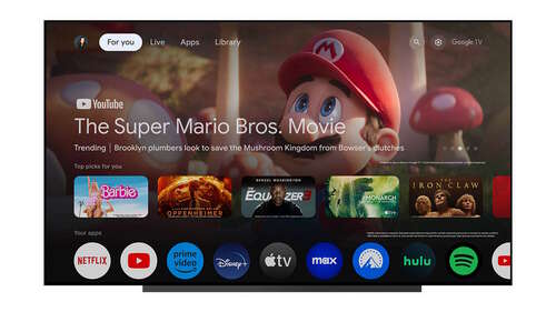
- App icons are now smaller and circular, free TV channels have their own dedicated shortcut, and the Your Apps row can be easily reordered and added to.
- This refreshed home screen is rolling out beginning today but will take the next few months to roll out to all devices.
Google TV has grown in popularity as a recommendation engine on top of Android TV. But changes to this interface are slow and deliberate, especially compared to how quickly and often drastically things change on Android phones. Google is now making a bunch of small changes to Google TV’s For You home screen, and hopefully, they add up to a better experience.
As Google announced through its support forums (via 9to5Google), Google TV’s home screen has a new look but is only slightly different from before. Firstly, apps now come with a smaller circular icon instead of a larger rectangle, meaning you can see more apps at once. The “Your apps” row now also houses more of your most-used apps, so you don’t have to go to All Apps to see some less-frequently used options.
Next, Google TV’s free TV channels now get their own dedicated shortcut in the “Your apps” row instead of residing on the “Live” tab. Google reiterates how the free channels from Google TV include options across local news, movies, and sports, and all of them within this short are available to watch without any additional payment.
The “Your apps” row on Google TV’s For You home screen also gets a “reorder” button that makes it easier than before to set up your home screen exactly how you want it to be. There’s a new “add apps” button too, which will let you discover and install new apps, presumably from the Google Play Store.
Google says this new home screen refresh is rolling out starting today but will take the next few months to roll out to all devices.
Have you received the new layout on your Google TV device? Do you like it? Let us know in the comments below!

