You’re probably looking at images of the just-unveiled Samsung Galaxy S24 series and thinking, “I’ve seen this before!” And you’re right, to the naked eye, the Galaxy S24 lineup is basically a copy-paste of the S23 lineup which, itself, was a copy of the S22 lineup.
But we have more than basic eyes here at Android Authority, don’t we? And if you’re here, then you’re likely as detail-oriented as we are. So we took our magnifier glass and went looking for every minor design change between the Samsung Galaxy S24 and its two predecessors, focusing specifically on the flagship Ultra model.
Samsung Galaxy S24 Ultra
200MP camera • ProVisual Engine • Up to 1TB of storage • New AI tools
The best of the best in the S24 series
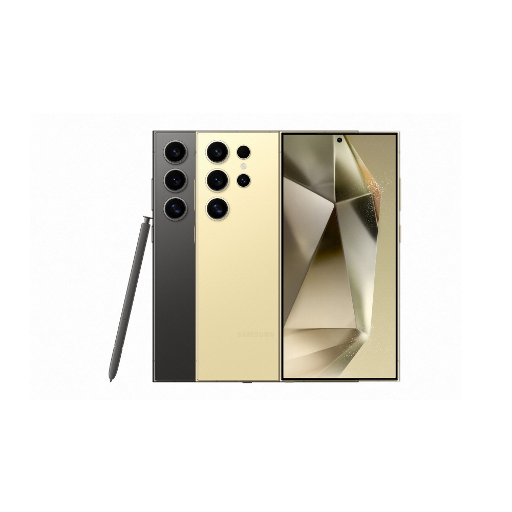
Samsung’s true flagship device, the Galaxy S24 Ultra offers the very best specs and features from any Galaxy phone to date. Ai and camera functions are the name of the game, with a 200MP primary camera, 50MP 5x telephoto, 10MP 3x telephoto, and 12MP ultrawide shooters. Smaller display bezels, 2,600 nit display, 5,000 mAh battery, an advanced cooling vapor chamber, up to 1TB of UFS 4.0 storage, and 12GB of RAM make for a powerful mobile computing system. The new ProVisual Engine offers AI-powered camera tools for photo and video capture.
Lanh Nguyen / Android Authority
First of all, the new Galaxy S24 Ultra is the only phone with a flat display, a gradual departure from the slightly curved S23 Ultra and the super curved S22 Ultra.
As a side effect of the flat panel, you can now see the bezels all around the phone, unlike the previous models where the left and right bezels were hidden away from view on each side. What was done with visual trickery before is surpassed with technical mastery on the S24 Ultra, though, because the bezels are super thin all around the phone. Yes, you’ll see them, but they don’t look bad at all. If you ask us, this seems like a decent compromise to get the S Pen to work across the entirety of the display, instead of slipping away when we reached the sides.
Are the Galaxy S24 series’ minor hardware changes enough?
63 votes
Robert Triggs / Android Authority
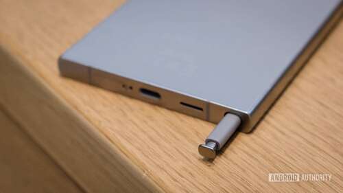
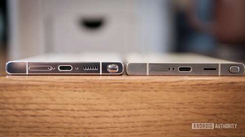
Speaking of the stylus, it’s practically the same too and it offers the same S Pen features, but there’s one minor and helpful change. Once slotted into the phone, its top is no longer a bumpy dome shape like on the S22 Ultra and S23 Ultra. No, it’s flat and sits flush with the bottom side of the S24 Ultra. That allows you to easily stand the phone up straight, without it wobbling.
Minor changes add up to make the Galaxy S24 an all-around more refined version of its predecessors.
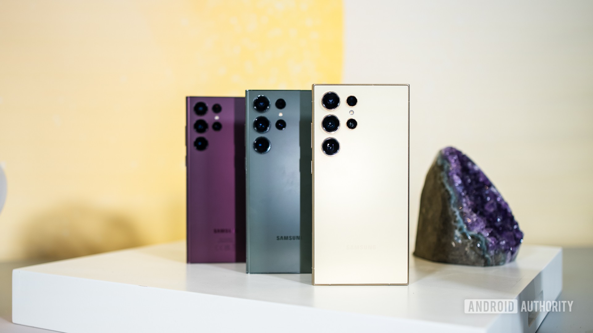
Moving on to the sides, the S24 Ultra’s rails are made of titanium with a matte finish, giving it a distinct look and feel compared to the shiny chrome rails of the S23 and S22 Ultra.
And finally, the Galaxy S24 Ultra has the most squared-off corners of the three phones. If you thought the previous models were boxy, this one is boxier. We’ll have to reserve our judgment about the phone’s long-term ergonomics until we’ve used it for a while, but I’m personally a bit worried about how my short female fingers and easily tired wrist will handle this change.
Robert Triggs / Android Authority
Samsung is also going for different colorways this year. Besides the traditional black/dark grey, the S24 Ultra comes in light grey, pale yellow, and purple options, while the S23 Ultra launched in cream, olive green, and purple, and the S22 Ultra offered white, green, and burgundy.
That is everything we noticed about the external design improvements in the Galaxy S24 Ultra. Of course, there are more changes under the hood like Qualcomm’s latest Snapdragon 8 Gen 3 for Galaxy chipset, a new 50MP 5x zoom lens, and a base version with 12GB of RAM and 256GB of storage as opposed to the base 8GB/128GB configuration on previous Ultras.

Samsung Galaxy S24 Ultra
200MP camera
ProVisual Engine
Up to 1TB of storage
New AI tools
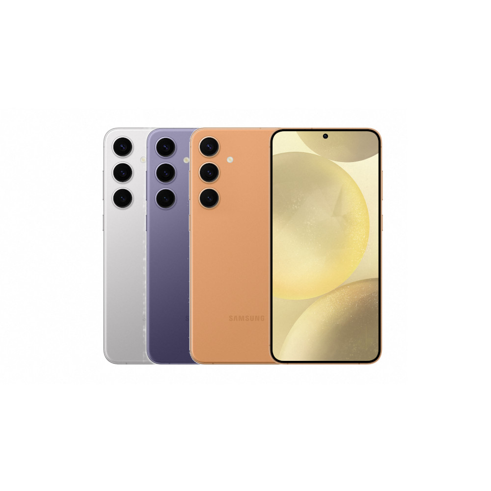
Samsung Galaxy S24 Plus
Big bright display
Snapdragon 8 Gen 3 for Galaxy
Thin bezels

