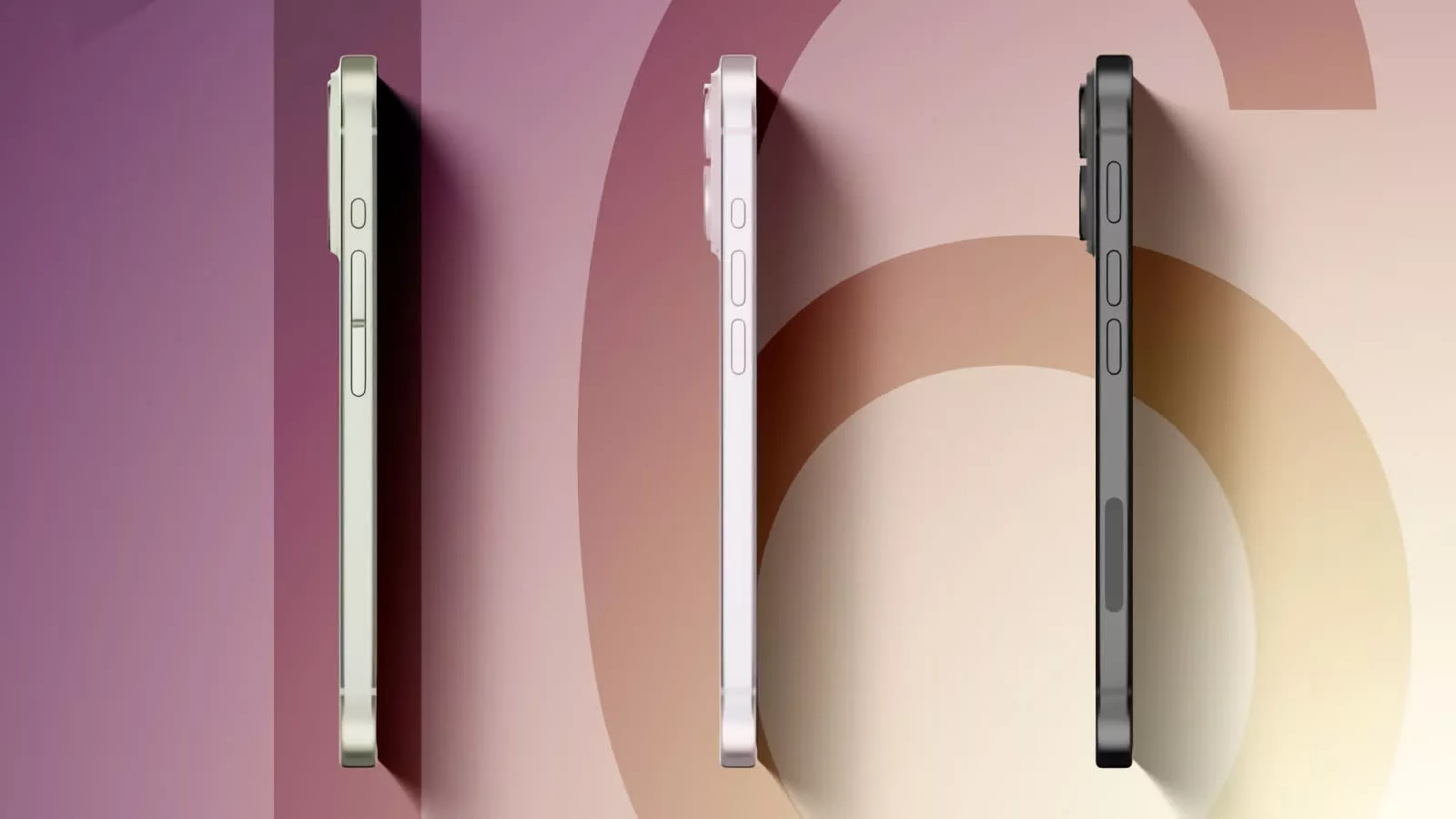
Rumor mill: While seeing the possibilities of upcoming devices is fun, take these renders and information with a healthy grain of salt. It is still very early in the design process. There are at least three prototypes because engineers are still working on and testing functionality. All or none of these changes could end up in the iPhone 16, which is still nearly a year away from launch.
The iPhone 16’s design might resemble the iPhone 15’s in most respects. Internal documents obtained by MacRumors imply that the primary aesthetic differences will be in the camera lens layout and the button designs. MacRumors drew up some renders from the descriptions of three of Apple’s early iPhone 16 prototypes. Let’s review the potential possibilities.
The front of the iPhone 16 is business as usual with no changes – not even to the controversial “Dynamic Island.” Admittedly, the small black field housing the front sensors is a significant improvement over the notch, especially considering it serves multiple practical purposes now. However, it is still an obstacle forcing movie viewers to use less screen real estate or users to put up with the obstruction to the side of their shows.

Probably the most noticeable change is the layout of the rear camera sensors. There are two styles on the three prototypes. Both harken back to earlier models – specifically, the vertically oriented pill-shaped sensor casing similar to the iPhone X (masthead yellow) and the iPhone 12’s separate vertical enclosures (masthead pink). The flash remains to the right of the lenses.
The other significant difference lies in the button layouts and designs. As depicted above, the volume and action buttons remain on the left side, but Apple is experimenting with two styles for each. These variations could offer users a more intuitive and comfortable interface.
The left-side buttons on the pink phone represents the iPhone 15’s design. The yellow version is similar but has a unified capacitative volume switch rather than the separate mechanical buttons on the current flagship.

Meanwhile, the black prototype has the same volume buttons as Apple’s current model but enlarges the Action button to be slightly longer. You might also notice that the mmWave antenna is below the volume controls. This orientation is the opposite of the iPhone 15, and for good reason.
Looking at the black prototype’s right side (above), we see that the iPhone 16 might procure another Action button below the power switch. Since its location above and on the right (when held in landscape mode), it could make a more appropriate shutter switch than the volume buttons, which I have always found awkward to use. While the documents don’t go into detail about it, it will likely be a capacitive multifunctional switch, set to the user’s preference in the Settings app.
Apple engineers were working on this component under the codename Project Nova. Past leaks call it the “Capture button,” which hint to it defaulting to the camera shutter or maybe a single button to take screenshots (another awkward task on current iPhones). It might also be force-sensitive. Apple has tinkered with and even released similar tech in other iPhone models. The SE’s home button is an example of a capacitive button that mimics its mechanical brethren using haptic feedback. There was also the Force Touch technology that Apple ran with for a while in iPhone displays and still uses for the Apple Watch and MacBook trackpad.
Image credit: MacRumors

