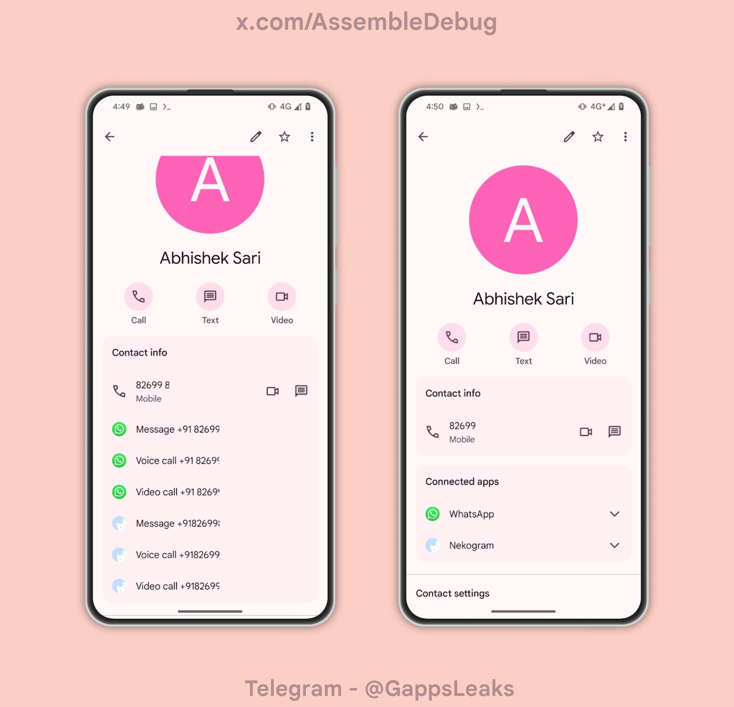
Inside the Contacts app from Google, numbers from third-party apps, such as WhatsApp and Telegram were listed out in a manner that could be described as a bit messy or chaotic. In a change that should soon be rolling out to users, things are getting more organized.
Showcased in Contacts app version 4.26, a UI change is placing numbers from connected apps into dropdown menus. Until you click on these menus, the numbers will remain tucked away so as not to clutter up your view. This is a much cleaner aesthetic, which is always welcomed.
Old vs. New
You can see the difference above. On the left side, numbers are listed out and it’s messy. On the right, we have the number tucked behind their respective apps. It’s a good change and it’s reported that it’s not purely limited to just WhatsApp and Telegram.
Be on the lookout for Contacts 4.26 to hit your device soon.


