Key Takeaways
- The Pixel Watch 2 improves upon the original with better performance, battery life, and software.
- However, it still falls short as a fitness tracker due to its reliance on Fitbit and lack of advanced features compared to competitors.
- While the design is comfortable and stylish, the software is not as customizable as some alternatives, and the price remains a significant barrier.
In 2022, Google made its long-awaited debut in the smartwatch space. However, the original Pixel Watch was far from a perfect device, easily outclassed by Samsung Galaxy Watches and the Apple Watch. The Pixel Watch 2 makes some noted improvements, but is it ultimately enough?
I was pretty hard on the original Pixel Watch in my review. It had all of the shortcomings of a first-generation device, but this wasn’t some Kickstarter project from a start-up company. Google is Google, and smartwatches aren’t a new concept. Needless to say, it left a lot to be desired for a $350 device. So, I was very curious to see the improvements made in the Pixel Watch 2.
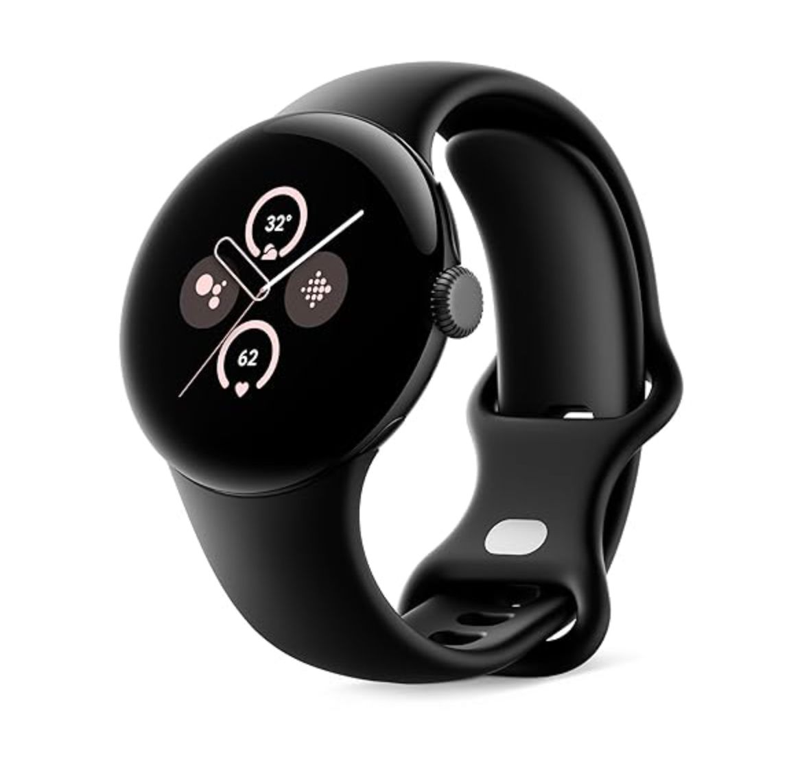
Google Pixel Watch 2
Google’s Pixel Watch 2 packs a stylish design featuring a 41mm round display, multiple health and wellness sensors, fall detection, and all-day battery life. Get the best of Google and Fitbit on your wrist.
- Heart Rate Monitor
- Multi-path optical
- Operating System
- Wear OS 4
- Onboard GPS
- Yes
- Case Material
- Aluminum
- Case size
- 41mm
- Colors
- Black, Silver, Gold
- Display
- Gorilla Glass 5,AMOLED, 320 ppi
- CPU
- Qualcomm 5100
- RAM
- 2GB
- Storage
- 32GB
- Battery
- 306 mAh
- Connectivity
- Bluetooth, NFC, Wi-Fi, 4G LTE
- Price
- $349-399
- Beautiful, comfortable design.
- Excellent performance.
- Battery life is greatly improved.
- Software feels slightly more finished.
- Fitbit integration is lacking for activity tracking.
- Aluminum is a downgrade from stainless steel.
- Proprietary bands are limiting.
- Still too expensive.
Same Great Design, Now With Aluminum
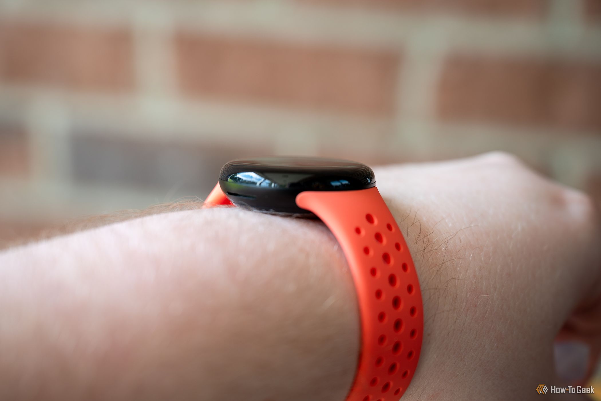
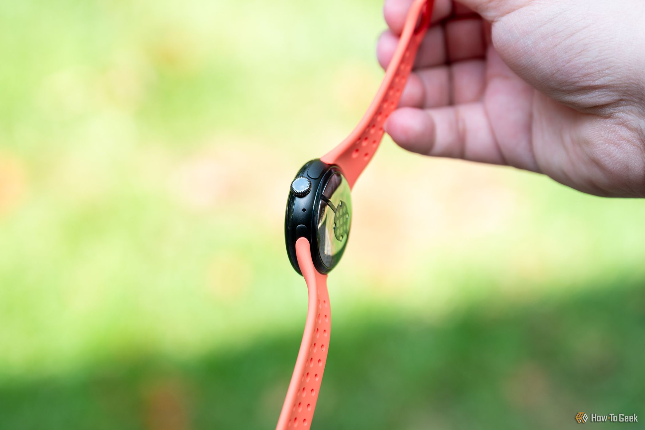
The Pixel Watch 2 looks identical to the original, and that’s a good thing. The smooth, fully rounded-over shape makes it feel smaller than it really is. It’s one of the most comfortable smartwatches I’ve used, which is also thanks in part to Google’s stock silicone band.
The main design change is the use of aluminum for the bottom casing—the original Pixel Watch was stainless steel. The result is a slightly lighter watch, but five grams doesn’t make a big difference. I can’t say I noticed a discernible change in the wrist feel, but stainless steel is more durable than aluminum. It’s disappointing that Google switched to a lower-quality material for a device that still costs $350.
Something that didn’t change at all is the display. The display size complaints about the original Pixel Watch were definitely overblown, but I was still hoping a bigger display would have been one of the upgrades this time around. Thankfully, the domed Gorilla Glass 5 and the AMOLED black-heavy UI do a great job of mitigating the size of the bezels.
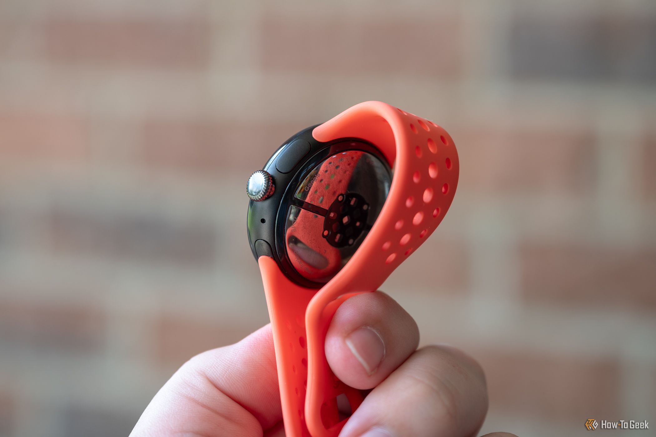
The buttons are also identical this time around. The main “button” is the dial that is used for scrolling, opening the app drawer, and returning to the watch face. I’ve come around to liking the dial, especially for scrolling through notifications. The second button, on the other hand, is still not great. Due to the bottom of the watch having a heavy round-over, the button feels almost like it’s underneath the watch.
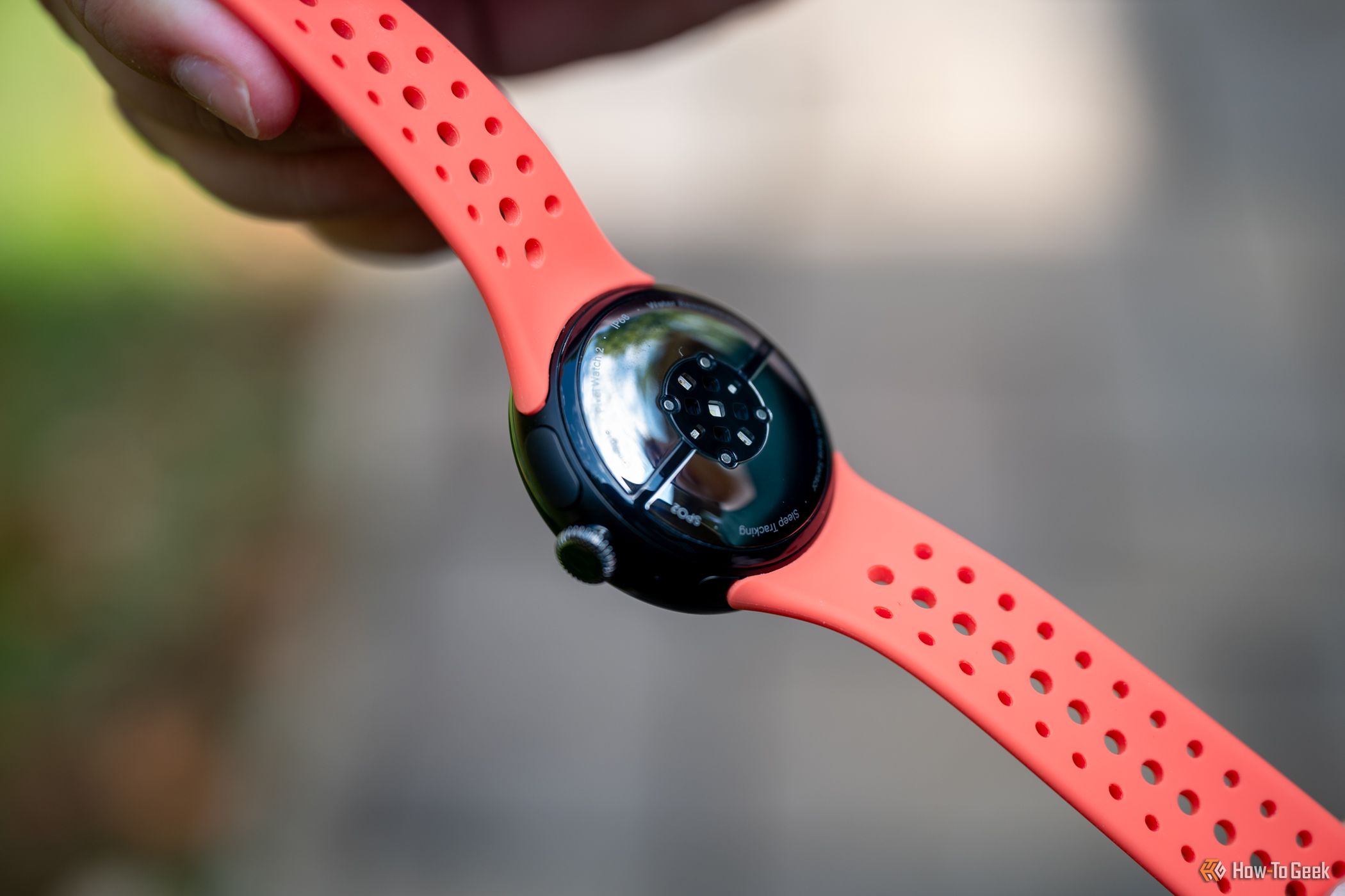
One design feature that I was wholeheartedly against on the original Pixel Watch was the proprietary bands. I’m still not a big fan. Yes, it’s cool how it looks like the band is coming directly out of the watch, but at what cost? Over a year later, the watch band selection is still minuscule compared to the Apple Watch or regular watch bands. I also still found the mechanism not particularly easy to use. I really had to push the locking button down hard to slide out the band.
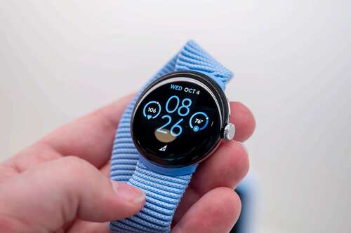
In general, the Pixel Watch 2 is a very attractive smartwatch. Since the watch body itself is so minimal, it lends itself well to just about any look you’re going for. You can class it up with a leather band that adds lugs or go for the sporty activity tracker look. I like the versatility of a device that lives on my wrist.
Incremental Improvements in Software
I was pretty disappointed with the software experience on the original Pixel Watch. Pixel UI is my Android skin of choice on phones, but on a watch, it was too barebones. The Pixel Watch 2 runs Wear OS 4, which is more of the same, but there have been some improvements.
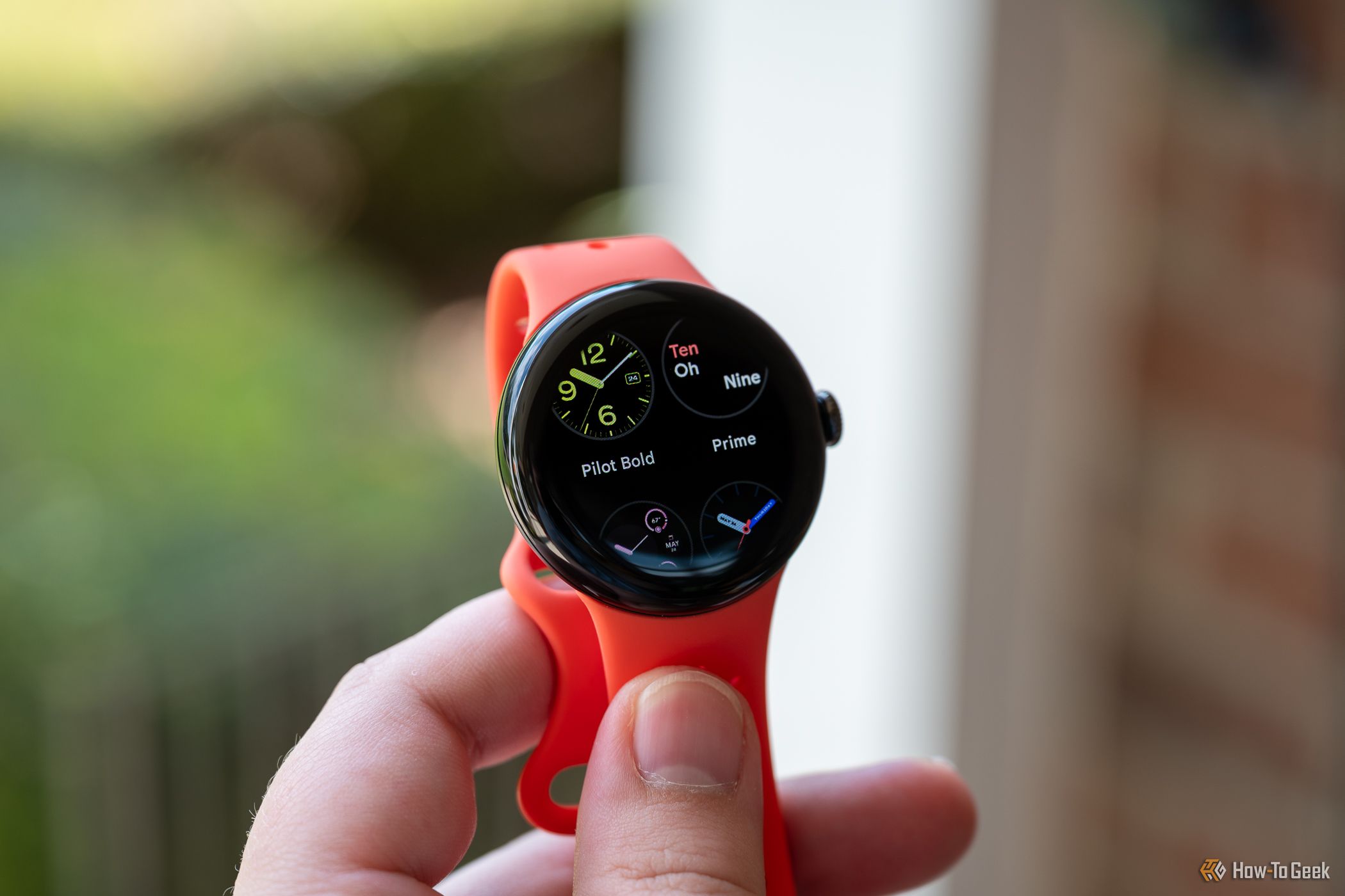
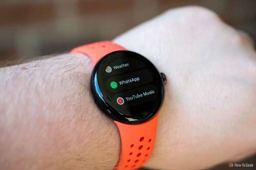
First of all, I’m still a fan of the overall look of Google’s Pixel UI. I like the accent colors, the big corner radius on buttons and cards, the way notifications are presented, and Google’s watch faces. It’s a much more cohesive look than One UI on Samsung Galaxy Watches.
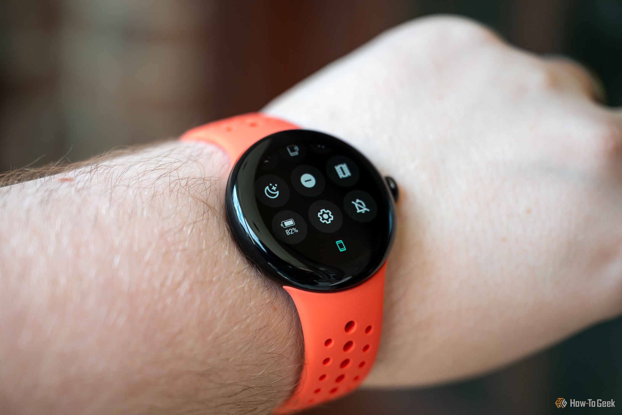
The biggest practical improvement I noticed is the fact that Do Not Disturb and Bedtime Mode actually sync with the connected phone now (at least with a Pixel phone). That was a glaring omission on the original watch. The UI also felt smoother and snappier on the Pixel Watch 2, thanks in part to the new chip inside. The fluidity contributed to the software feeling more finished this time around.
Coming from a Galaxy Watch, I was originally put off by how Google organizes the notifications, Tiles, and Quick Settings. For whatever reason, I didn’t dislike it as much this time around. Vertically scrolling through notifications is actually better than Samsung’s horizontal list, and the carousel of Tiles makes it easier to get to the Tiles at the far end of the list.
That being said, Pixel UI and the companion app are still very barebones compared to other smartwatches. Some things seem like they haven’t been fully thought out. Why does Bedtime Mode disable waking the watch by touching the screen but not the dial button? I have to manually turn on “Touch Lock” every night to ensure I don’t accidentally push the button and do something on the watch in my sleep.
The “Touch Lock” toggle is found in the Quick Settings, which can’t be customized at all. I have to scroll past a bunch of toggles I never use to get to the Touch Lock. This is also the case for the app list, which is locked in alphabetical order. Customizing the Quick Settings can be done on Galaxy Watches and every Android phone. So, the software experience definitely feels more finished, but it’s still not all the way there.
Fitbit Is Not a Serious Fitness Platform
For better or worse, Google has hitched its train to Fitbit for the Pixel Watch’s health and fitness functionality. Fitbit is very good for some things but extremely lackluster for others. Despite some improvements, this was probably the weakest part of the Pixel Watch 2 in my testing.
First, I’ll start with the new and improved features. The Pixel Watch 2 has a new multi-path heart rate sensor, which can measure your pulse from multiple directions. One of the problems with wrist-mounted heart rate sensors is all the tendons in your arm that get in the way. The new sensor gets around that with multiple read points. In reality, the heart rate readings seemed to be as accurate as a smartwatch can be, and there was not much lag in the reading.
The Pixel Watch 2 also has Fitbit’s body-response and skin temperature sensors. Fall Detection, Emergency SOS, and Safety Check are all present as well. Oh, and the Fitbit app on the watch can finally automatically detect some workouts now. There are certainly enough sensors in the Pixel Watch 2 to be a great health and fitness device, but Fitbit is holding it back.
The Fitbit app is simply not for serious fitness tracking. The amount of data shown after an activity is far less than what I get from Samsung Health, Strava, and other apps. Let’s look at some examples. Recently, I started swimming, so I used the Pixel Watch 2 and Galaxy Watch 5 for tracking. Here are the readouts I got from Fitbit and Samsung Health (not for the same swim).
Fitbit only showed me the duration, distance, cryptic “Zone Minutes,” average pace, number of laps, and calories burned. Samsung Health, in addition to those things, showed my average heart rate, total strokes, average SWOLF (swimming efficiency), a chart of my heart rate throughout the swim, lap splits, heart rate zones, and it even attempted to guess which swimming style I was using. Samsung blows Fitbit out of the water, and it’s the same story for other activities, too.
Now, Fitbit isn’t bad at everything. The Pixel Watch 2 is comfortable enough to wear while sleeping, and I really liked Fitbit’s sleep tracking. Unlike activities, Fitbit actually gives you a lot of information about your sleep. I honestly never bother with sleep tracking unless I’m using a Fitbit device. That information, along with activities, is taken into account for a daily “Readiness” score. I found that helpful for knowing when I should take a break from strenuous activities.
In general, I think Fitbit is much more focused on health and wellness than fitness and activity tracking. I wouldn’t have a problem with that if it weren’t the stock fitness app on a $350 smartwatch, and the genuinely good features weren’t locked behind a Premium subscription. It’s disappointing to need a third-party app for serious activity tracking.
Excellent Performance and Improved Battery Life
One of the few legitimate hardware upgrades on the Pixel Watch 2 is the chip. The original Pixel Watch used a Samsung-made Exynos 9110 SoC, but it switched to the Qualcomm Snapdragon W5 chipset for the Pixel Watch 2. The W5 is supposedly more powerful and efficient, and that checked out in my testing.
As mentioned earlier, the UI felt very smooth and snappy. I think part of why the software felt more “finished” this time around is that the watch simply runs better. Scrolling is super smooth, the animations look great, there’s no lag with the keyboard, voice typing is super quick, and it’s an overall very pleasant experience.
Google’s battery rating for the Pixel Watch 2 was improved from “up to 24 hours” to “24 hours with always-on display.” The battery is marginally bigger (up to 306mAh from 294mAh), but the more efficient chip deserves more of the praise. In my real-world testing, I had no problem going a full 24 hours on a charge. That often included activity and sleep tracking.
The one downside on the battery front is the new magnetic pogo-pin charger. Some people were annoyed about the switch away from wireless charging, but that’s not my gripe. In reality, smartwatch wireless chargers are never cross-compatible, which partially defeats the purpose anyway. My problem with the new charger is it can only be connected in one specific orientation. That was annoying to work around at times.
Pixel Watch 2 Price & Availability
The Pixel Watch 2 is available for $349.99 for the Bluetooth and Wi-Fi model and $399.99 to add 4G LTE connectivity. The watch comes in four color combinations: silver with a light blue silicone band, matte black with a black silicone band, gold with a hazel green silicone band, and silver with a porcelain silicone band.
Should You Buy the Google Pixel Watch 2?
There’s no question that I enjoyed my time with the Pixel Watch 2 more than I did with the original. Performance is better, battery life is better, and the software is better. However, Fitbit holds it back from being a great fitness device, and while the software is improved, it’s still not as rich as Samsung’s implementation of Wear OS.
While the overall experience certainly felt like an upgrade, I’m still having trouble recommending the Pixel Watch 2 over its direct competitor. The Galaxy Watch 6 is $100 cheaper (40mm), has far superior fitness tracking, more customizable software, a larger selection of bands, and access to all the same Google apps. The Pixel Watch 2 offers slightly better performance, a better design, and nicer-looking software.
If price were no concern, I’d go for the Pixel Watch 2. Losing Samsung Health would be a bummer, but there are some good third-party alternatives to Fitbit that I could use. The design of the Pixel Watch 2 has really won me over. It’s a bit futuristic but also classic, and it’s super comfortable to wear. And while there are still some annoyances with the software, it’s a more cohesive overall experience than One UI.
The problem is price is a concern—the Pixel Watch 2 is too expensive. This device should not be priced similarly to an Apple Watch. For $250 or even $300, the Pixel Watch 2 would be much easier to recommend. Hopefully, by the third generation, Google will have a product that lives up to the promise of its price tag. As of right now, the Pixel Watch series is on the right track, but there’s work to be done.

Google Pixel Watch 2
Google’s Pixel Watch 2 packs a stylish design featuring a 41mm round display, multiple health and wellness sensors, fall detection, and all-day battery life. Get the best of Google and Fitbit on your wrist.
