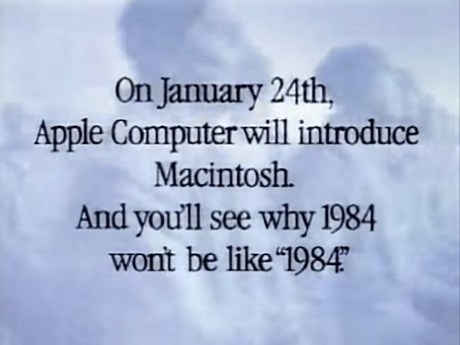
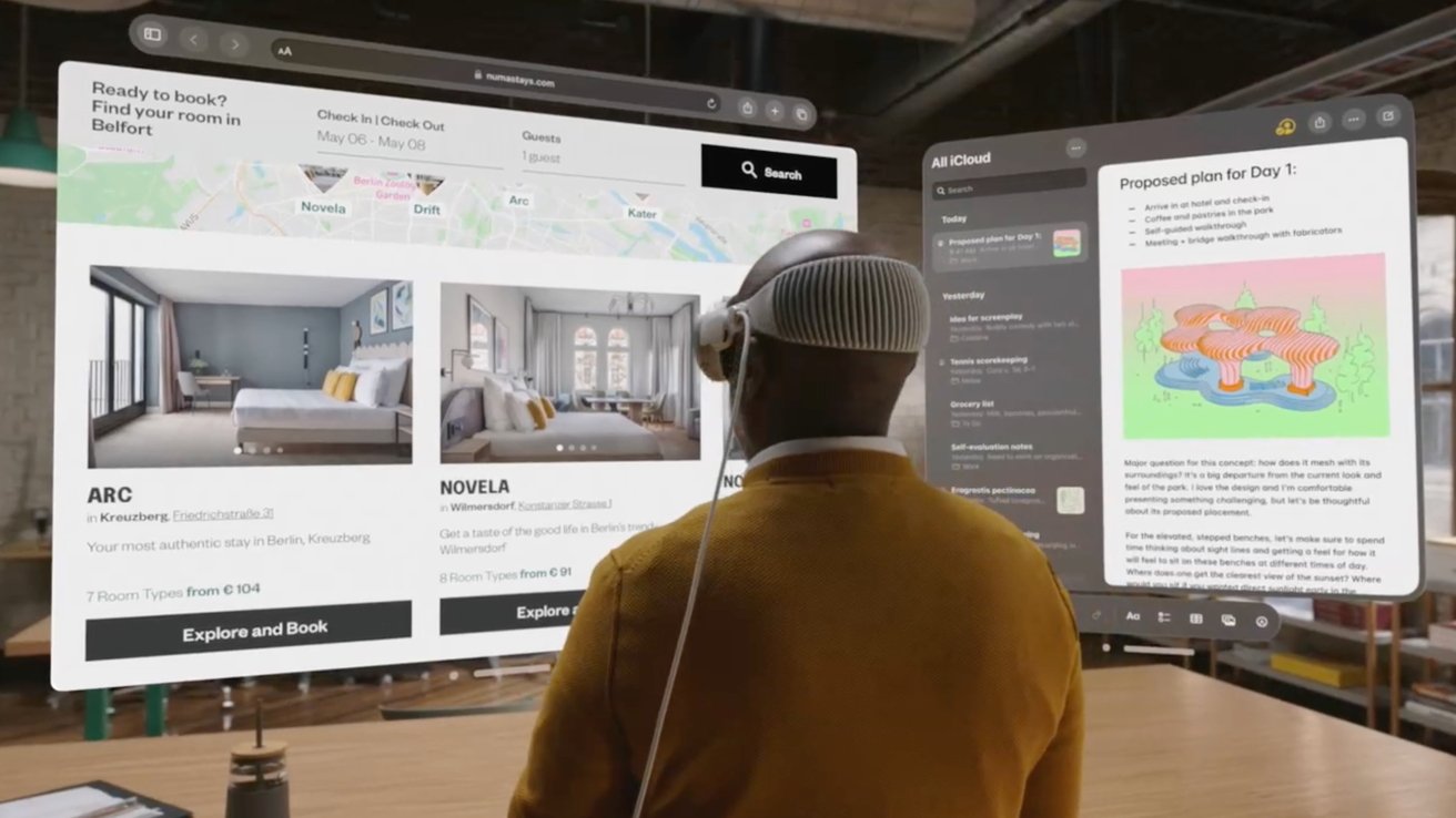
There’s something about traveling to new places and experiencing new things that sparks the imagination, recalibrates one’s view of what’s possible, and allows association of apparently unrelated ideas like the Apple Vision Pro and Macintosh launches into analogies that can illuminate our future outlook.
Here’s what my own recent travels made me think about Apple’s ambitions for the new year. The introduction of Vision Pro, at the 4th decade of the Macintosh, plays into this.
Bigger reward, none of the risk
When Apple debuted the first Mac way back then, there were no flagship Apple Stores. There was no track record of building great development tools, nor any App Store supporting the distribution, updates, and sales for Mac software.
Apple’s track record in 1984 was tarnished by the poorly built Apple III and the very expensive and not quite fleshed out concept delivered by Lisa, Apple’s first graphical computing system that had a muted debut a year prior.
All of these foundational factors have dramatically changed for Vision Pro. Kids today have no concept that Apple was once beleaguered once, let alone multiple times. They’ve only known a world where Apple hardware is desirable, elegant, and updated for free every year for many years after purchase.
Apple Vision Pro as a product also isn’t facing a threat comparable to what the much larger IBM once posed to the Macintosh in 1984. Back then, IBM’s new PC already seemed to offer more of what business users apparently wanted that Apple did with the Mac. Users also had to be convinced that this new fangled concept of a mouse pointer and overlapping windows made any sense.
Today the public is generally familiar with the concept of immersive computing, if only related to VR gaming and futuristic portrayals in movies. But despite the billions invested by Sony, Microsoft, Google and in particular Facebook’s Meta, there is no entrenched standard that Apple has to struggle against in a desperate attempt to establish its own hardware solution.
Instead, the world’s developers, including Sony, Microsoft, Google, and Meta, are already very familiar with using and deploying Apple’s iOS-based development tools. Apple also has a massive installed base of users who love the company and everything it makes. They listen and subscribe to Apple Music and watch Apple TV and even see Apple’s logos at the openings of blockbuster movies. This isn’t your father’s introduction to the Mac.
All Thaied up with no writes
After making an effort on January 1st to take the time to organize my thoughts into an article recognizing the new year and how 2024 relates to the now 40 year old history of Apple’s Macintosh, I allowed myself a two week hiatus from my otherwise unbroken series of weekly pontifications to just relax and enjoy the vacation from the cold of winter I’d planned.
I honestly hadn’t really “planned” a vacation at all. Instead, I’d merely bought a ticket to Bangkok and tried to not worry too much about how things would work out.
Hungry and reckless youth
My younger self was always pretty good at showing up in some new place and rapidly figuring out what to do and where to go essentially in real-time, with only a minimal idea of what the options were.
The first time I ever went to Thailand was way back before the iPhone first arrived. I planned out my backpacking adventure equipped with little more than an iPod and Apple’s 30-pin Camera Connector that let you conveniently transfer tons of your digital camera photos to its hard drive.
It turned out to be a more exciting trip than I’d anticipated. A small motorbike I’d rented slipped out of my control on the oily roads of hectic traffic in the middle of Chang Mai, long before an Apple Watch was around to report crashes. Luckily people stopped to help.
I then rented a larger motorcycle thinking it would be safer, only to have it catch fire well outside the city, leaving me at the mercy of a local driver with a cell phone who stopped to help me.
The next bike I rented was an even bigger, new motocross bike I imagined could get me anywhere. I confidently plowed through flooded rivers of uncertain depths only to find that my vehicle choice left me unpredictably vulnerable to getting abruptly punched in the face by a jealous Italian who mistook me for somebody else. Once again I experienced the help of locals to stitch me up the hospital.
There is no way to perfectly prepare oneself for the future. You have to do your best and adapt to whatever might happen. You also probably need to lean on those equipped and willing to help. If it weren’t for the helpers, many of us would never have made it to an advanced age.
Satiated and overwhelmed with age
However, as I get older and begin turning into my father, I find myself finally grasping why he always seemed to be overwhelmed with concerns about all sorts of theoretical problems that likely were not even going to materialize.
In 2005, Steve Jobs quoted The Whole Earth Catalog‘s advice to “stay hungry, stay foolish” in his commencement address to students graduating from Stanford.
Remaining voraciously open to the possibilities of the upcoming future and foolish enough to recklessly embark upon ambitious goals regardless of their cost and without too much concern about what might happen are traits associated with youth.
In contrast, the conventional wisdom gained while growing up is perhaps just trauma from all the problems we get hit with, that in retrospect we failed to adequately anticipate and prepare for.
And so we often try to ensure that we (and often our kids) take great cautions so we don’t also suffer the same mistakes. But the problem then becomes paralyzing fear that prevents us from focusing on things that matter and instead being too concerned with creating complex hypothetical solutions to problems we only imagine might occur.
The solution, it seems, is to balance the voracious ambition of youth with the thoughtfulness of acquired experience, and do this without ever getting too “foolish” to the point where you’re too far over your skis,’ but also not so conservatively timid that you can’t decide your way out of the tar pits threatening to turn you into a fossil.
And so, continuing upon my last article’s corporate personification of Apple as the middle-aged brain child of Boomer founders, the question might be: is today’s Apple-and specifically its new Vision Pro— too much, not enough, or just the right about of hungry innovation and thoughtful value to sustain itself and create a new platform of immersive, spacial computing that enough users will find sufficient, real utility in it that they will pay close to $4K for it?
Criticizing where the puck is
There are at least three things I saw while traveling that cause me to reflect on aspects of this. I thought I’d share the first two as things to think about when trying to peer into the future of Vision Pro, before it reaches shelves and gets evaluated by more than just the initial crowd of influencers that have rarely ever done anything other than share their written opinion on things.
Apple’s critics all seem to come from the blogger crowd of content generators who are sponsored by surveillance advertising, and thus largely incentivized to generate absurdisms calculated to attract engagement that can pay their soapbox rent.
The savviest Apple thinkers seem to all come from previous positions where they actually have some real world experience building a product, administrating a company, or working with the public, giving them some insight into what Apple actually needs to do to deliver a hit. For so many others, the only actual experience they seem to have with delivering “hits” seems to be their own pieces, metaphorically.
18 stories of ad vantage
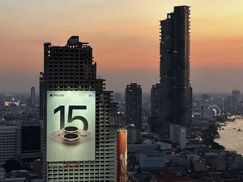
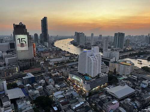
But my first actual metaphor from Thailand, pertaining to Vision Pro, is a roughly 18 story billboard for iPhone 15 in the middle of Bangkok. It towers over the twin viaducts of the SkyTrain and an inner city highway, and is not just visible but downright difficult to ignore.
This spectacularly vast advertisement appears to be Apple’s, but at closer examination it is, like virtually all big outdoor iPhone ads, paid for by a mobile carrier that has agreed to subsidize the profits of Apple in exchange for promoting the iPhone brand in the hopes you’ll buy their for cellular service.
That in itself is quite incredible. The largest and most valuable company in the world offering a mobile phone has effectively blanketed the world with these sort-of-tasteful but still quite imposing promotions that are virtually all paid for by its cellular partners, not by Apple itself.
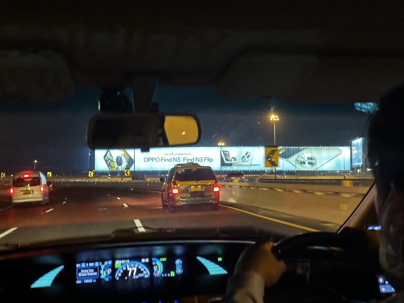
Compare this with Apple’s “competitors,” who often pay for their own huge billboards in their struggling attempts to get anyone to take notice of their much cheaper, often quite good enough and certainly carrier-friendly Androids.
For example, right outside the Bangkok airport there are a series of free standing billboards of extraordinary size— and by that I mean Bladerunner scale posters that appear to run on for at least four or five limes the length of a conventionally large highway billboard. I’m not certain but it sure looks like Oppo and other Chinese brands are buying these on their own accord.
Expensive Androids don’t make big money for carriers nor do they attract so many well heeled customers. So Samsung, Google and the PRC has to desperately promote them at significant cost. After a lot of years of big taunting ads trying to ridicule and also copy Apple, Google and its alliance of Androids makers have only circled the drain.
Google itself sure tried to promote its momentary advantage in low light photography, and at best only prepared future iPhone buyers to get excited about Apple’s own forthcoming Night mode. That pattern also occurred with NFC, Google Pay, and many other one-time, heavily advertised Android exclusives from the Internet’s ad giant that just failed to matter.
A decrepit dinosaur in perpetual beta, plastered with advertising
However, the really interesting aspect of this massive iPhone billboard is not the ad itself but rather what it’s attached to, and why. The reason why there’s such a truly massive ad— and why any building tenant would go for such a huge installation to be attached to the side of their building— is that there are no tenants.
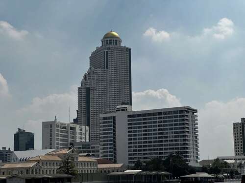
The 43 story Sathorn Unique Tower, as it’s called, was never finished. Like Apple’s long ago Copland project, it was imaged to deliver a glorious future in the early 1990s but then was beset by a series of problems and work on it came to a halt in 1997. Unlike Apple’s ill fated software initiative, this tower quite literally couldn’t just be dragged to the trash.
Despite being about 80 percent finished, its 43 floors of concrete don’t have any windows and are just sitting there serving as a giant birdhouse, a canvas for graffiti, and of course, as a host for this massive billboard. Only that last feature generates any revenue.
The tower most certainly won’t ever be finished, because it would be a massive and very expensive job to completely retrofit its ruins after 25 years of decay, and so much easier to build a new, purpose-built tower virtually anywhere else.
One has an iPhone, the other Windows
I first spotted this massive, unfinished tower on my first visit to Bangkok. Its striking stature left me wondering for all this time why it never got finished and why. This time around, I happened to stay in an Airbnb condo located in another tower located nearby, and my view included a clear look at the decrepit, monstrous pile of concrete.
It piqued my curiosity that both this billboard tower and the one I was staying in shared quite a lot in common: the same sort of phony Greek columns that seemed out of place on a high rise building, as well as their overall shape and imposing scale. It turned out that they are twin towers both designed by the same architect. Both were impacted by the 1997 financial crisis that disrupted the construction boom in Asia.
However, the Sathorn Unique Tower’s even larger 68 story sister, called the State Tower, was actually finished in 2001 and has been in active use ever since. That makes it tempting to think of the tower that got finished as “Mac OS X,” in contrast to the abandoned Copland.
If you’ve seen The Hangover Part II, the glitzy roof deck of the State Tower makes a significant appearance as a setting of a memorable scene, resulting in a level of notoriety that makes for really expensive drinks if you want to visit its open air bar.
Yet despite the fancy facade of its hotel lobby and roof deck, much of the insides of the State Tower were oddly patched up, on top of being strangely designed in the first place. Combined with being overpriced, over-hyped, and featuring a seres of clearly unsafe features that really leave it unsuitable as anything other than a convenient crash pad to use in a pinch, it’s tempting to compare the tower with windows to a product made by Microsoft.
A fresh new build backed by research and development
Instead, I’m going to compare both towers to Apple’s competitors in general. I wrote all this not just to be disparaging, but to be instructive of how difficult it is to compete with Apple. Like the series of new towers built in Bangkok since 2001, Apple has been building fresh, new pillars of its business with gleaming success.
But Apple’s growing list of successful ventures aren’t a product of luck or simply being inherently better than other tech companies. It comes from years of expensive, studied efforts to define real needs and build solutions that better target customers than anything resembling these two crumbling old legacy buildings could ever hope to do.
Nobody can look at half-finished projects like Windows Phone or Google Pixelbook and wonder why they didn’t work out as intended. There wasn’t sufficient effort put into building something of value.
Using products from Apple’s competitors is a bit like being inside the State Tower, looking out of the vast skyline of Bangkok and seeing much nicer buildings and wondering why you’re not in one of them instead, rather than complaining about green bubbles or the quality of non-iOS apps just so you can live next to a big ad for something you don’t want to think about.
The user friendly Icon
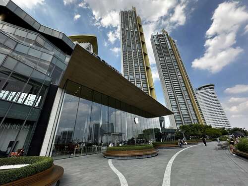
The newest, fanciest and highest towers in Bangkok are adjacent to the equally tony, recently completed IconSiam mall. Bangkok is a shopping destination for Asia, and it’s full of high end malls. So the Icon really has to turn things up to be able to capture attention. Unlike a lot of malls around the world, it’s actually full of active shops, including a huge section of really good street food options presented in an appealing way.
And of course, it features a high end flagship Apple Store, with high ceilings and glass walls that open out over a large park-like platform with views looking out over the river and across the city.
The enormous amount of effort, resources, and attention to design that Apple has invested into its retail stores like this one not only makes them spectacular venues for launching new products, but also reflects the aura of Apple’s products and how much effort went into them.
Just like the products of Microsoft, Amazon, Meta, Google and its various Android partners, their stores (or the lack there of) serve as an additional reason to avoid what they’re selling.
High end retailers know that buyers interested in fancy clothes, accessories, vehicles and other major purchases usually want to see the goods in person before making a buying decision. Like Apple, other luxury brands invest a lot of resources into making an inviting and glamorous retail setting for this to occur.
Microsoft, Amazon, Meta, Google and so on would all like to sell fancy phones, watches, tablets, VR headsets and so on, but they all either lack any real desire to put in the effort to craft good products, or don’t genuinely care about end users because their real customers are actually advertisers.
That amounts to a vast lead Apple has across its product line, but especially with Vision Pro. Microsoft, Meta, Google and others have already brought perfunctory VR or related offerings to market and got quite timid results for their efforts. But their efforts were also timid, so what they earned was largely in line with what they invested.
Apple spent several more years working on its ideas for what would make a spacial computing product distinctive, valuable, useful and desirable. What the company has demonstrated was largely similar to how it rolled out iPhone to a world that already had plenty of smartphones; iPad into a world satiated in tablets; Apple Watch in a market with lots of smart watch alternatives, and so on with AirPods and AirTags.
I have yet to use Vision Pro as a device, and there’s one more week of writing before I get my hands on the newly ordered product. So it remains to be seen what I think about the product in actual use. But the skyline of Bangkok offers a series of analogies that suggest Apple’s successes born from hard work and effort will continue its track record.
At the same time, Apple faces some questions related to subjects ranging from competitive AI to government regulation of its platforms and services that I plan to address next week. Let me know in the comments if you have any thoughts on these I can address.
