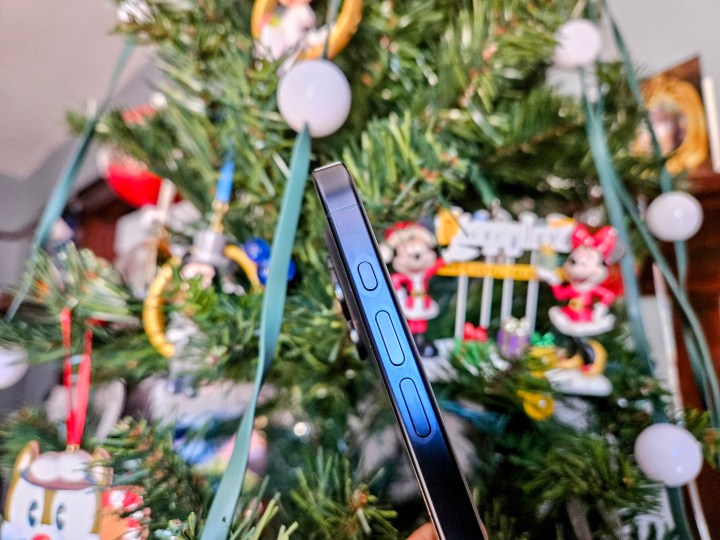
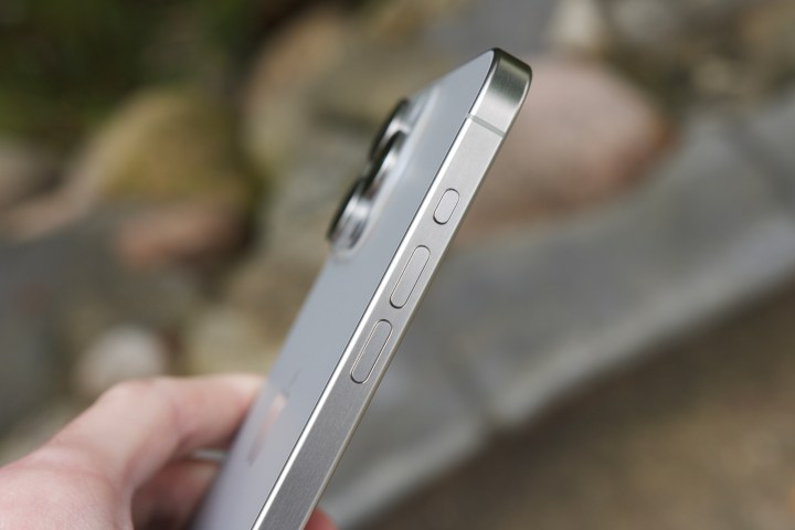
When Apple launched the iPhone 15 Pro and iPhone 15 Pro Max, Apple decided to get rid of a hardware feature that has been around since the original iPhone in 2007. The change that I’m referring to is the replacement of the silent/ring toggle in favor of the new Action button, similar to the one on the Apple Watch Ultra.
It seems that the Action button is pretty divisive, as you either love it or hate it. When I got my iPhone 15 Pro, the Action button was one of the main reasons why I upgraded from my iPhone 14 Pro.
However, it seems that not everyone likes it as much as I do.
Don’t Miss:
Why I still love the iPhone’s Action button
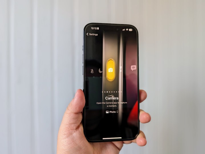
As I mentioned, the Action button was one of the more exciting things about the iPhone 15 Pro that I thought was worthy enough to upgrade to.
Since I’ve started using various Android phones, one of my favorite things about them is being able to open the camera with the power button. Though Apple doesn’t replicate that gesture exactly, the Action button gives me a similar type of functionality with my iPhone.
Yes, I know that there is a camera shortcut button on the iPhone lock screen, and I still use it occasionally out of habit. But the problem I have with that on-screen shortcut is that it’s hit or miss. Sometimes, it will get me to the camera without an issue; other times, it seems to act up, and by the time I get to the camera, the moment I want to capture has passed.
When I got my iPhone 15 Pro on launch day, the first thing I did was set the Action button to launch the Camera app (just on a default photo, though there are other options). The reason for this is that I want to access my camera as fast as possible; there are a lot of moments with my daughter that I want to capture, and if you know toddlers, those moments happen in seconds and can be hard to replicate.
With my Action button set to launch the camera, I’ve regularly used it multiple times a day. Usually, it’s to capture a photo of my daughter being cute, but I also use it often whenever I want to get a picture or video, especially when I’m at Disneyland. It’s become my preferred way of launching the camera, and though I could do so much more with it by using Shortcuts, I think I prefer simplicity.
So far, I’ve found the Action button to be so much more useful than the silent/ring toggle switch that it replaced. I’m the kind of person who never takes my phone off of silent, so whenever I get a new iPhone, I set it to silent and never turn the sound back on again. In other words, the toggle would basically get used once and never again. By comparison, the Action button gets used multiple times a day.
My one issue with the Action button
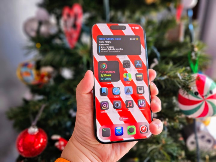
That said, there is one thing I’ve noticed about the Action button that Apple may want to reconsider in the future.
Though I’m just one of the people who gets a lot of use out of the Action button daily, I have seen some comments on various social networks about how other users kind of overlook that it exists or just don’t really use it. One of the reasons for that is because of where the button is located.
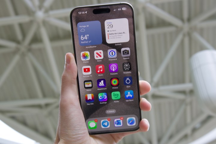
When I use the Action button, I notice that I typically use both hands to access it — I hold the iPhone 15 Pro in my right hand and use my left to press and hold the button. Sometimes, I can get to it one-handed if I’m holding something, but usually, I use both hands. And this is just with the smaller iPhone 15 Pro.
While I don’t have the iPhone 15 Pro Max myself, I can certainly visualize that it’s even harder to easily reach the Action button, especially one-handed, on Apple’s largest flagship. I know one of my friends who has an iPhone 15 Pro Max and told me that he doesn’t really use the Action button because it’s just out of the way.
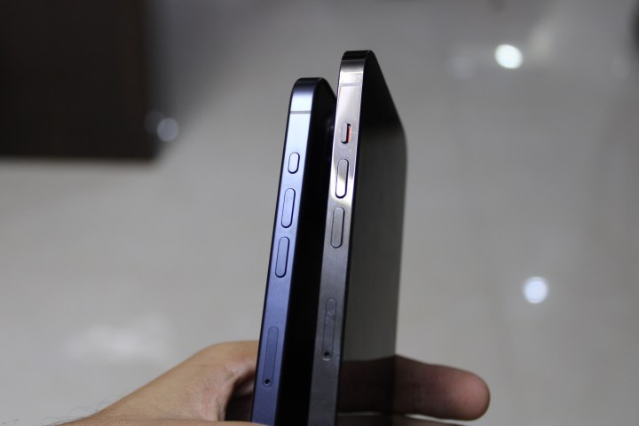
I know that Apple used the Action button as a replacement for the silent/ring toggle, but I’m not sure that above the volume up button is optimal placement. The natural way to hold a phone is with your palm near the bottom and your fingers and thumbs on the side edges. The ideal placement for an Action button would be below the volume buttons, towards the middle, as that’s where your thumb would be.
There are already some rumors circulating that the entire iPhone 16 lineup will have the Action button, not just the Pros, as well as a completely new “capture” button on the right side of the body. With a new button on the right side, Apple would also have to shift the mmWave antenna to the left edge, so it may be possible that the new button will be in a more reachable position than the current Action button.
Of course, we still don’t know what this speculated new button will actually be used for. But with the rumor that it’s going to be a “capture” button, it’s likely it could be a dedicated hardware camera shutter, thus leaving more options available for the Action button itself.
A great (but flawed) iPhone 15 Pro feature
While some people may not be using the Action button much, if any, it’s become one of the most used functions on my iPhone 15 Pro. Honestly, I don’t think I could go without it now that I’m so used to having it. I’ve been able to capture so many more moments with my daughter because it gets me to the camera faster and more reliably.
But that doesn’t mean that the Action button, at least in its current form, is perfect. I really do wish that the position was more accessible, especially one-handed. I also think Apple could have made it even more useful by allowing for multiple gestures so that you could do more than a single action with it.
But even with those complaints, I’ll still take the Action button over the hold ring/silent switch any day of the week. Apple took a gamble with the Action button, and if you ask me, it paid off.
Editors’ Recommendations

