SlavkoSereda/iStock via Getty Images
This article talks about how money moved around in different parts of the US in February 2024 and how it could impact the markets in March 2024. This is important because when the amount of money going into the economy changes, it takes about a month before it affects the stock market and other types of investments. This can help figure out how investments will do in the future. Other large money movements can indicate what might occur in several months or years.
The chart below shows how much money comes in and goes out of different parts of the US economy. This information comes from the national accounts.
US Treasury and Author calculations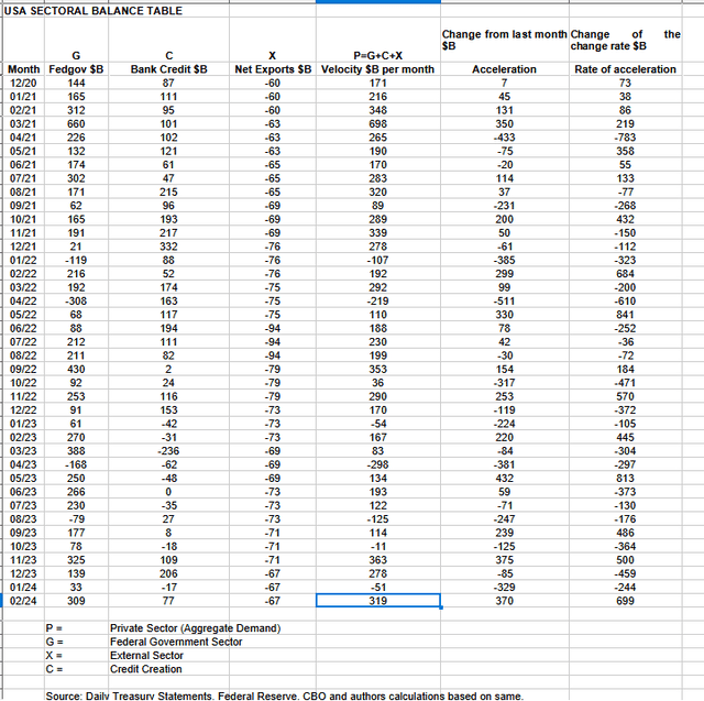
In February 2024, the private sector recorded a surplus of $319B and this is a very positive result for asset markets as financial balances in the private sector have risen and caused the aggregate demand for goods, services, and investment assets to grow.
From the table, one can see that the $319 billion private sector funds surplus t came from a $309 billion injection of funds by the federal government (and this includes the new injection channel from the Fed of around $11B from interest on reserves that went directly into the banking sector), less the -$67B billion that flowed out of the private domestic sector and into foreign bank accounts at the Fed (the external sector X) in return for imported goods and services. Bank credit creation added $77B reversing last month’s result where bank credit in aggregate went backward.
The chart below shows the balance of different sectors in the economy, measured in regular money terms. The calculation is how much the government spends, plus what is traded with other countries, to see how much money is left for people and businesses in the country. This is a fact that is always true.
US Treasury and SPX and author calculations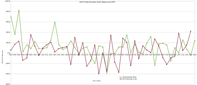
Last month the lead of the private domestic sector balance over the (SPX) predicted that the (SPX) will finish February lower than it began. This was not what happened and the stock market melt-up kept going and is still going and is great to see. The caveat last month was that one should also see the seasonal stock market index comments below for more information on short-term stock market movements which was indeed foreseeing that markets would keep rising.
The chart shows how the information in the US sectoral balances table is changing over time, taking into account any delays in the impact of these changes. This is like a tool that helps us see what’s happening in the market from far away.
Mr Robert P Balan of the Predictive Analytic Models Seeking Alpha Investment Group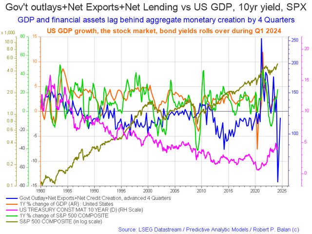
The blue line represents the money that the government spends and the credit that banks create, minus the current account balance. It can predict economic changes up to four quarters in advance. The blue line showing money coming in has started going up again compared to last month. It’s now at its lowest point and starting to go up, which means it’s looking like 2024 will be a good year for most of the year.
The chart below shows the five-year average of the seasonal stock market patterns for the SPX (SPX), Nasdaq (NDX), Dow (DIA), Russell 2000 (RTY), and Biotech (IBB) market indexes. The black oval shows where we are now.
Mr Robert P Balan of the Predictive Analytic Models Seeking Alpha Investment Group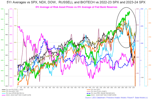
The end of the green line is the (SPX) and shows where we are at the time of writing. The index averages predicted the markets would roll over and decline from trading day 290 onward and continue to do so through February and into March in a grand decline that may last until trading day 320 which is about the 22nd of March. This has not happened and a general market melt-up has occurred.
The discussion at the end of this article about the G5 fiscal flows may explain why this is happening and could be overmatching all other near-term predictive tools.
The table below shows how much money the federal government took out of their bank account at the Federal Reserve. When the government spends money, it gives more money to the private sector and helps the stock market go up.
US Treasury and author calculations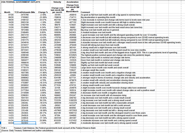
The table shows that total outlays were slightly down over the previous month and still a very strong $3T+. This month Federal taxes, fees, charges, and bond turnover allowed $309B of that spending to remain in the private sector and form the federal deficit which is dollar for dollar the private sector surplus. When one deducts the current account deficit from this result the private domestic sector balance is $242B. In terms of purchasing power, this improves again when one adds the $77B of bank credit creation.
ANG Traders of the Away from the Herd Seeking Alpha Investment Group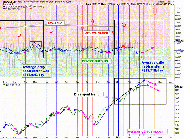
The chart above, top panel, highlights in red and green the financial relationship between the currency creator (red area and the federal government) and currency users (green area the private sector). The ghosted red circles shown in March and April are large federal taxation events that make for a series of financial sinkholes that also include another large federal taxation event, often the largest, in the middle of June.
The simple message is federal taxation up = markets down.
The average daily net transfer is +$13.71B/day compared to +$14.92B/day last year. Nominal spending is running hotter than last year at this point, but taxation is higher this year leaving less money in private bank accounts. April’s tax-drain is expected to have an effect (and hopefully it will provide a buying-dip).
(Source: Mr. Nick Gomez, ANG Traders, Weekly Report for Subscribers the Away from the Herd SA Market Service).
ANG Traders of the Away from the Herd Seeking Alpha Investment Group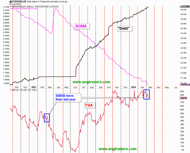
The chart above, top panel, shows the general conditions of the stock of treasuries rising and the SOMA (Fed balance sheet) falling. The bottom panel is the federal government’s bank account balance at the Fed and is moving in a range where it has about $700B in it. This is a large balance, larger than normal. No doubt it has been maintained at this size to allow for a buffer given the constant negotiations over federal government spending authorizations and appropriations and the threat of a federal government shutdown if a last-minute continuing funding resolution is not passed.
The next major fiscal milestones are not nice and as previously mentioned there are a series of large financial sinkholes coming up that give us the seasonal summer stock market lows. The only highlight is a treasury coupon interest payment in the middle of May.
At the White House in the last month, a continuing resolution was passed to fund the federal government a few months more and the wrangling about passing a proper budget for the year goes on in a shameful display of how not to run a country.
The next Fed meeting is in the middle of March where most likely rates will be paused or raised slightly. This article goes into depth on what to expect there.
It’s important to check the housing market regularly because it’s closely related to the overall economy, and it’s expected to reach its highest point in 2026.
Mr Robert P Balan of the Predictive Analytic Models Seeking Alpha Investment Group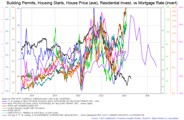
The chart shows aspects of the housing market. In this instance, we have the price of lumber (orange line and that tends to rise in a boom) appearing to bottom and be close to a local low. Now all rising are the home-builder ETF (NAIL), Home Depot (HD), housing starts, and permits. Even the Freddie Mac 30-year contract rate is increasing [which is normally bad for housing] Important to note though is the purple government expenditure line rising through most of the rest of 2024 before dropping and rising again into 2025. This line is the fiscal carrier wave that sets the overall trend for all other waves that follow in its wake and is shown as a blue line in the second chart in this article.
It is possible that the “over-match” impact of the carrier wave has now taken effect and is lifting all markets before it and offers some explanation as to why markets have been rising even though shorter-term financial models are predicting a local decline. Ballistic over-match is a physics concept whereby the diameter of the shell exceeds the thickness of the armor of the target to such a large extent that it penetrates regardless of any other consideration.


