franckreporter
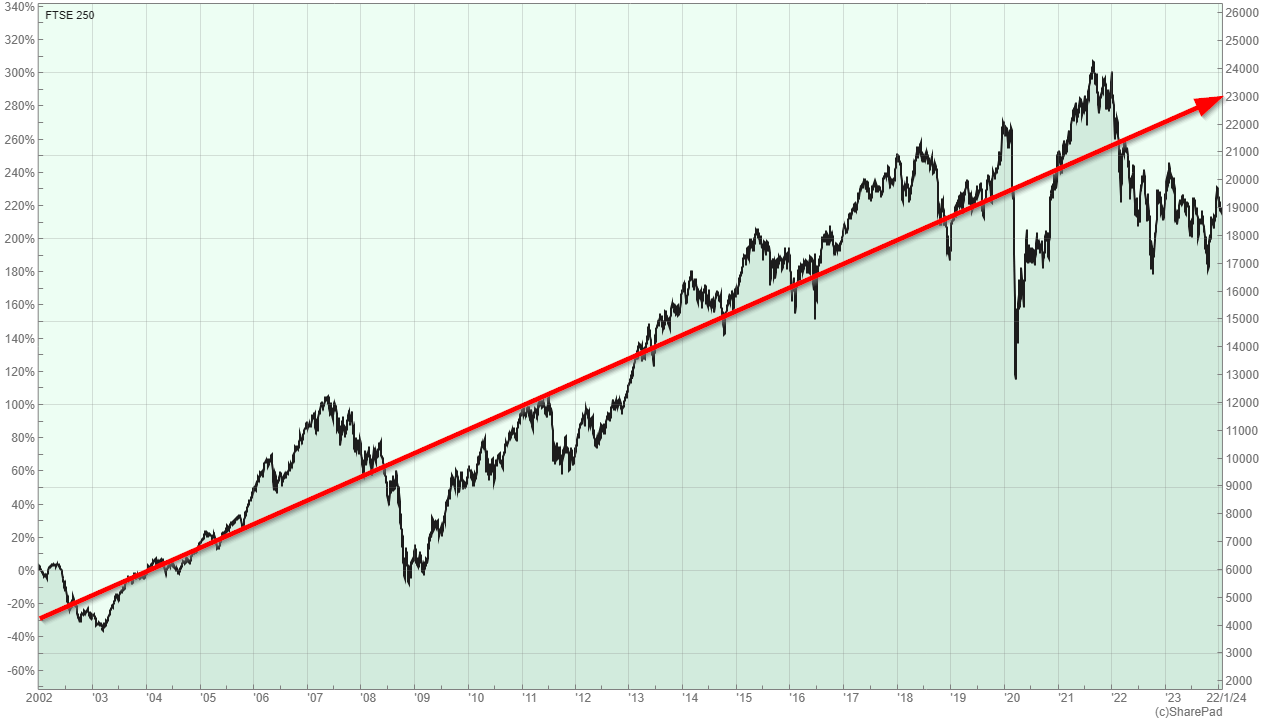
The last few years haven’t been kind to the UK stock market and the FTSE 250, much like the FTSE 100, has fallen out of favour with all but the hardiest and most dedicated (or stubborn) UK investors.
Perhaps now is indeed the time to throw in the towel, sell everything UK-related and move the proceeds into everybody’s favourite index, the S&P 500.
On the other hand, two of the best-known investing maxims are to be greedy when others are fearful and to buy when there’s blood in the streets. If those statements are correct, and I think they are, then the deeply negative sentiment that surrounds the UK could be creating precisely the right conditions for outstanding future returns.
It’s impossible to know for sure, but we can draw some sensible conclusions by looking at the FTSE 250’s past, calculating its valuation multiples and forecasting (but not predicting) its future price.
How did the FTSE 250 perform in 2023?
We can only begin to understand the FTSE 250’s potential future by understanding its past, so let’s start there.
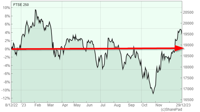
Although the last few years haven’t been kind to the UK stock market, 2023 wasn’t all that bad. The FTSE 250 gained a little over 4% during the year which, from a historical perspective, is fairly typical.
Charts by SharePad
4% is a reasonable one-year capital gain, but as you can see from the chart above, there wasn’t any kind of upward trend during the year. Instead, the FTSE 250 went up a bit, it went down a bit and it just happened to end the year during a brief upswing.
On balance, I would describe the FTSE 250’s performance as broadly flat in 2023, and I’ve highlighted that trend in the chart with a big red arrow.
Of course, equities are long-term investments, so worrying too much about the ups and downs of the stock market over a single year is pointless at best and counterproductive at worst. Investing is all about the long-term, so here’s a chart showing the FTSE 250’s performance over the last five years.
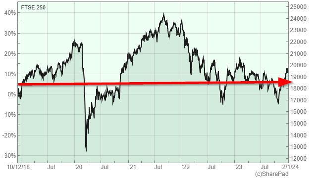
Alas, the five-year chart is as depressingly flat as the one-year chart because the FTSE 250 has gained barely more than 10% since the end of 2018. This is disappointing, but it isn’t surprising as the last five years haven’t exactly been plain sailing for the UK economy.
However, while disappointing, this chart does contain an important lesson. The lesson is that when it comes to the stock market, five years is still a relatively short time frame where returns can be materially impacted by a single unpredictable event (in this case, the pandemic).
If we really want to understand the FTSE 250’s past, and therefore its possible future, we need to look back far enough so that no single event has a material impact on returns, and that means looking back multiple decades, not just multiple years.
Unfortunately, that sort of long-term data is hard to come by, but SharePad does include FTSE 250 data going back 20 years, which is just about long enough.
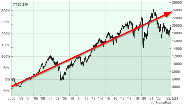
From this multi-decade perspective, the FTSE 250’s long-term upward price trend is clearly visible and the last five dismal years can be seen as nothing more than an entirely normal short-term blip within a longer-term upward trend.
The long-term upward price trend is perhaps the FTSE 250’s most important feature, and despite the ups and downs of the dot-com bubble, the financial crisis and the global pandemic, the FTSE grew by 235% over the last 22 years. That’s equivalent to an annualised capital gain of 5.7% per year and with dividends included, the FTSE 250’s total return over that period is close to 9% per year.
For an even longer-term view, the chart below shows a version of the FTSE 250 (that excludes investment companies) going back almost 30 years to 1995. Once again, the long-term upward price trend, driven by inflation and real economic growth, is clear.

In this chart, the index goes from about 4,000 in 1995 to about 20,000 today, for a total capital gain of 400% in just under 30 years, or 6% per year on average.
The growth of the trend line is even more impressive. It goes from 4,000 in 1995 to about 26,000 today, and that’s equivalent to a capital growth rate of almost 7% per year.
So, if we’re interested in how the FTSE 250 might perform over the next one, five, ten or twenty years, we should keep this long-term upward price trend and its 6% to 7% growth rate front and centre in our minds.
Is the FTSE 250 expensive, cheap or somewhere in between?
Although stock markets tend to go up over the long term, in the short term (0 to 5 years) and even the medium term (5 to 10 years), share prices can go down as well as up (as I’m sure you’re very much aware).
These short-term ups and downs are mostly driven by the emotional ups and downs of investors, who push prices too high when they’re optimistic and too low when they’re pessimistic.
You can see this in the price trend charts above, where the FTSE 250 falls far below the trend line during the bursting of the dot-com bubble in 2003 and the financial crisis in 2009 (periods of pessimism) and rises far above the long-term trend during the credit boom of the late 2000s (a period of optimism).
If I was interested in how the FTSE 250 might perform over the next 100 years then these short-term divergences from the trend line would hardly matter at all, but over one year or even ten years, they can have a larger impact on returns than the underlying upward trend.
The ten-year period from 1998 to 2008 is a good example. Over those ten years, the FTSE 250 produced zero capital gains because it went from being far above the trend line in 1998 to far below in 2008.
Fortunately, these short-term price fluctuations aren’t entirely random. Instead, we know that within any given ten-year period, it’s very likely that the index will return to its trend line.
Because of this, when the FTSE 250 is far above trend we should expect weak returns as the index is more likely to move down towards the trend line, and when it’s far below trend we should expect strong returns as it’s more likely to move up towards the trend line.
Another way to say this is that when the FTSE 250 is above the trend line the price is high (or expensive) and when it’s below the trend line the price is low (or cheap). However, the long-term upward price trend is ultimately driven by the long-term upward trend in earnings and dividends, so I prefer to measure expensiveness and cheapness by comparing the FTSE 250’s price to its earnings, rather than to the price trend line.
You can see the long-term upward trend in earnings and dividends in the chart below.
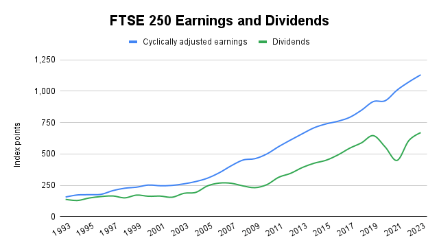
Note: The chart shows cyclically adjusted (ten-year average inflation-adjusted) earnings as this removes the ups and downs of earnings over a single year and gives a clearer view of the underlying upward trend.
The FTSE 250’s cyclically adjusted earnings have grown by an impressive 7% per year over the last 30 years, which almost perfectly matches the price trend line’s growth rate from the previous chart (which, of course, is no coincidence, as earnings growth ultimately drives price growth).
The chart below shows the FTSE 250’s CAPE ratio (cyclically adjusted P/E ratio) over the last 30 years along with its estimated 100-year rolling average (the 100-year average is estimated as index data only goes back to 1993, so the period before 1993 is assumed to be similar to the period after 1993). This allows us to see when the CAPE ratio was relatively high (expensive) or low (cheap).
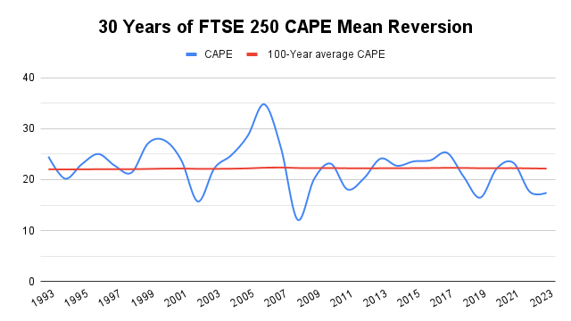
For example, the FTSE 250’s CAPE was extremely high in 2006, suggesting that subsequent returns over the medium term would be weak (which they were). The chart also shows that the FTSE 250’s CAPE was very low in 2009, suggesting that medium-term returns would be good (which, once again, they were).
So, CAPE does have some degree of predictive power, but it’s important to not get too carried away with our crystal ball gazing efforts. The range of possible outcomes is always wide, especially when CAPE is relatively close to its long-term average.
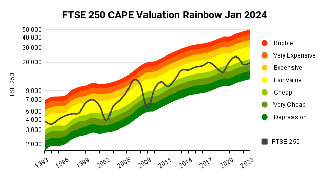
I think it’s important to have a good understanding of the range of likely outcomes, and that range is hopefully captured in the following “CAPE rainbow” chart.

The rainbow trends upwards and to the right, mirroring the long-term growth trend of the FTSE 250’s cyclically adjusted earnings. The width of the rainbow, from red to green, tells you where the FTSE 250 would have been with the CAPE ratio at various levels across its normal range.
More specifically, CAPE tends to stay within half to double its long-term average (this is broadly true across the FTSE 100, FTSE 250 and S&P 500), so with an estimated 100-year average of 22, the range of likely CAPE values extends from 11 to 44.
Here’s another version of the same chart, but with a more descriptive legend.
So, where does the FTSE 250 sit today in terms of its normal valuation range?
At the start of 2024, the FTSE 250 stood at 19,690 with a CAPE ratio of 17.4 compared to a long-term average of 22.2. That puts the FTSE 250’s CAPE some 21% below its long-term average and that’s enough to push it down into the green “cheap” end of the valuation range.
Over the last 30 years, the FTSE 250’s CAPE ratio has only been this depressed on five separate occasions, and this bodes well for the index’s expected future returns.
Where is the FTSE 250 likely to be by the end of 2024?
Nobody knows where the FTSE 250 will be at the end of 2024, but that doesn’t mean we can’t make a sensible forecast (but not, of course, a prediction).
For example, we can come up with a simple and sensible forecast by assuming that the future will look very much like the past in two fundamental ways:
- Cyclically adjusted earnings will continue to grow in line with their long-term trend
- The FTSE 250’s CAPE ratio will revert to its long-term average
Let’s start with cyclically adjusted earnings growth. Over the last 30 years, these have grown by an average of 6.8% per year, so I’ll assume that level of growth for 2024.
As for the CAPE ratio, for CAPE to revert from 17.4 back to its long-term average of 22.2, it would have to grow by 27.2%.
If we combine these two assumptions by multiplying the 6.8% earnings growth by the 27.2% estimated CAPE expansion, then we end up with the following forecast for 2024:
- FTSE 250 forecast for 2024: The FTSE 250 grows by 36% to reach 26,742 by the end of the year
At first glance, that seems like an outrageously optimistic forecast, but is it really? After all, 26,742 is only 5% above the FTSE 250’s all-time high in 2021, and a 36% gain in one year pales in comparison to the FTSE 250’s 80% one-year gain after the lows of the financial crisis.
So, although the above forecast will almost certainly be wrong (because it isn’t a prediction), it does fall well within the range of normal market behaviour.
Where is the FTSE 250 likely to be ten years from now?
Equities are long-term investments, so investors should focus on the long-term upward trend rather than the market’s emotionally-driven short-term ups and downs, and that’s why I think ten-year forecasts are useful.
They give us a chance to step back and measure the long-term potential benefits of spending decades invested in the stock market.
For example, if you told investors in 2008 that the FTSE 250 was going to grow from its then value of 4,000 to almost 26,000 in 2021, they would probably have said you were insane. But that is exactly what happened and it was, in fact, a fairly unsurprising outcome if you focused on the long-term upward trend of earnings and the tendency for CAPE to revert to its long-term average.
We can make a similarly sensible forecast for the next ten years, simply by extrapolating those earnings growth and valuation mean-reversion tendencies into the medium-term future.
In terms of cyclically adjusted earnings, if they grow at their historically average rate of 6.8% per year for the next ten years, they’ll grow by a total of 93%.
As for CAPE, if it’s equal to its long-term average ten years from now, it will have increased by 27.2%.
If we then multiply the forecast 93% earnings growth by the forecast 27.2% growth of CAPE, then we end up with the following ten-year forecast:
- FTSE 250 forecast for 2033: The FTSE 250 grows by 146% to reach 48,341 by the end of the year
If the 2024 forecast seemed optimistic then this ten-year forecast will surely stretch the credulity of even the most bullish UK investor.
But that needn’t be the case, because neither the assumed earnings growth rate nor the assumption of CAPE mean reversion are optimistic. Instead, they simply lack the suffocating pessimism that has enveloped the UK stock market over the last five years or so.
But pessimism, like optimism, cannot be sustained indefinitely, and when it does inevitably dissipate, don’t be surprised if these forecasts are the ones that turn out to be pessimistic.
Editor’s Note: The summary bullets for this article were chosen by Seeking Alpha editors.


