NicoElNino
Fed Policy: Long and Variable Lags
In early June, we examined the performance of stocks relative to bonds to see what we could learn about the soft versus hard landing question. At that time, the stock/bond ratio was siding with the soft-landing scenario, which thus far has been the case. Since we know Fed policy works with long and variable lags, it is prudent to revisit the soft vs. hard landing question as we prepare for 2024.
Seeking Alpha
Human Beings and Economic Fear
If market participants believe a deep recession, a big hit to corporate earnings, and significant job losses are on the horizon, they would also most likely believe the Fed will cut interest rates faster and to a greater degree. Under this scenario, stocks would become less appealing as earnings expectations would have to be reigned in significantly. Bonds would get a nice tailwind from Fed policy featuring numerous interest rate cuts.
CCM
Thus, the analysis below can help us evaluate the relative attractiveness of the big three equity exchange-traded funds, the SPDR S&P 500 ETF (NYSEARCA:SPY), the tech sector ETF (XLK), and the NASDAQ 100 ETF (QQQ) versus the major bond options, the 7-10 Year Treasury Bond ETF (IEF) and the 20+ Year Treasury ETF (TLT).
Before The 2001 Recession
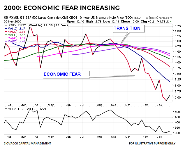
The U.S. economy entered a recession in March 2001, confirming what investors had already anticipated, a hard landing. The chart below shows the S&P 500 Index (SPX) relative to the price of a 10-year U.S. Treasury bond. The look of the chart passes the common economic sense evaluate; investors’ conviction and desire to own stocks were waning, and their desire and conviction to own more defensive U.S. Treasury bonds were increasing.
CCM / StockCharts.com
2008: Risk-Off Well Before Lehman
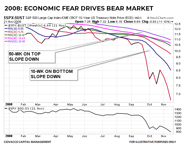
Lehman Brothers declared bankruptcy on September 15, 2008, delivering another blow to a staggering U.S. economy. Notice how the stock/bond ratio was already in full-bore bearish mode when one of the darkest days in U.S. economic history arrived in September. The fastest moving average, the blue 10-week, was at the bottom of the moving average cluster, and the slowest moving average, the 50-week, was on top; price was below all the moving averages, and the slopes were all down, indicative of a strong risk-off downtrend.
CCM / StockCharts.com
How Does The Same Chart Look Today?
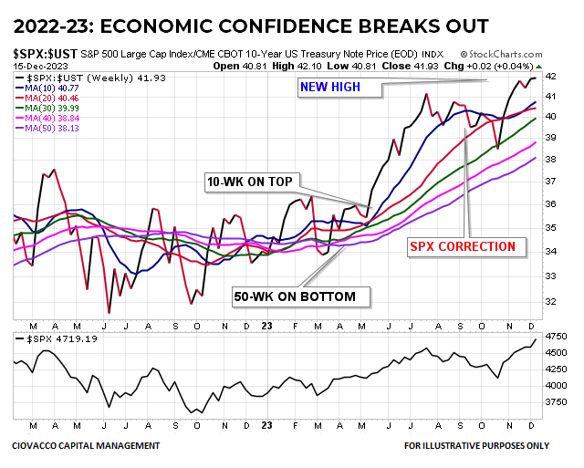
In mid-December 2023, the message from the stock/bond ratio is the same as it was in June; it favors the soft-landing/risk-on scenario. If we think about the logic shown in the image below, it is difficult to argue that the look of the stock/bond ratio is reflecting a high degree of economic fear.
CCM CCM / StockCharts.com

The look of the 2023 chart above is the polar opposite of the 2008 chart. The 2023 chart features the stock/bond ratio above all the moving averages, with the blue 10-week on top of the moving average cluster and the 50-week on the bottom. All the moving averages have positive slopes, completing a full-bore bullish look from a trend perspective. If the unemployment rate was about to pop higher and earnings were about to tank, we would not expect to see stocks as the preferred investment over more defensive bonds. As noted back in June, if the ratio flips, it may be time to sell stocks and buy bonds. That may happen in the coming weeks or months, but it is not what we have today.
Post-CPI Moves Were Insightful
Hypothetically, if the Fed holds interest rates steady and the rate of inflation drops significantly, monetary policy is becoming more restrictive to economic growth. Thus, the wide range of risk-on moves that were covered on November 14 following the release of CPI data aligns nicely with the Fed’s dovish interest rate forecasts that were published on December 13.


