Sonos has heard you, its users, and it made its mobile app better.
That, at least, is the company’s promise as it unveiled its new mobile app, as well as an all-new web app, on Tuesday.
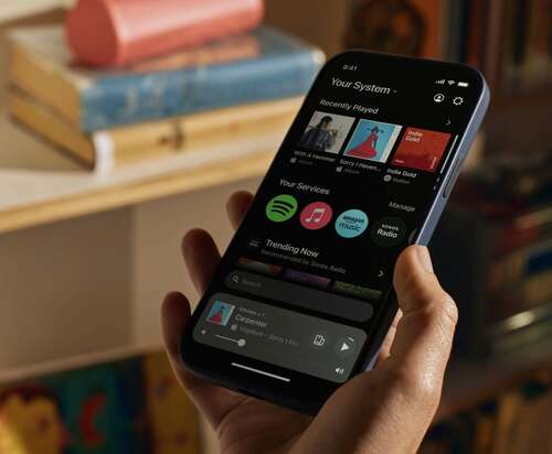
The upcoming app refresh does away with tabs on the bottom of the screen, instead providing access to Sonos system controls, your music library, recently played items, and the search bar, all on the Home screen.

No more tabs.
Credit: Sonos
I haven’t been able to try the new app myself yet, but I’ve seen demos and it does look a bit easier and faster to use. There was nothing tragically wrong with the old (current) Sonos app, but it does often take a few unnecessary taps to get to the bit you need. Furthermore, some parts of the old app can look a bit empty, such as the System tab when you only have one Sonos speaker in your system.
The new app is also a lot more customizable. Your content, services, and other parts of the app are represented as rows on the (scrollable) Home screen, and you can pin, move, edit, and rearrange them as you please.
Search has also become more intuitive, with the ability to personalize the results by designating a preferred service for Sonos to fetch results from.
Finally, swiping up from the bottom of the Home screen brings you an overview of your entire system, including an overview of what’s playing where — pretty useful for folks with large, multi-room systems.
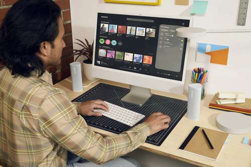
The company also launched a new web app, allowing users to play music and manage their Sonos system on a larger, desktop display.

Want to manage your Sonos ecosystem and music library on a bigger screen? The company now has a web app, too.
Credit: Sonos
The new Sonos mobile app will become available on May 7. The web app, which will go live on the same date, will be available at www.sonos.com/web-app.

