imaginima
The monthly job report is not a cudgel for making political points…
If you are an investor you have a burning need to understand this month’s employment report for what it is. Unfortunately, if you read any analysis you’re going to read comments by a lot of people who are trying to fit the square peg of the employment report into the round hole of their ideological beliefs. Beware! There are people who want to use this report to show that Joe Biden has been a great president. There are people who want to use this report to show that Joe Biden has been a terrible president (p.s. It’s an election year!). There are people who want to use this report to argue that immigrants are taking our jobs and driving our wages down. There are many other contentious issues as well… However, the report only speaks to the facts of the report and all these other uses of it are ancillary to the cold hard facts that we can know – or argue about, as you shall see.
Question: Are immigrants ‘taking our jobs’ and suppressing wage gains?
Table 1
Average Hour Earnings By industry Relative to Inflation
inflation adjusted (real wages) year-over-year growth by industry (Haver analytics & FAO Economics )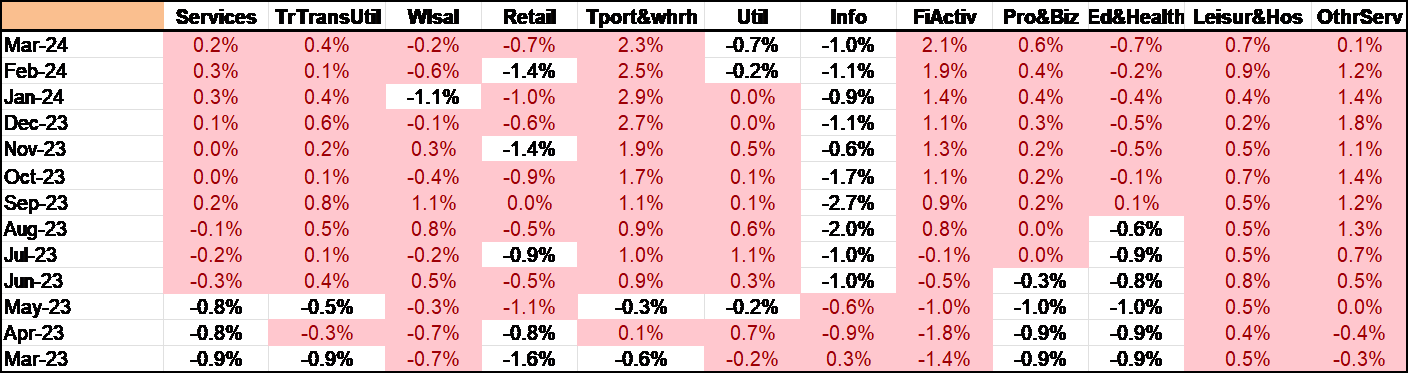
Table 2
Industries’ wage change rank Vs wage level rank
Industry rankings by wage levels and 12-month growth in wages (Haver Analytics and FAO Economics )
The Table 1 shows changes in real wages year over year for the past year by the various industries; the small table just below it shows you the ranking of nominal wages as well as the ranking of year over year changes in nominal wages (it’s the same as for real wages) by industry. What’s very clear in this table is that the industries with tempered declining real wages are utilities as well as Information Services. These are the first and second highest paying sectors in the table! It seems unlikely that immigrants flooding over the border are responsible for tempering wage gains in these sectors! It is true for example that the lowest wage paying sector on the chart Leisure & Hospitality shows a tempered and weak real wage gain. Leisure and hospitality is the lowest paying sector on the table It’s increase in real wages is only slightly higher year-over-year. However, among the industries in this table, as of March, it has the third highest real wage gain over the last year! As a result, neither does it appear that immigrants have flooded into the lowest wage paying sector depressing wages there.
Very often immigrants wind up in agriculture and we don’t have agricultural data here. However, there’s little support in these data for the idea that the tempering of wages owed to the influx of immigrants. Without a separate specific survey on the matter, I don’t see how we can better identify that effect.
Table 3
March Labor market reports summarized (Haver Analytics & FAO Economics)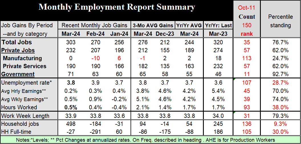
Job creation…
Next, let’s look at some of the job creation issues. There were 303,000 jobs created in March – these are net job increases. The private sector created 232,000 of them manufacturing created zero. The private service sector created 190,000 of them and government created 71,000 of them. A large slug of government jobs was created in March. In the far right hand column of the table, I have ranked the standing of this month’s job creation on data back to October 2011. Government jobs created by month have been higher than the March creation tally less than 8% of the time. Government job creation is a large part of the job creation this month and has been for some time. Jobs created in manufacturing have been stronger about 75% of the time and jobs created in private services have been higher about 38% of the time. Total job creation has been stronger just a little more than 25% of the time. Manufacturing job creation is at zero, it has only been weaker about 75% of the time; while zero is a weak number, everything is relative.
The unemployment rate shifted back down this month to 3.8% and has been this low or lower on this timeline only about 29% of the time. The next three categories we rank based on their year-over-year percent changes. Average hourly and weekly earnings are both relatively elevated higher only 25% to 30% of the time on this timeline. And hours worked are relatively modest and are only higher about 38% of the time.
Hours Vs jobs
However, it’s interesting to note that hours worked rose by 0.5% in the month after rising 0.4% in February. Now February’s sharp rise was a bounce back from January when hours fell sharply by 0.4%, as well. Hours-worked are accelerating from 1.7% pace over 12 months to a 2.1% annual rate over three-months. Hours-worked are reflection of the number of people working as well as the quantity of hours they work. I’ve always considered this a much more important number than the headline number for jobs because jobs are only bodies in motion. A lot of them might be part time. What if the number of jobs is the same and the length of the work week has contracted? Then the job number is telling you everything is the same but the hours-worked number would be telling the city economic activity is contracting which seems to be more likely. This month the hours worked data are extremely important because they bring forward another dilemma that we have in looking at: the difference between the household and the payroll report..
Two labor surveys; Jobs Vs Employment
Every month the Bureau of Labor statistics engages in two separate surveys: one is called the payroll report ( a job survey) and its surveys firms about the number of workers that are on their payroll as a certain date in the month. The date determines the work-week that firms look at to determine what their head count is. And the labor data gathered and in the report comes from that work-week. The household report is a more continuous survey during the month that survey is people by telephone and other means and asks them a series of questions. Are they in the labor force? if they are, are they employed or they’re unemployed. Certain other questions help to determine whether their employment status is full time or part time.
The table shows you we look under household jobs a row of data for household full time employment. You’ll notice that the change in jobs for the full year ended March 2024 shows a decline and full-time employment averaging 88,000 a month. Over the most recent three months full-time employment averages is a decline of 86,000 per month. In March full-time employment fell by 27,000 after it fell by 291,000 in February! These numbers have been feasted on the anti-Bidenists.
But…these figures are in stark contrast with total household jobs. Total household jobs increased by almost half a million in March as 498,000 jobs were created. According to the table all of those jobs- and in fact more than all of those jobs since 27,000 full time jobs disappeared – we’re part time jobs. This has brought forth a lot of criticism of the job report. Of course, the people who support Joe Biden want to call this a great report, but run into resistance from the people who look at the household statistics and want to undermine the report and undermine the achievements of the economy and those of the Biden administration.
Can you separate the wheat from the chaff?
What’s right and what’s spin? The household report is what it is. I’m not saying it’s correct and I’m not saying that it’s wrong. It’s simply presenting the data that it has from the survey it took. Surveys sample the economy, and they are subject to certain kinds of error. What the household report says is quite inconsistent with what the payroll report says. I know the household report said that there were even more jobs created than the payroll report says because 498,000 is greater than 303,000. I get that. But that’s not the statistic I’m looking at. If you look at the household report detail, you find out that some full-time jobs actually disappeared during the month. But if you look at the payroll report there’s no specific line about full-time and part-time employment, however, there is an accounting of hours-worked. And the work-week length in the payroll report got longer in March at 33.9 hours up from 33.8 in February. Part time workers generally don’t work as long as full-time workers so it’s hard to see how, if all of the ‘new’ workers are part-timers, the length of the work week would rise. In tandem with that, there is a 0.5% increase in the number of hours worked by all workers which includes the number of workers and the hours that they work. The increase in workers only accounts for a gain of 0.2% – the rest is due to hours. This kind of explosive number for hours +0.5%, seems quite incompatible with the idea that all of the increase in employment was part-time workers. Statistically it seems impossible. The household and payroll reports are from different planets.
The Jobs conundrum
Now I know there’s going to be a tendency to look at the household report and look at that specific label on full-time and part-time workers and draw conclusions about what’s really happening. However, the payroll report casts everything in a totally different light. These two reports drawn from very different samples are really telling us very different things and they’ve been doing that for some time. Over the last year the household report says there were 54,000 jobs created per month while the payroll report says there were 244,000 jobs created per month. Over that period, the household report says that there were 88,000 full time jobs per month that disappeared. Who ya gonna call? Ghost Busters?
Dazed & Confused?? Does the job report go over like a lead Zeppelin?
If you’ve read these paragraphs and you’re confused, then you’re paying attention. I am not writing this to try to resolve the problem. I’m writing this to try to point out that there is a sharp difference in the information we’re getting about the job market and when you read things about the economy and its strength, you’re reading very different accounts of it depending on which of these reports analysts want to look at. And you want to be really careful about this during this period. There are many analysts who are using this data to make political points with the elections coming forward. I don’t want to use these reports to make political arguments I want to use these reports to understand what the economy is doing so that we know what policy ought to be doing and so that the Federal Reserve knows what it ought to be doing with policy as well. If you’re an investor you have all these same goals. You have every incentive to understand what’s really going on rather than to understand the political spin that your favorite Democrat or Republican wants to put on this report.
The odds of getting objective analysis are frankly not very good. I will repeat my new mantra – Trust science, but not the scientists.
Should we follow ‘tradition?’
Traditionally the payroll report is the report that that gets emphasized because it is a survey of actual firms and actual payrolls. However, using this report has its own problems and these have to do with the ‘birth and death’ of businesses. If a business doesn’t report to the survey, the BLS will have to estimate its numbers and unfortunately the participation in these surveys has been going down since COVID. However, it won’t be until the end of the year that the BLS will find out if the business whose data it is estimating is still out there functioning or not. So, it may be putting numbers in a slot for a firm that doesn’t exist. On the other hand, there are also new businesses coming into existence that the BLS doesn’t know about because they weren’t there when it sent out the mandate for firms to report to it. So the BLS has a so-called birth-death model that attempts to bridge the gap between firms that are failing and firms that are coming into existence based on available economic data. That’s one clear weak spot in the payroll report. The household report is based off surveys and there’s a question of whether people are being honest, of whether people understand the concepts, and whether the survey methods used by the BLS are capturing all the people. That is a particular problem with this tremendous influx of undocumented people in the United States since the border has become porous.
At a time when we would really like to know much more, it looks like we, instead, know much less – and are forced to guess much more. That is the sorry state of policy. For now, judging from comments, economists and FOMC members seem to be placing emphasis on the payroll report and setting aside household report weakness as well as household report findings of increasing part-time work. All of this is extremely important to monetary policy. It will make a difference which report is right.

 Q2 2024 Earnings Call Transcript")

