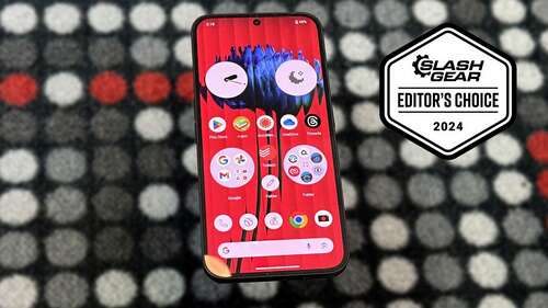
One of the great things about launching a midrange phone is you don’t necessarily have to change the software, and in the case of Nothing, that is a very, very good thing. Nothing’s software is simply delightful. It’s a mostly stock build of Android, but where Nothing has made changes, it has made thoughtful changes.
By now you’re likely familiar with Nothing’s design aesthetic with the dot-matrix style writing, and its color palette of reds, greys, black, and white. To that end, Nothing has built several widgets that all fit that design philosophy. Nothing is also a fan of circles, and that shows up not only in those widgets but in the icons you can have on your screen. Folders can be enlarged so they take up more space but display more apps. Plus they can be enlarged circles to fit the theme.
Nothing also includes an icon pack that can turn virtually all of your icons into monochromatic icons. That’s a really cool way to use your phone, but it’s also very difficult to get used to. Apps and brands put a lot of thought into their color palette, so when you’re hunting for an app, the color will most likely be what draws you to the app first. Take that away, and finding a particular app becomes a lot harder to do at a glance.
If you want to use your phone less, this is a good way to do it. But if you don’t necessarily want to curb your phone usage, you’ll want to skip this particular feature.

