The MacBook Air‘s famous wedge-shape design is no more, replaced by the square-sided M3 model. Long live the sloped MacBook Air.
Back in 1991, Apple showed up the entire laptop industry by making one key design decision that all rivals then forever copied. That was the moving of the keyboard from the front of the laptop to the back, and turning what was wasted space into a useful palm rest.
As simple and even obvious as that now appears, it remains the single best ergonomic design change in laptops — but then there was a second one. Some 17 years later in 2008, Apple unveiled the wedge as we’ve known and adored since.
Apple wasn’t the first
As ever, Apple wasn’t the first with a wedge shape where the front of the laptop is lower than the back, giving a sloping feel to the whole device. When he introduced the MacBook Air in 2008, Steve Jobs even illustrated how a Sony laptop was 1.20 inches at the back and 0.8 inches at the front.
Jobs just then immediately showed how that compared to the Sony laptop. To surprised cheers from the audience, the MacBook Air was revealed to be 0.76 inches at the back, sloping down to what Jobs called “an unprecedented 0.16 inches.”
“Now I want to point something out here,” he continued. “The thickest part of the MacBook Air is still thinner than the thinnest part of the [Sony] TZ series.”
In what perhaps felt like a clever bit of foreshadowing, Jobs had also criticized existing wedge-shaped laptops for running slowly. He said that they had to because of what he called their thermal envelopes, the way the shape meant they couldn’t cool a processor that was running at full speed.
Over its entire life, but especially at the start, the MacBook Air would be criticized for how its shape reduced ventilation and so required the processor to be run slow. But at the time, we had the word “envelope” in our heads, and then of course Jobs did what’s still remembered today.
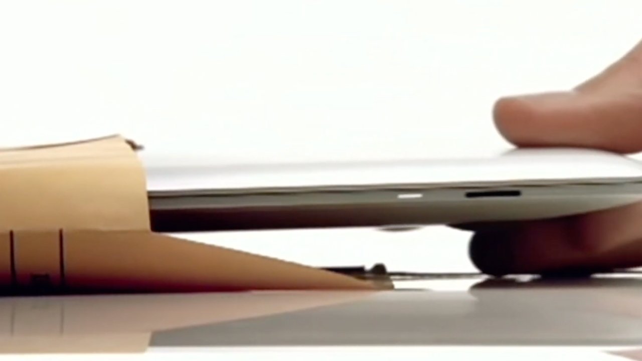
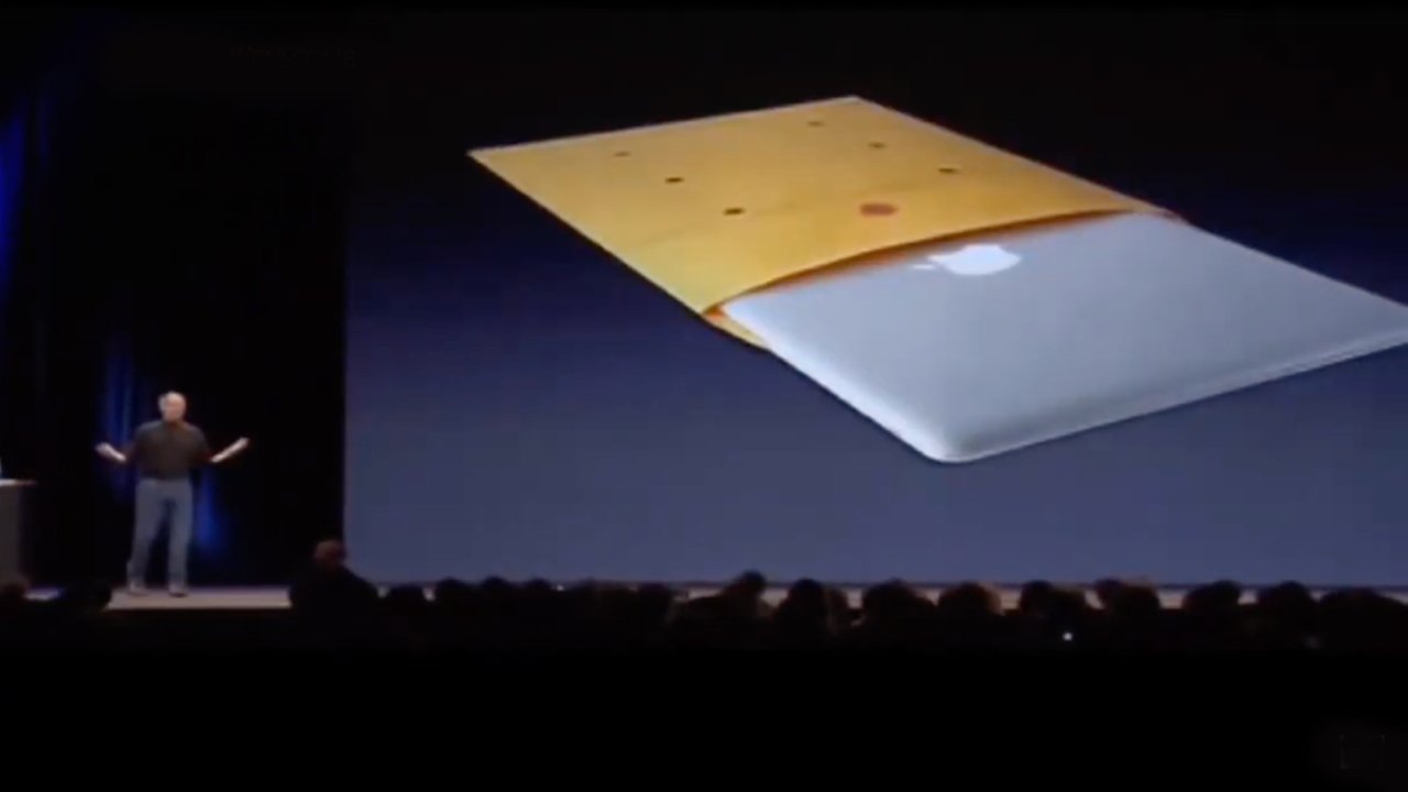
He showed the MacBook Air by slipping it out of an inter-office envelope.
Today these are practically unheard of, but for decades businesses would use these as reusable envelopes. They had a series of boxes on the front where you crossed out the last recipient, wrote in the new one underneath, then chucked the envelope into the internal mail.
In 2008, these inter-office envelopes were still common enough that Jobs’s audience knew them. And even now, the sight of that laptop coming out of an envelope remains impressive.
The specifications don’t, though. While not unreasonable for its day, the original MacBook Air shipped with 2MB RAM, an 80GB hard drive, and its screen was a 13.3-inch one at a resolution of 1280×800 pixels.
For comparison, the new M3 MacBook Air starts at 8GB RAM, a 256GB SSD for storage, and its screen is a 13.6-inch one at 2560×1664 pixels resolution.
The 2008 original MacBook Air sold for $1,799, which today is the equivalent of $2,577. The new M3 MacBook Air starts at $1,099.
However, to put the original 2008 MacBook Air in context, it was introduced alongside the now long-gone Time Capsule. The event was also exactly 200 days since the original iPhone launched, and by this point Apple had sold a total of four million iPhones.
The 2008 MacBook Air form factor was tremendous
In 2008, AppleInsider praised the MacBook Air’s physical design, describing the wedge as tapering “down into a whisper thin edge.” It also said, though, that “physics simply limits the degree to which the Air could be reduced in size” while following the same overall proportions as the MacBook Pro.
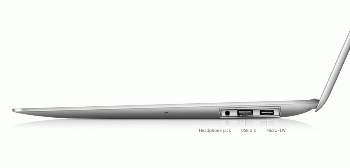
The curved edges make the wedge taper less obvious, but there’s still a distinct slope from back to front (right to left). Notice the (opened) pop-down door revealing the ports.
The New York Times was effusive, saying “you can’t take your eyes or your hands off it… this thing looks as if it’s descended from a spatula.”
“When it’s on a table, you might mistake this laptop for a placemat,” it continued. It did say that the wedge shape “wastes a bit of internal space.”
But for anyone who shares Apple’s admiration for elegance, the tradeoff is worth it,” concluded the New York Times. “This laptop’s cool aluminum skin and smooth edges make it ridiculously satisfying to hold, carry, open and close.”
According to Engadget in 2008, as archived by AOL, the MacBook Air was so unusual that airport customs officers held up a traveller with one. They were suspicious because it had no obvious hard drive, and seemingly no ports — because the ports were hidden behind a pop-down door.
Macworld also praised it overall but noted that it was “the slowest currently shipping Mac model.”
That slowness was to become a problem, especially since despite it being slow, the MacBook Air still overheated. In August 2008, Apple released a fix for that problem — but it didn’t work.
By the end of 2008, and also then again during 2009, Apple refreshed the MacBook Air’s design. It upgraded the processor and graphics options, for one thing, plus it reduced the price to $1,499. And, that flip-down USB-A door was gone.
Then in 2010 as Apple revamped the 13-inch MacBook Air, it also introduced an 11-inch version.
Surprisingly, since it’s now all but forgotten, there was an 11-inch model of the MacBook Air for six years. It was replaced in 2016 by the 12-inch MacBook.
Last rites for the MacBook Air wedge
The simple wedge shape of the MacBook Air genuinely made typing easier and more comfortable. It mean users didn’t have to raise their wrists to reach the keys, it meant their palms could be flat down on the surface.
But it also always meant there was less physical space for cooling air to circulate. That in turn meant — just as Jobs said of the Air’s rivals — that there was a compromise in performance.
The MacBook Air got faster and faster, but it was still under-powered because of its thermal envelope. The move from Intel to Apple Silicon helped the 13-inch MacBook Air in late 2020.
But it was the 2022 redesign that made all the difference — and removed the wedge.
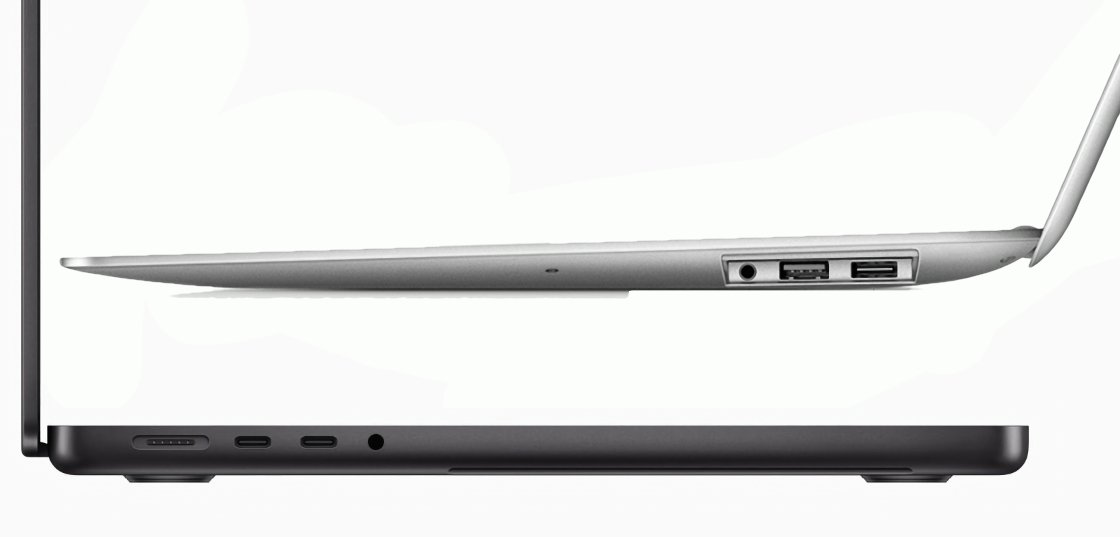
On the plus side, adopting the more straight-line profile of the MacBook Pro increased the ventilation and meant the device could run faster, and for longer. It meant that the choice between a MacBook Air and a MacBook Pro was harder.
But it also meant that the distinctive and adored wedge shape design has gone. At least for now.


