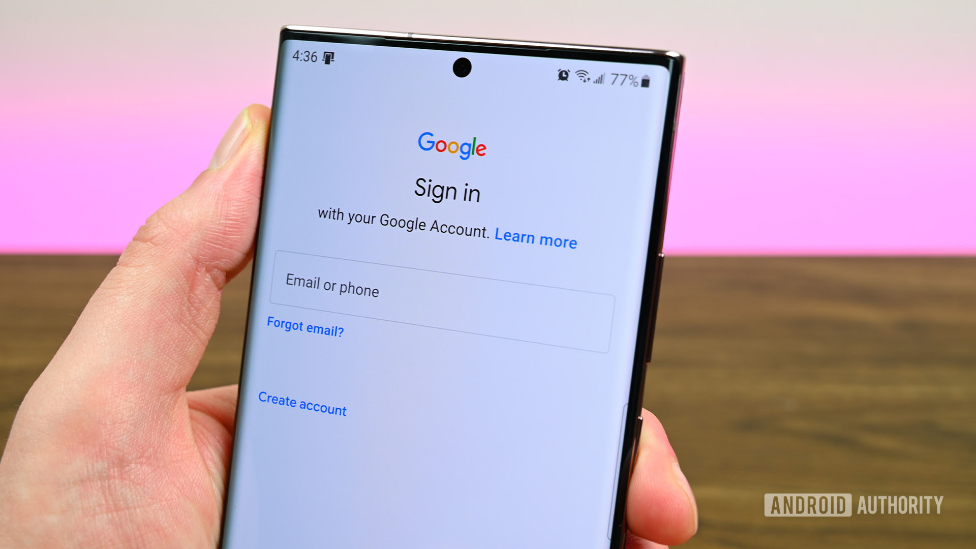
Joe Hindy / Android Authority
TL;DR
- Google has changed the look of its sign-in page.
- The company says the new layout is better suited for all screen types.
- The new design can be seen on computers, phones, and tablets.
If you recently signed in to your Google account and noticed something looked a little different, you’re not alone. Google has rolled out a new design for the sign-in page.
On its help page, Google announced it has changed the page you typically see when signing into your account. According to the tech giant, it has adjusted the layout so it will be better suited for all types of screens, whether big, small, or wide. Additionally, the page will now automatically adjust to the size of the screen.
Outside of the design, everything still works the same. There’s still a field for you to enter your credentials, as well as clickable elements if you for forgot your email address or if you want to create an account.
Google says you’ll see the new sign-in page on computers, tablets, and phones when logging in to a Google app or a Google service. However, you may not see it if you’re running an older version of the browser. If the change hasn’t rolled out for you yet, you should see a banner presented at the top of the page with the disclaimer “A new look is coming soon.”

