
Lemon_tm
Written by Nick Ackerman, co-produced by Stanford Chemist.
Credit Suisse High Yield Bond Fund (NYSE:DHY) and BNY Mellon High Yield Strategies Fund (NYSE:DHF) deliver high monthly distributions to income investors through leveraging up their below-investment grade portfolios (i.e., “high yield,” as their names state.) Both of these funds also are trading at relatively attractive discounts.
They also both launched in 1998 and swiftly went from their launch price to low single-digit share prices as the dot-com bubble exploded. Today, they remain ‘penny stocks’ as the technical definition is a security trading below $5. However, these are both closed-end funds.
These similarities are what caught my attention with these two, and I think a comparison of the funds is an interesting exercise that seems appropriate given their similarities. Additionally, I’ve not covered either of these funds but have held DHY in the past at various times.
DHF Basics
- 1-Year Z-score: -0.34
- Discount: -13.86%
- Distribution Yield: 7.83%
- Expense Ratio: 1.33%
- Leverage: 29.44%
- Managed Assets: $189.4 million
- Structure: Perpetual
DHF’s investment objective is to “seek high current income.” They will attempt to achieve this by investing “at least 65% of its total assets in income securities of U.S. issuers rated below investment grade quality or unrated income securities that Alcentra NY, LLC, the fund’s sub-adviser determines to be of comparable quality.”
DHY Basics
- 1-Year Z-score: 1.38
- Discount: -7.37
- Distribution Yield: 9.25%
- Expense Ratio: 1.44%
- Leverage: 27.07%
- Managed Assets: $325 million
- Structure: Perpetual
DHY’s investment objective is to “seek high current income.” They will attempt to achieve this by investing “primarily in below-investment-grade U.S. fixed-income securities.”
Leverage
Both of these funds are fairly small, but they are helped out by utilizing borrowings to ramp up the amount of assets in the funds. DHY would gain the slight edge here, but both could have issues with liquidity, particularly for large investors wanting to make a significant move in or out of the funds. This leverage is also employed in an attempt to achieve higher relative performance than they otherwise would. On the other hand, more leverage means more potential volatility and risk as well.
However, that leverage comes with costs, and those borrowing costs increase with higher Fed rates. For DHF, those expenses brought up the total expense ratio up to 3.96% as of their last semi-annual report. DHY’s total expense ratio comes to 3.8%.
DHY has a lower total expense ratio overall when factoring in the leverage costs. That said, DHY still has higher operating expenses when excluding borrowings – even as it is the larger fund. This also gathers information from the fund’s annual report as opposed to the semi-annual report we had for DHF. Additionally, it’s for the period ending October 31, 2023. These two factors shouldn’t have had a meaningful impact on the comparison, though.
The borrowing rate for both of these funds is based on a floating rate, and neither appears to have been directly hedged in the latest reports provided. That said, both of these funds carry exposure to various floating rate instruments that would have naturally helped offset the higher borrowing costs.
Floating Rates And NII
DHF’s last reported listed CLOs and “floating rate loan interests” securities at a weight of around 12.2%. DHY’s portfolio, as of its last report, showed bank loan exposure of around 17.2%. Additionally, the fund also listed another ~5.5% in asset-backed securities. The yields on ABSs are generally floating rate as well.
Floating rate exposure can help the funds protect the income-generating abilities of their underlying portfolios to offset the higher borrowing costs. According to each fund’s report, that is exactly what happened as well. Even with DHY’s higher exposure to floating rate securities, it was DHF who seemed to have benefitted at least a bit more in terms of net investment income.
I’m primarily basing this on the fact that if we annualized the latest NII figure, it would come to $0.22. That would be good for an increase of 10% from the prior fiscal year.
DHF Financial Metrics (BNY Mellon)
In the case of DHY, their latest report also reflects a slight increase in NII, but it was an increase of 6.25% year-over-year.
DHY Financial Metrics (Credit Suisse)
Of course, the caveat here is that we are simply annualizing the last semi-annual report for DHF. Also, with low-priced securities, there could be some rounding going on that can impact the percentage changes we end up with quite meaningfully.
However, the main takeaway here would be ultimately that despite higher borrowing costs, they were able to generate sufficiently higher income not to see it as a detriment. This is whether they were rolling their portfolio into higher-yielding securities or from the floating rate exposure, both of which contribute positively to the distribution coverage of each fund. Therefore, this round would appear to end in a tie.
However, let’s shift to the actual distribution discussion now and coverage.
DHF sports a 7.83% distribution rate, and DHY is at 9.25%. On an NAV basis, the rates come to 6.74% and 8.57%, respectively. Easy win for DHY, right? Well, that’s where coverage of the actual distribution comes in.
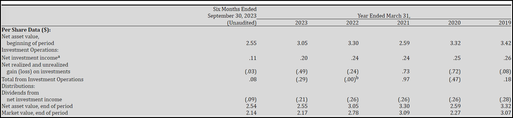
We can see in the above that DHF paid out $0.09 in the six-month period ($0.015 per month times six) against the $0.11 earned. That would put the coverage of the distribution at 122.2% – indicating that the fund could be in a position to raise its distribution to investors.
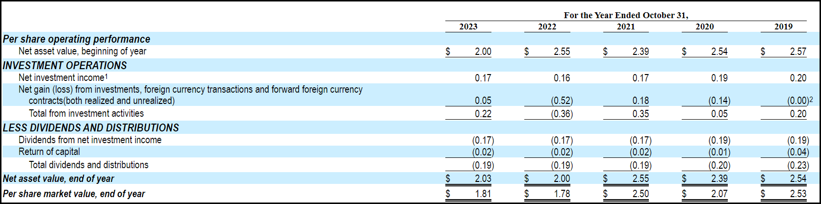
On the other hand, in the last fiscal year, DHY paid $0.19 in distributions against the $0.17 earned. That results in a shortfall of the distribution coverage with only around a 90% coverage rate.
If DHY were paying what it earned, the distribution rate would have dropped to 8.45%, and if DHF were paying what it earned, it would climb to 9.57%. That would put DHF on top.
To look at this another way, the ratio of NII against average net assets for DHY comes to 8.34%, and for DHF, it comes to 8.26%. Essentially, they are quite close to being able to generate similar NII rates in their underlying portfolios. I think the difference here has to do with rounding once again for DHF. Again, I’d also reiterate that they are simply annualizing a six-month report. There is no guarantee it’d be the same in the second six months.
That said, it is once again close enough that I suspect it is a tie. All else being equal, which we know never happens, but in a perfect world, both of these funds would essentially deliver nearly identical returns going forward.
With DHY, you’d just simply have a lower share price and NAV as it chips away slowly at both of these over time due to overpaying. Alternatively, for DHF, you’d receive a lower monthly distribution rate, but you could be making that up with a price and NAV appreciation as the fund underpays over time.
Performance Track Record
As we all know, though, we don’t live in a perfect world. It is nearly guaranteed that when you are looking at income sources in the high-yield space, there are inevitable defaults that happen. If you’re messing with fire, you’re going to get burned.
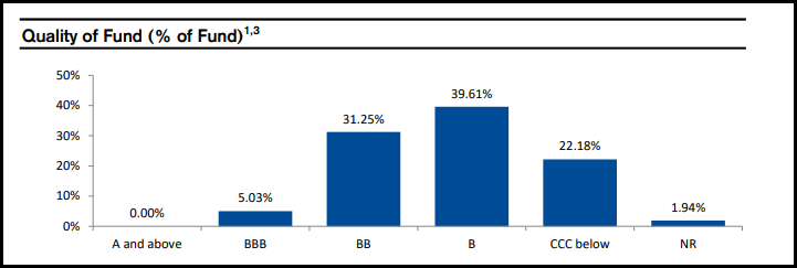
Here’s the credit quality breakdown for DHF.
DHF Credit Quality (BNY Mellon)
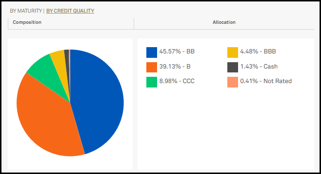
Here is a look at the credit quality on DHY.
DHY Credit Quality (Credit Suisse)
This is another area where the comparisons between these funds are important in determining potentially greater or lower risk going forward. For the most part, DHY looks like the riskier portfolio with a notably larger CCC and below-weighting. These are essentially securities that are already in default, or if the wind blows too hard one day, they’ll be in default. DHF leans on a relatively higher allocation to BB rated debt, which is still junk but higher quality junk, if you will.
All that said, managers can still realize gains in trading around these underlying debt instruments, too. So, it isn’t always right to expect defaults will hit unrealized/realized losses; if the managers are successful enough, they can still generate gains overall. It’s just that those would have to offset the default losses that are inherent in this space of the market.
All of this will ultimately be reflected in total returns. While we can’t guarantee what the future looks like or how these portfolios will perform, what we can do is look at the track record of each fund.
As noted at the beginning of the article, both of these funds were launched in 1998. DHF is a slightly older twin with a birth date of April 29, 1998. DHY was born on July 31, 1998. For the long-term comparison, that latter date is the max chart setting for total return performance, which we’ll be going back to.
In terms of looking simply at the price and NAV chart, both fell dramatically. after launching to hit single-digit levels and then ultimately dropping now to the $2 area – which ironically is where both these funds are trading.
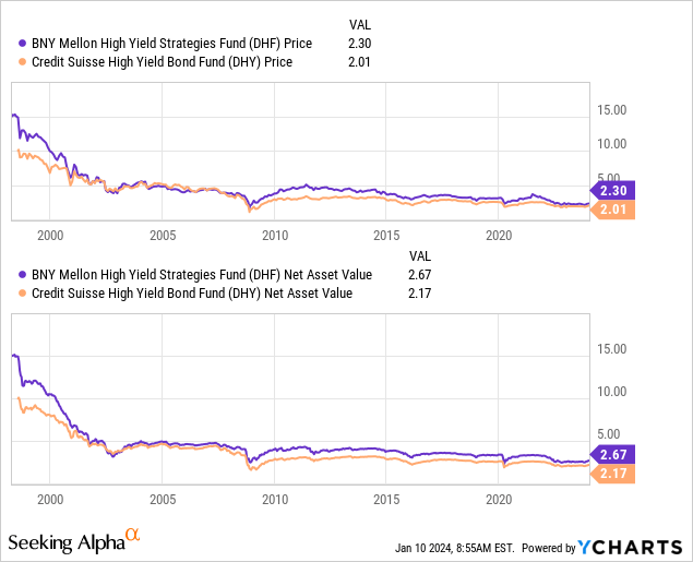
Ycharts
That seems to be worse news for DHF because that fund actually launched with a price of $15 compared to DHY’s $10. Therefore, it would be expected that DHF would be the worst performer in terms of total returns, and that’s exactly what we see.
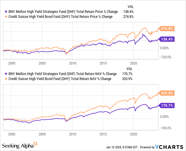
Ycharts
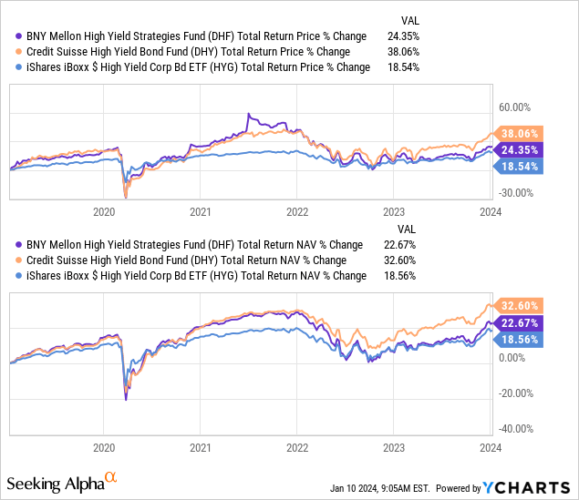
With all that said, 1998 is ancient history, and we’ll look at more recent performance metrics. This time, the below shows the last 10 years history. To spice it up, we’ll also add in the iShares iBoxx $ High Yield Corporate Bond ETF (HYG) for some additional color.
In this case, both these funds have exceeded HYG’s returns on a total NAV basis, but on a total share price basis, DHF has suffered with lagging results.
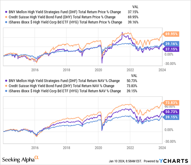
Ycharts
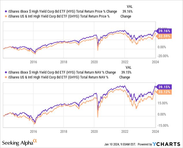
In fact, the clear winner over the last decade in both total return results is clearly DHY by a wide margin. One of the causes for this could go back to DHF, also incorporating some global ‘opportunities’ compared to a more concentrated U.S. exposure. If we look at the last 10-year history of HYG compared to iShares US & Intl High Yield Corp Bond ETF (GHYG), we can see that the U.S. market has provided better results. GHYG still invests roughly 63% in U.S. investments, with the rest located elsewhere around the globe.
Ycharts
Looking back at the last five years, we can see similar results in that DHY is showing a better track record in terms of total returns. DHF has competed and beat out HYG during this period as well on both metrics. Though considering the ~30% leverage employed on DHF compared to the non-leveraged HYG, some investors may not feel comfortable with the added risk relative to the fairly minimal outperformance.
Ycharts
Those risks of borrowing can really bite, which can be seen during the Covid crash. While we don’t get a COVID-style crash all that often, it’s still good to know what you are getting invested in before it happens.
In this case, the performance period is from February 19, 2020, to March 23, 2020. DHY was able to keep total NAV return losses at a more shallow level when compared to DHF. The total share price results certainly didn’t reflect that, as both got hit nearly identically. However, both funds – as we would naturally expect – saw meaningfully larger losses when compared to HYG.
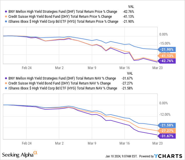
Ycharts
Finally, we’ll take a look at the last 3-year performance, which measures the more recent pressures of the fixed-income space. That would be the higher interest rate environment that the market has had to deal with throughout 2022 and into 2023. In this case, the high-yield space actually suffered significantly less than the higher quality, thanks to higher yields and lower maturities. Still, it wasn’t as if it was a particularly strong period for most; regardless, junk-rated debt was just relatively better.
That said, DHY once again came out on top. It seemed to have gotten hit along with HYG quite similarly. However, it was more on the recovery from those lows where DHY shined. Throughout 2023 – and particularly the strong Q4 2023 observed when the Fed signaled a pivot – DHY flew higher and put in space between it and DHF and HYG’s performances.
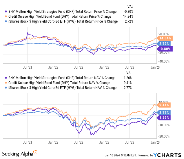
Ycharts
Clearly, DHY has a much stronger track record than DHF. That includes both periods of good and bad times, as well as since the launch of these funds. Though the leverage did negatively impact the fund during Covid, patient investors were rewarded in a fairly meaningful way for taking those higher risks.
Discount
On a valuation basis, DHF sports the larger absolute discount, and that can be due to the fund’s lower relative distribution yield compared to DHY. Though, as we already covered, we also saw that all else being equal, these rates should be roughly the same. DHF could support an even higher payout if they wanted due to strong distribution coverage.
In terms of a relative discount, both of these funds are trading below their historical levels. The spread differential for DHF is 7.12, and for DHY, we are looking at an absolute percentage differential of 2.67. So that does give the edge to DHF, in this case, as it has the absolute largest discount and even the wider relative discount.
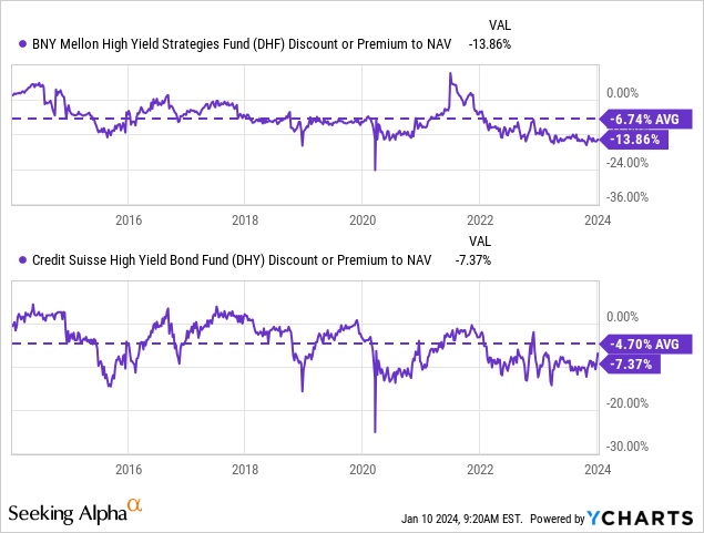
Ycharts
That said, we also now see that throughout every period, DHY has had a superior track record. In looking at the total returns, that factors in potential gains in trading around the portfolio and keeping defaults and the losses associated with that low. Therefore, investors could argue that even though we see a better valuation for DHF and better distribution coverage, the weaker track record of the fund, as well as the lower headline yield, may
Of course, the biggest caveat here is that it is simply past performance, and that cannot be guaranteed to continue.
Conclusion
Both of these funds are quite similar in their approach to investing in high-yield securities. They came to the market at nearly identical times – right before getting whacked by the dot-com bust. They also both seemed to navigate the higher rate environment thanks to some floating rate exposure that naturally offset the higher borrowing costs.
That said, this is where the difficult decision comes in, and ultimately, it’s where I’m willing to take the middle road. Investing in a combination of both of these funds could be an appropriate approach for those looking at either of these funds. Perhaps overweighting one over another, depending on each investor’s individual approach.
This is because if we simply look at past performance, DHY is clearly the choice here, but on fundamental metrics, DHF looks like the more solid choice. The fund’s distribution coverage is high and indicates that they could raise should they choose to with over 120% coverage, while DHY’s coverage is around 90%.
However, that’s simply comparing NII coverage levels. The past performance would indicate that DHY has been able to keep losses to more minimal levels and/or see higher gains in trading around its portfolio. One would have to have confidence that this continues to be the case going forward to just choose DHY at this time.
Besides the strong distribution coverage for DHF, it also wins in terms of the fund’s discount in terms of an absolute and relative valuation basis. That can help set the fund up to perform better going forward if it simply returns to its longer-term average discount. Thus, an investor with a value-based approach would likely see DHF as the stronger choice.

 Q2 2024 Earnings Call Transcript")

